Intro
While the economy of pixel art makes it a splendid medium to animate in, the limitations present peculiar nuances. The majority of pixel art is animated in a traditional frame by frame manner. Most often you will find pixel art animation in the form of short looping cycles, especially when used in video games. As simple as they may seem, looping animations demand great attention to detail. When repeatedly played over an over again you notice every detail, and a single misplaced pixel can create an eyesore. In other words, you can't hide poor cluster work with fluid animation. Furthermore, I recommend developing confidence in your basic pixeling skills before getting too carried away with animation. But ultimately, the most effective way to learn is by going through the motions. Best to start with simple small sprites and limited colors. Let's ease in with some idle cycles.
Idle Cycles
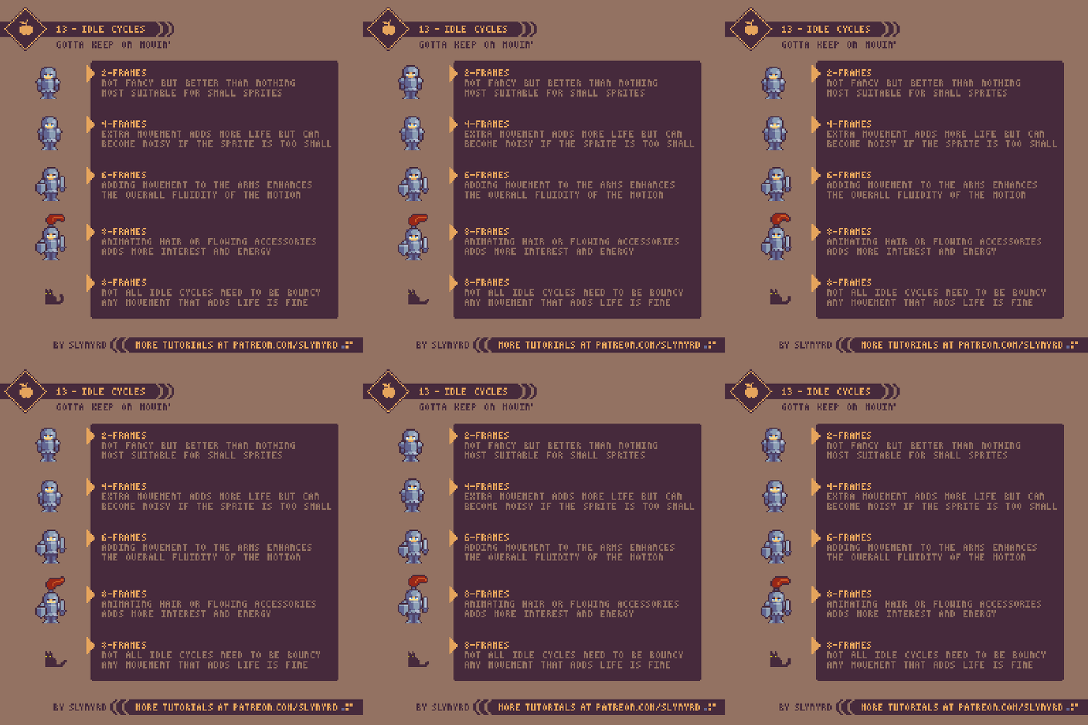
Idle animations are a simple and effective way to bring life to your art or game. The basic requirement for an idle cycle is movement. It doesn't even have to make sense, just move. In 8-bit JRPGs you commonly see them reuse the same 2-frame walk cycle for the idle animation, so the character appears to always be marching in place. I thought this was quite funny as a kid but I realized it's actually a clever way to bring life to incredibly small and simple sprites on a tight memory budget. However, the most common idle cycles come in the bouncy breathing variety.
As for the above examples, they are all reasonable solutions. The complexity of your idle cycles should be determined by the scope of your project. For example, if you are a small team making a game with lots of unique character sprites it might be unreasonable to give every character an 8-frame idle cycle. However you choose to approach idle animations they should be consistent.
Run Cycles
Now it's time to pick up the pace and go for a run. This is a good point to become familiar with keyframes. Keyframes are basically guide frames that determine the start and end of a specific motion. For example, say I'm going to animate a character throwing a punch. First I would make one keyframe of the character wound up before the punch, and one keyframe of the punch at full extension. If needed I would then make the frames that fill the motion between, which are called in-between frames.
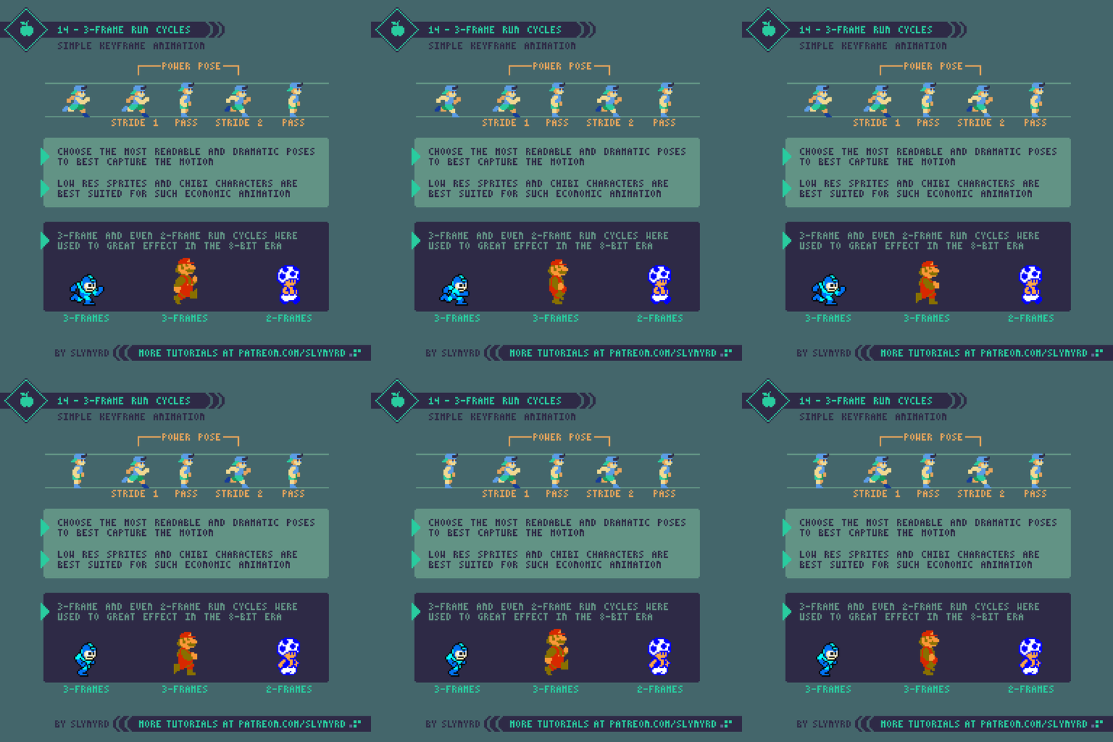
Keyframes should be the most dramatic poses that capture the essence of the motion. Even with the in-between frames removed the gist of the animation should be readable from the keyframes alone. Many good examples of pure keyframe animation can be found in older games. In the 8-bit era limited memory left little to no space for in-between frames, so developers were forced to create economical animations using only keyframes. While they appear simple, finding just the right poses to create the illusion of motion is an art in itself.
I particularly admire the Mega Man run cycle. With just 3-frames it captures more kinetic energy than most modern run cycles made with many more frames. Technically there are 4 frames in the loop but the same pass frame is used twice. This is the model I used for my own exampIe.
In my practice I found a few keys to making a good 3-frame run cycle. First, you want to make powerful stride poses with limbs extended and the character tilted forward. Often the fist is swung up in a manner that almost looks like the character is punching to maximize the action. The pass frame should have all the limbs close to the body in neutral positions so it connects with both stride poses. Lastly, don't forget to include some vertical movement to get the bounce effect.
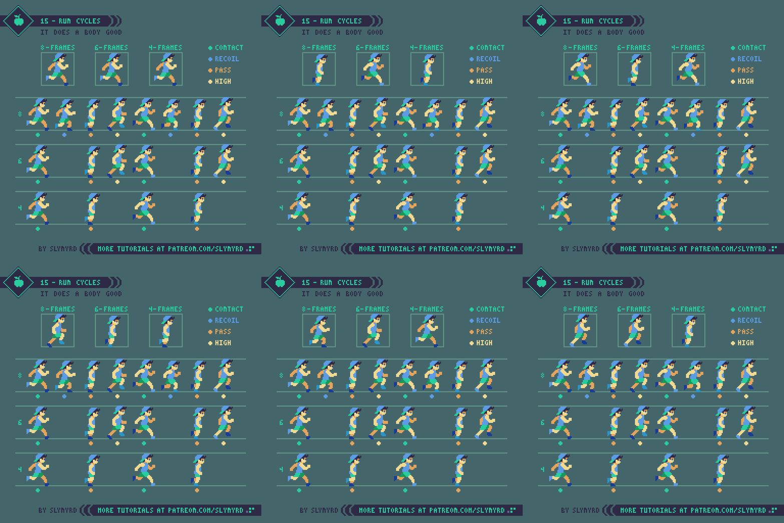
Now let's pick up the pace and look at run cycles with higher frame counts. I first created the 8 frame cycle and simply removed frames to make the economized cycles. So how do I decide which frames to remove? Well, we know from our study of 3-frame cycles that contact and pass frames are crucial keyframes, so we don't want to get rid of them. If you observe all of the frames you can see the recoil frame is quite similar to the contact and adds little movement. Therefore, I first remove the recoil to make the 6-frame cycle, and you can see it's of little consequence and may actually have better energy without them. Finally, the only non-keyframe I can remove to make the 4-frame cycle is the high point. This more significantly impacts the animation but the core movement and energy are still preserved.
In order to preserve that same energy the playback speed must also be adjusted when frames are removed. For example, each pose in the 8-frame cycle is shown for 80 milliseconds, while each pose in the 4-frame cycle is shown 160 milliseconds.
The most important thing when creating a run cycle for a game is the energy of the motion. As you can see in these examples, more frames creates smoother animation but not necessarily more energy. In fact, too many in-between frames can make your motion look sluggish. It's best to have trust in your keyframes and not weaken them with excessive in-betweens. The above example shows how your imagination fills in the blanks. Making an energetic run cycle all starts with strong keyframes. Nevertheless, I find 6-frame cycles work well in most cases. They are easy to manage and just have a nice gallop to them.
KEY POINTS
Start simple - Create simple sprites with clear color separation for the sake of animating. You can add details after you are satisfied with the motion.
Size - Tiny sprites limit the motion you can depict, while larger sprites are time-consuming and difficult to animate. Pick a size that is comfortable for you.
Keyframes - Good animation all starts with strong keyframes
Excessive frames - Too many frames can leach the energy from your motion. Focus more on solid keyframe design
Attention to detail - Respect the clusters of every single frame. A single orphan or misplaced pixel in a looping animation is obvious.
Energy - Smooth movement doesn't necessarily equal good animation. Focus on the overall energy of the motion.
Playback speed - The duration each frame is shown dramatically impacts the energy of the motion. Experiment with many speeds and feel it out.
Final Thoughts
Animation is a wonderful skill to develop and a very effective way to exploit the charms of pixel art. Especially if you want to make pixel art for video games, animation is a must. Don't worry if your first attempts are miserable, animation is a skill learned with practice. The first time I tried animating pixel art in Photoshop it nearly brought me to tears and I seriously thought maybe I should just stay away from animation. But I continued to practice and over the years my dread turned to joy. Now animation is one of my favorite things to make and continues to grow on me as I improve. I hope you too can experience the satisfaction of bringing your pixels to life with motion.
I'm just scratching the surface here and will continue covering animation topics in future posts. I hesitate to do software specific content, as we are all using different tools and I don't want to alienate anyone, but I'm curious to know what subjects or aspects of animation you would like me to cover. Explosive effects, parallax motion, sub-pixel animation, and quadrupedal run cycles are just a few examples on the table. Better make sure I know how to do all that;)
RESOURCES
Was this article helpful? If you find value in my content please consider becoming a Patreon member. Among many other rewards, Pixel Insider members get extra resources to compliment my tutorials. But most importantly, you allow me to continue making new content.
Assets featured in this Pixelblog are available in Anatomy & Animations Assets Pack.
Get caught up on all my downloads
If you're not ready to commit to the subscription model of Patreon, make a one-time donation and receive exclusive art and downloads. Fan support is necessary to keep producing content. Thank you!
-By Raymond Schlitter


