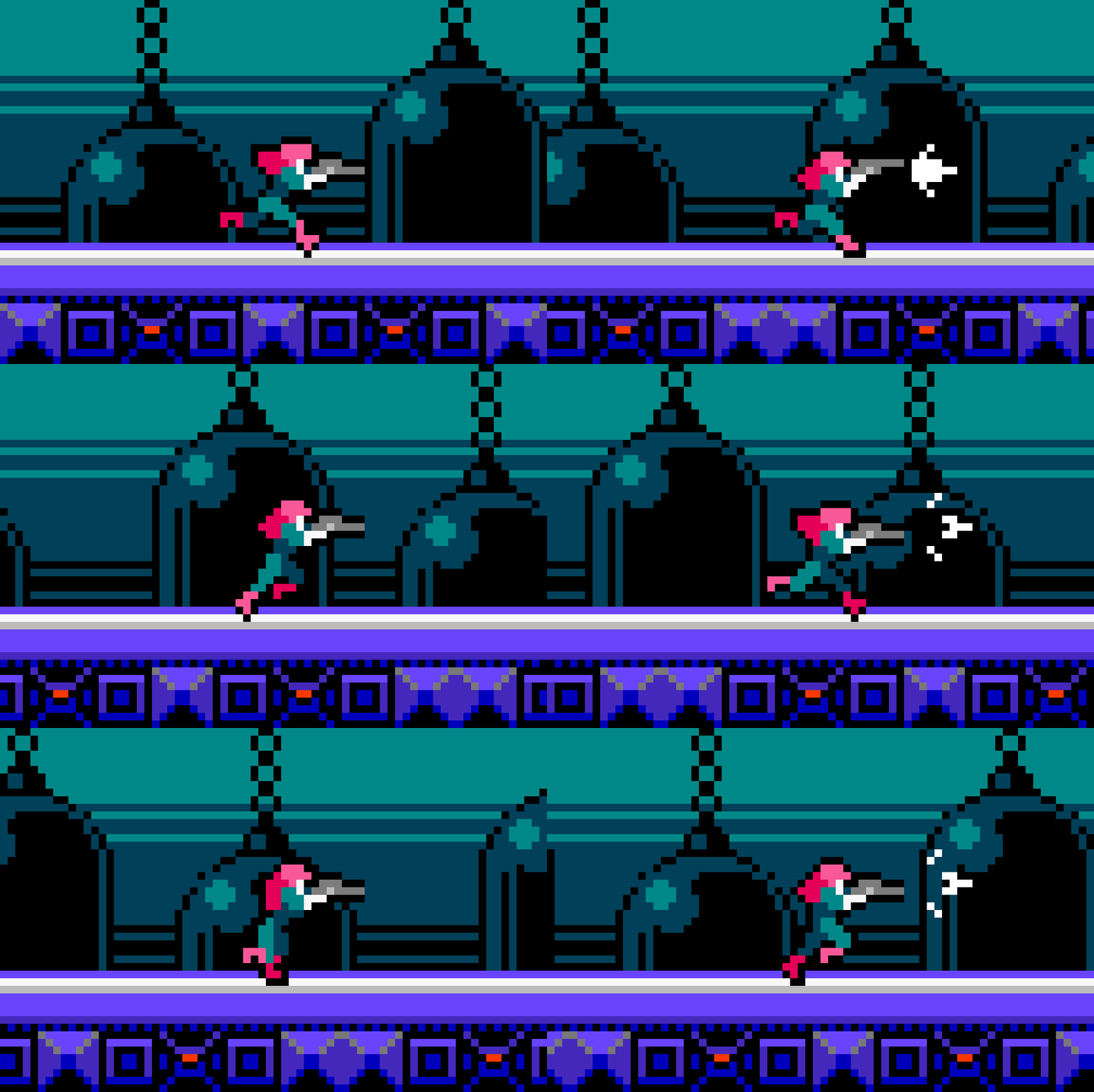
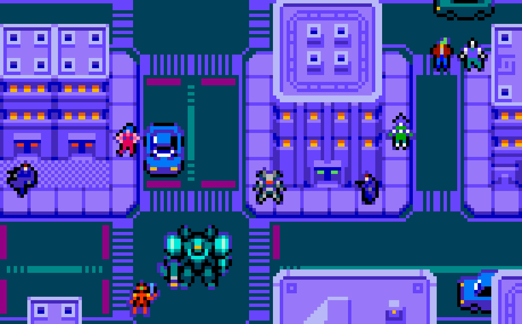
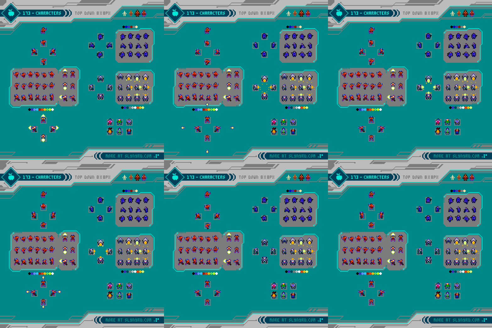
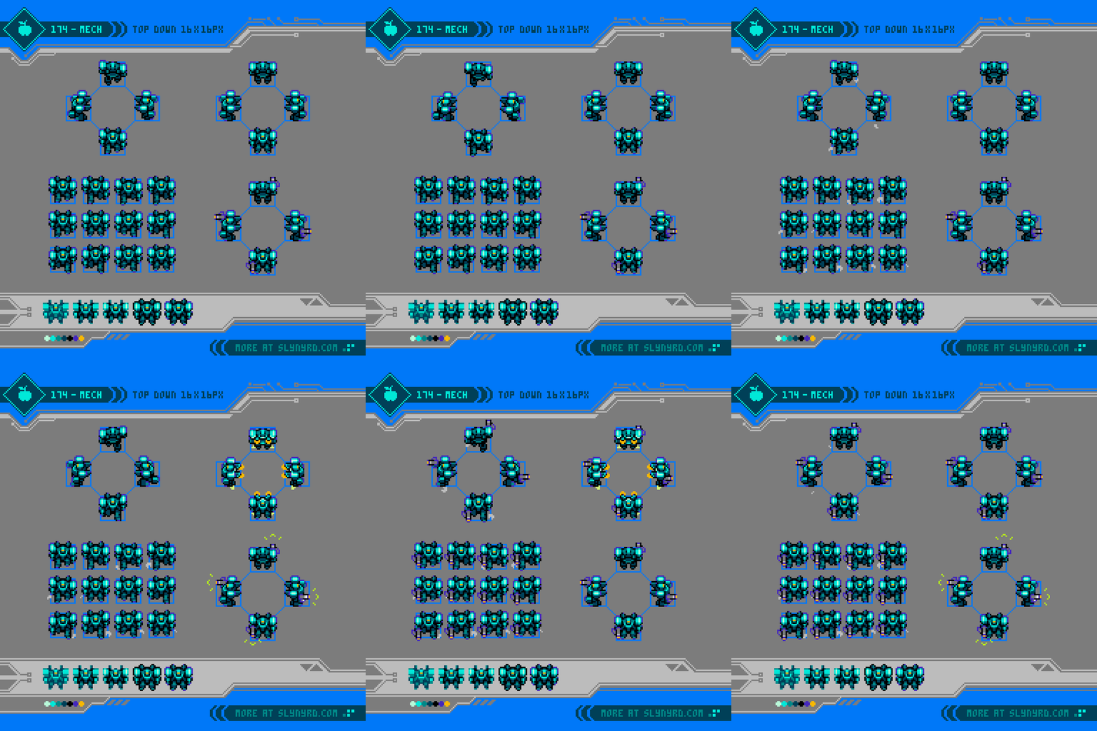
Pixel Diary - Golden Romance by Raymond Schlitter

320x180px, 43 colors, Aseprite

Intro

I arrange tiny squares on a digital canvas to make images called pixel art. Mechanically simple, but infinitely deep in intent, the human element is what legitimizes the pixels as art. I, a human being, thrust my intention with every choice made on the canvas, in an attempt to ascend myself and any willing viewers above the mundane, into the realm of sublime. However, intention alone won’t raise us from the mire of our sufferings, as beauty must propel the transcendence. While beauty is arguably subjective, I believe it has a fundamental quality, which directs us toward the divine, serving the ultimate truth and goodness. Indeed, a staircase to heaven, made out of pixels.

Pardon my pretentious philosophizing to justify my simple act in this world, but it’s important to contemplate the purpose of art, and man’s essential role as creators. Especially in the face of surging A.I. technologies, I’m disheartened to realize how few people appreciate, or even know what art is, as the masses gleefully amuse themselves with machine generated slop. How far are we willing to go for the sake of convenience? I concede, I’m reliant on the computer to facilitate the creation of my pixel art, yet there is still a considerable degree of labor required to transform a blank canvas into a coherent image, and mental anguish with every countless step along the way. I believe toil serves the art, and justifies the intention.

If a machine could instantly pull an image from my head, in spite of my intention, much of the art would be lost. Like taking a facsimile of a frame from the mind’s eye of a dream, I suspect the image would exhibit a predominance of vague distortions with peculiar areas of uncanny detail. Curious fascinations, but likely lacking in my definition of beauty. Automatically beautifying the image would grant the machine liberty to fill in any gaps that would be patched along the creative journey of human handy work. Therefore, diminishing human intention, and artfulness, no matter how pretty the result may be in objective design.

I wasn’t sure where this was going when I started writing this intro. Apparently, I’m not a fan of A.I., particularly in the world of art. I’ve done my best to ignore it’s presence, as I have no interest in its use, or products. However, it’s rapid permeation in all aspects of life have put weight on my heart. While it’s hard for me to see outside net negative, dystopian implications, I hold hope that its disruptive force can serve to awaken people to desire truth. It’s not a destination, but a quest we must endeavor through with the constant aim of achieving a higher good. As a lowly man with great propensity to sin, I humbly serve the quest through my authentic art. Now that I got that out of my system, how about some tangible goods to back up the word salad.

Inspiration

While I’m inclined to imaginary subjects and game inspired styles, a growing portion of my portfolio exhibits realistic landscape studies. I’ve done a fair bit of traveling in my past, witnessing the crystal blue waters of the Caribbean, mist filled verdant valleys of the Indian countryside, and the perfect chaos of far eastern metropolises, among many other highlights. However, nothing stirs my soul quite like my ol’ muse; the spirit hovering above the Kansas prairie. Modest, and seemingly unremarkable to the passerby, she requires you to slow down, and commit to her modest vistas before revealing her true grandeur. If you wait for the golden hour, that’s when she dances and dazzles with her crowning spectacle across the entire sky. Sure, the sun rises and falls across the world, but I’ve observed every place has unique characteristics in the nuance of color, texture, shape, and scope. Maybe it’s just because I can actually see the sky on the sparse, flat landscape, but I find nothing as epically inspiring, yet spiritually calming, as the Kansas sky.

Process

The process starts with finding the right scene to motivate me. Lately, the beautiful fall evening dog walks have been urging me to return to the subject. After a couple weeks of the daily routine, and snapping many photos, I sorted out the best shots. Funny enough, I ended up most drawn to a sunset from late July. I never seem to be timely with seasonal events. Maybe I’ll make a fall scene by next spring.

While I draw inspiration from several photos, and my feelings from the moment, I ultimately choose one image to reenvision in my pixel style. My goal is to marry realism with a human painterly quality, to form an image that speaks beyond the photographic source.

The main key to maintain a painterly quality is to observe the reference off to the side of the canvas to simulate the open air scenario of transferring observation into mark making. I advise to not directly paint over the reference, as it tends to result in a paint by number process that ends up looking more like a poorly down scaled photo than handmade pixel art. In contrast, separating the reference from the canvas engages the minds eye in order to make the jump. The idea is to capture the essence of the photo, but not every little detail. I’m still learning to trust my vision, and embellish more abstractions rather than obsess over precision.

This is my first realism piece since I switched from Photoshop to Aseprite. The setup is familiar, with my work window on the left hand, and my reference to the right. However, I do miss the ability to float out multiple file tabs. This allowed me to keep my reference visible in PS, so I could easily eye drop colors on the fly. Aseprite allows multiple file tabs, but as far as I know, only one can be viewed at once. Therefore, when I want to sample a new color, I have to click on the tab with my reference, sample the color, then click back into my work tab, while I use a separate image viewing app for the reference off to the side.

Canvas size significantly impacts the level of abstraction. Naturally, the smaller the canvas, the more abstraction, while the bigger the canvas, the more accurate the details can be made. Subject matter and desired detail should be considered when choosing a size. I like to work on a relatively small size, as obvious chonky pixels lend themselves to an abstract painterly look. On the other hand, a large canvas can obscure the pixels, diminishing the aesthetic of the medium.

For this piece, I went with a 320x180px canvas, which is on the large end of my scale. This size allows me capture the intricate textures in the clouds, and convincing leafy quality in the trees, yet the pixel clusters are still apparent.

EDITING

I edit the reference photo before I start pixeling. Usually, I up the saturation and vibrancy a bit to juice up the color. Nothing too extreme, just enough to give the pixels some life without pushing into the surreal. A color boost will also help prevent the low res photo look. Color correction is also preemptively done to my reference, as I color sample directly from the photo to form the palette.

Another edit I typically do is cropping, and sometimes distorting the image for my desired composition. In this case, I only cropped a portion of the photo to achieve a 16:9 ratio. The original composition was quite nice, but I wanted a wider format, and the crop eliminated labour without losing the most interesting clouds. However, I do miss the radiant light shooting above the clouds. I played with squishing the image, but any amount of uneven scaling appeared unsightly. An interesting vertical format was also possible, but I had my heart set on a wide format.

The last edit I do is scale down the entire image to closer match the size of the canvas I’ll be working on. This pixelates the image, giving me a better view of how to translate things into my own clusters, and saves me from stressing over unnecessary details. I only do this to a certain extent, as its good to scale some details with the imagination for the sake of unique clustering. In this case, I matched the 320x180px size of my canvas, as it still retained ample detail for the imagination to further simplify in my clusters.

BLOBBING

The first phase of pixeling I call blobbing. In this phase, I use the pencil tool with large round settings to blob out all the main shapes of the composition. I capture a rough overview of the entire composition before refining any small details. Unless the canvas is tiny, I rarely use the single pixel pencil setting in this phase.

I also establish the color palette in this phase. I’ll grab a color from the area of the reference that I intend to paint, then I blob with that color as far as I can until it feels like I need a new color. I repeat this pattern, scanning across the canvas until the entire area is filled, and all the basic shapes are established.

CLEANING

Once the basic composition is established with blobbing, I take a much more thorough pass over everything, cleaning up stray pixels, and better defining the rough shapes. I still make many checks with the reference to inform my shape making decisions, but I focus more on the quality of the clusters on my canvas. Many clusters will arrive at there final form in this phase.

POLISHING

The final hyper focused pass over, where I analyze every pixel to make sure the colors and cluster relationships are optimally defined. I check for consistency of details, so the image feels wholistic without any areas that feel unfinished, or areas that are overworked with unnecessary, or out of place details. I also check for any unsightly jagged connections, or pillowed shading. I want to achieve an overall consistent style in my cluster use, and detail level.

Cluster style is largely defined by the size, repetition, and common characteristics. For example, observe the relation of similar wavy/swirly shapes in the distance clouds, or the repeated small circles in the nearer dark clouds, which gives them a consistent puffy feel. Furthermore, I chose to use very little dithering, which is mostly in the trees to convey shape without using extra colors. This captures a leafy texture, and enhances depth by distinguishing them in the foreground. I also avoided anti-aliasing, and made sure to weed out anywhere I dabbled, opting for creative clustering and smooth color ramps.

Final Thoughts

With a roadmap supplied by nature, there isn’t much conceptual creativity involved beyond the initial photo taking and editing. However, there is a lot of potential for expressive creativity in the execution of the clustering, and handling of colors. The main challenge in a piece like this is patience, and persistence. Things happen quick in the blobbing phase, but the cleaning and polishing take exponentially more time. Unless you record the process, it starts to feel like you’ve been in the same state for hours. Before I had much experience with realistic pieces like this, I was easily discouraged, to the point of abandoning a few pieces. But these days, I find zen in the focus on pure technique. I estimate this one took around 25 hours. Some may say it just looks like a photo, and I may as well had a machine generate it. If no discernment for my handmade clusters, I rebuke with the journey of my process, and the intentions in my heart.

Thanks for coming by the studio!

-By Raymond Schlitter

Pixelblog - 52 - Idle Fighting Stance by Raymond Schlitter

These characters aren’t just standing around to chew bubble gum, they are prepared to beat up hordes of scumbags.

Intro

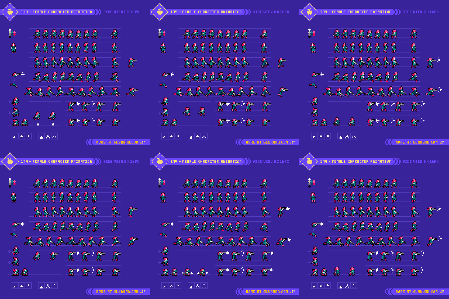
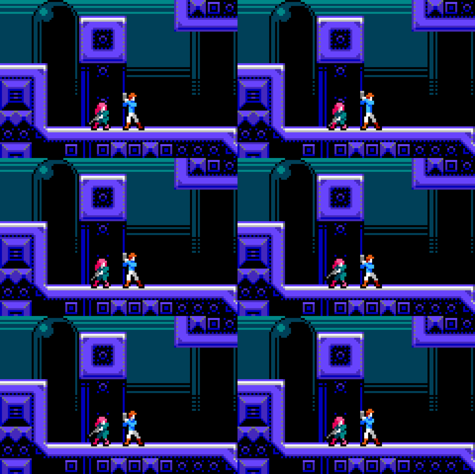
Welcome back to another edition of my ongoing human anatomy series. In the pervious two entries (Pixelblogs 49, and 50), we covered basic male, female anatomy models, and walking animations. In this edition we take a detailed look at idle fighting stance animations. Calling them ‘idle’ animations makes it sound like there’s not much going on, however, a character’s idle loop is one of the most effective means of displaying personality, and bringing the sprite to life. Furthermore, minute changes from frame to frame amount to a surprisingly nuanced challenge. While small sprites can evoke expressive movement with few frames, larger sprites afford the pixels for smooth, hyper realistic motion, but require more frames to execute with satisfying results. In this lesson, I take my example sprites that encompass a size of 48x92px, and maximize fluidity of motion with a reasonably economic 8 frame idle loop.

While the main purpose of this series is to develop general proficiency with human anatomy, the underlying design perspective is driven by the concept of creating a 2D character action/beat em’ up game. Ultimately, I don’t know how far I’ll take this series, but it’s important to understand the foundation my design decisions come from, as we move more into the animation. Moreover, the goal is not rotoscoped realism, rather a stylized hyper realism within the context of action based gameplay.

Male Idle Fighting Stance

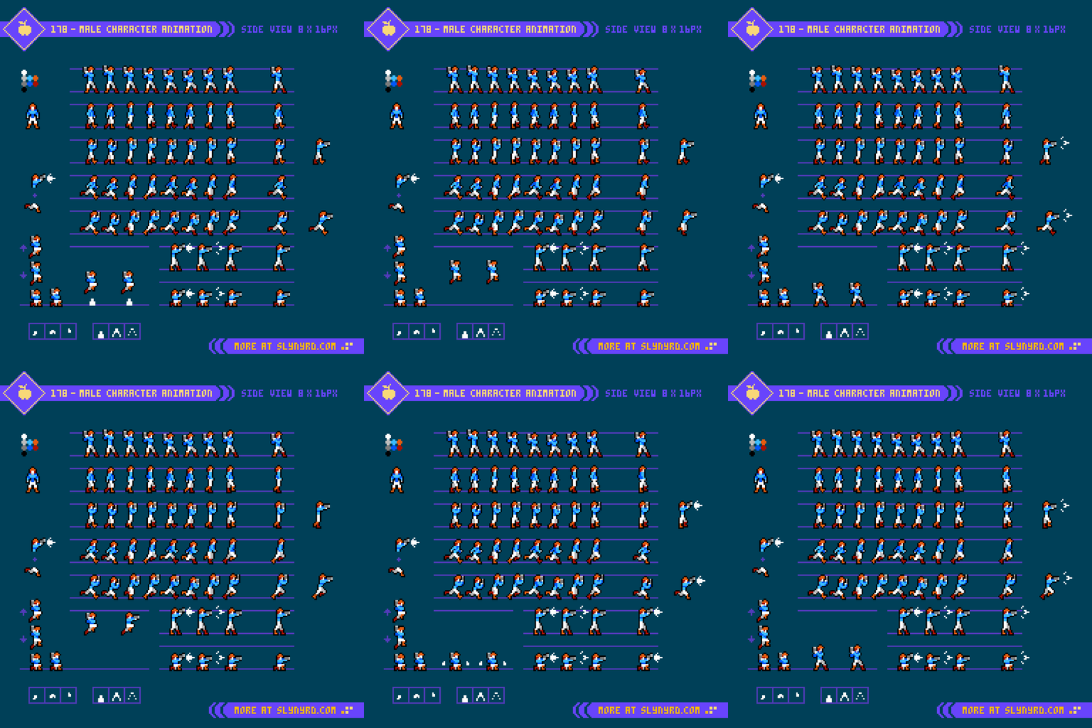
We start with the general pose of the color coded dummy based off the anatomy established in previous lessons. For the male character, I use a basic boxer’s stance to suit a character who will rely heavily on upper body strength with an arsenal of mostly punches. In this stance, the hands come up to protect the face while the neck scrunches down into the shoulders to further shield the vital head target. A soft bend in the knees keeps the fighter light on his feet, ready to quickly shift weight into a punch, or evade a strike.

Putting this pose in motion adds a gentle bounce to everything in a breath like up, down rhythm. Through the entire motion the initial pose is maintained while the force of gravity acts upon alert, yet relaxed pulsing muscles. Everything is anchored to the steady motion of the torso.

Frame 1 to 2: The Head and torso raise 1 pixel on account of the legs slightly straightening, which shifts the knees in 1 pixel. The shoulders, elbows, and outer fist raise by 2 pixels, while the inner fist raises by 4 pixels. Note the subtle shift in the forearm orientation, which is most apparent on the inner arm with the more pronounced fist movement.

Frame 2 to 3: The feet slightly bend raising the heels, which moves the entire body up 1 pixel, but nothing else changes in the pose. This is the greatest height the figure reaches through entire sequence.

Frame 3 to 4: The heels go back flat to the ground, dropping the torso, legs, and outer fist by 1 pixel, but the head stays at the same level. Shoulders, elbows, and the inner fist drop 2 pixels.

Frame 4 to 5: The knees bend, moving out 1 pixel, which moves the thighs, torso, head, shoulders, and elbows down by 1 pixel. The outer fist moves down 2 pixels, and the inner fist moves down 3 pixels. Note, the subtle change in the orientation of both forearms.

Frame 5 to 6: The knees continue to bend, moving out 1 more pixel, which moves the thighs, torso, head, shoulders, and elbows down by 1 pixel. Both fists move down by 2 pixels. Note, the subtle change to inner forearm orientation.

Frame 6 to 7: The bottom portion of the legs compress, dropping the knees, torso, head, shoulders, and elbows by 1 pixel. Both fists drop by 2 pixels. This is the lowest height the figures reaches through the entire sequence.

Frame 7 to 8: The bottom of the legs stretch back out, moving the entire body up 1 pixel, except the head remains at the same level.

Another detail to consider is the playback speed. Frames 1-4 play at 100 milliseconds/0.1 seconds, while frames 5-8 play faster at 50 milliseconds/0.05 seconds. This accentuates the force of gravity by speeding up the downward motion, and subtly slowing the motion at the max height of the bounce.

Adding clothes and design details to the dummy is more than just a color swap. While the suit is fairly form fitting, it hangs off the figure and slightly thickens the overall profile. You must consider the tension on the fabric imposed by the body position, and gravity in order to properly fit the clothing. Furthermore, the shoes thicken the feet, and raise the overall height by 1 pixel. The hair also slightly increases the overall height of the sprite.

When in motion, the fabric conforms to the figure, while making small sub movements in the wrinkles, and where it hangs loose. Additionally, the hair permits sub movements to further bring things to life. Capturing a natural feel to the flow of the fabric and hair definitely takes some trail and error. Part imagination, part reference study(mostly bouncing in front of a mirror), and a good dose of experimentation are required for satisfying results. I suggest starting with a form fitting design for the overall animation, then carefully work in the sub movements one area at a time.

Female Idle Fighting Stance

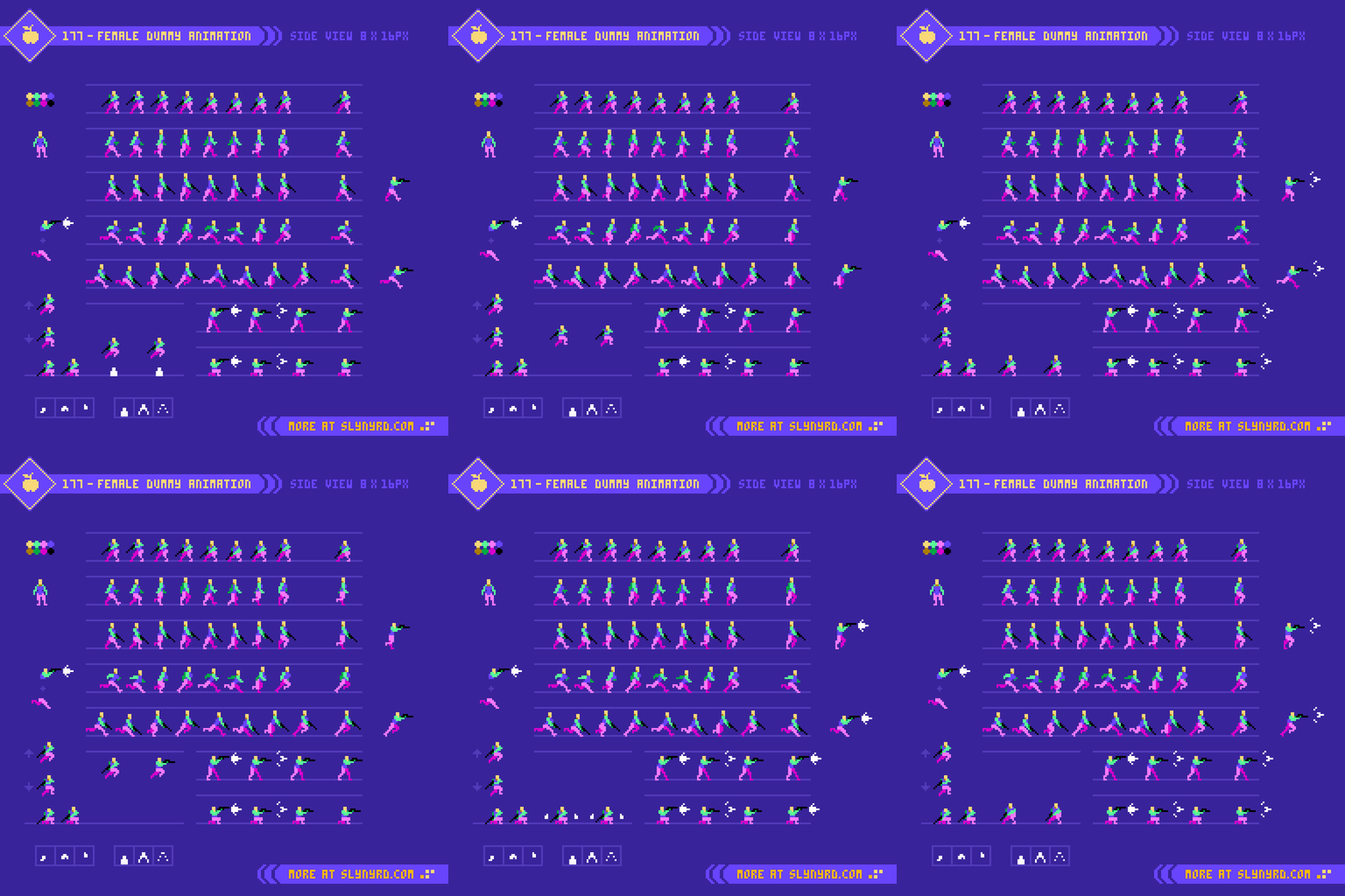
Moving on to the lady character, we take the same approach, starting with the pose of the dummy figure. For this character, I went with a karate stance to take advantage of the female’s lower center of gravity, and strong legs. From this posture she is poised to effectively strike with kicks, while defending attacks with clever spacing, and counter grapples.

The motion follows the same bouncing formula as the male, with subtle differences.

Frame 1 to 2: The outer knee shifts up and in 1 pixel, while the inner knee moves straight up one pixel. This moves the torso, breasts, and head up 1 pixel. Both arm units move up 2 pixels.

Frame 2 to 3: The feet bend, raising the heels off the ground, moving the entire body up 1 pixel.

Frame 3 to 4: The heels move back down flat on the ground. moving the torso and legs down 1 pixel. The head and breasts remain at the same level. The shoulders and elbows move down 2 pixels, but the hands only move down 1 pixel. Note the change in forearm orientation.

Frame 4 to 5: The outer knee moves out and down 1 pixel while the inner knee moves straight down 1 pixel. This moves the upper legs, torso, breasts, head, shoulders, and elbows down 1 pixel. The hands move down 2 pixels. Note the subtle shift of the forearms.

Frame 5 to 6: The outer knee moves out and down 1 more pixel. The inner knee moves down 1 pixel. Note, the compression movement in the legs. The lower legs, torso, head, shoulders, and elbows move down 1 pixel. The hands and breasts move down 2 pixels. Note the shift in orientation of the forearms.

Frames 6 to 7: A compression occurs in the lower legs moving the knees, legs, torso, head, shoulders, and elbows down 1 pixel. Note the subtle changes in the form of the legs. The hands and breasts move down 2 pixels. Note the shift in orientation of the forearms.

Frames 7 to 8: The lower legs decompress, moving the entire body up 1 pixel, except the head remains at the same level.

Same as the male, the frame timing plays at 100ms on frames 1 to 4, and 50ms on frames 5 to 8.

There is less fabric to go around on the female design, but there is a more dynamic contrast between the tight fit, and the loose portion at the bottom of the dress. Furthermore, there is obvious sub movement in the skirt area of the dress, and a subtle stretching of the outer shoulder strap, but everything else is skin tight. The high heels dramatically modify the feet shape and lift her height by 4 pixels. The hair jostles as she bounces to imply its relative lightness. Of course, jiggle physics are enabled.

Final Thoughts

I started this blog with the intention of including some simple melee animations as well. However, just breaking down the idle animation for for both models, along with the clothed designs, turned into a substantial amount of content. Moreover, it would be a waste to gloss over this crucial part of animated character design without a detailed explanation of the nuanced movement, as even a skilled visual learner may struggle to notice all the subtle changes between frames. I hope the information digests smoothly.

In the next edition, we’ll finally get to those melee animations. I’ve already started on multiple attacks for both characters. Stick with me, and do not fear the oncoming challenge. I’m on this journey with you, and we’ll be taking our time, so no one gets left behind.

Resources

Please consider supporting my work by becoming a Patron. Among many other rewards, Patrons can download the assets featured in my tutorials. But, most importantly, you allow me to continue making new content! 

Many of my popular assets are also available to purchase from my digital shop

Alternatively, you can support me by making a one-time donation 

Assets featured in this Pixelblog are available in Idle Fighting Stance Assets Pack

Source files used in the making of this Pixelblog are available in Idle FIghting Stance Resource Files

Get caught up on all my downloads

You made it to the end of the article. Thank you for reading! 

-By Raymond Schlitter
Pixelblog - 51 - City Builder by Raymond Schlitter

Intro

Made in the image of God, it’s in the nature of mankind to create, build, grow, and influence with the power of flesh, and the will of spirit. Within the digital realm, video games allow us to exercise these desires far beyond the limits of our earthly capacity. While all games contain some kind of god-like features, an entire genre emphasizes the overlord concept to such a degree, they’ve earned the moniker god-simulator. Among these games, I most enjoy the city builder type found in the early iterations of Sim-City. However, I never got deeply into the kind of games, for playing god is a stressful job. Nevertheless, I enjoy the creation aspect, and find great satisfaction witnessing a civilization flourish. You could describe much of my work as a practice in playing god, often featuring communal architecture from a top-down viewpoint. This has lead me to consider the compelling prospect of what a city builder game in my style might look like.

Top-Down Assets

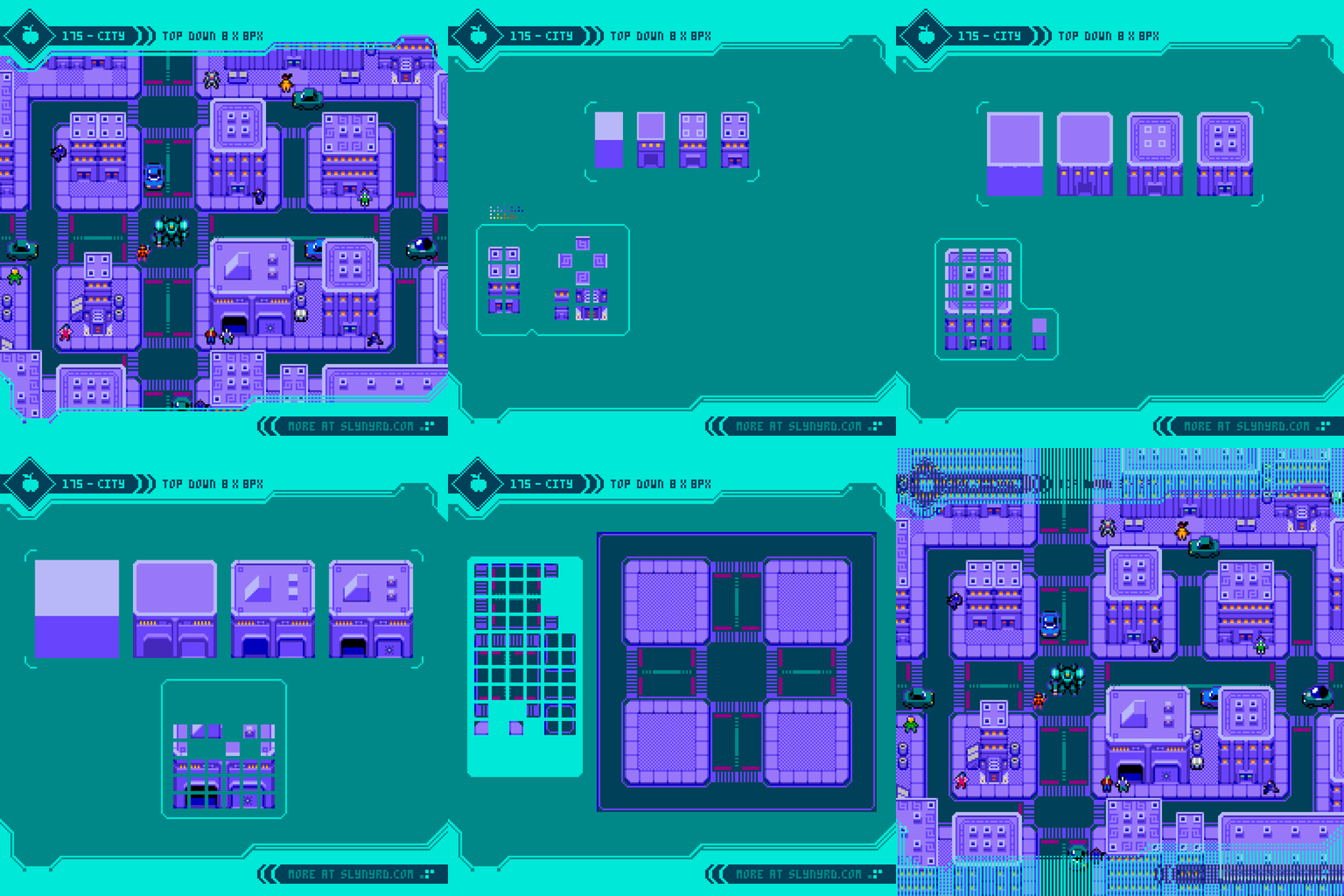
Having spent most my life in Kansas, I approach the concept in terms of the typical mid-west city of the United States. Country style homes with lawns, wide roads, and a relatively flat, grid layout are key characteristics of these suburban getaways. From top to bottom, I present a couple houses, school, office building, and a church. The designs are classic idealizations for the sake of recognition and visual charm. More or less, they are colorful simplifications of real life counterparts in my neck of the woods. In reality, most roofing materials are dull browns, and grays. The modern school building is commonly a single story, tan brick prison, literally constructed by the same contractors who build the other kind of prison for convicted criminals. Multi-story office buildings are rare but do exist. The church is the most inspiring architecture, and probably the most accurate design, modeled after one of the many great limestone structures that grace these plains.

Moving on, I present more essential elements of any town of substance. From top to bottom, we have a post office, restaurant, courthouse, police station, and fire station. Again, they are somewhat cutified versions of irl counterparts, which check key characteristics to be easily recognizable.

As for the technical execution, I determine the size based on 16x16px grid units, which offers compatibility on a tile map with terrain tiles. The foundation of the area the structure will encompass adheres to 16x16px tiles, however I permit the height of the structure to slightly go beyond this foundation a few pixels at the top of the asset along the y-axis. This creates subtle overlap of other elements for a nice touch of depth. Note, that I do not break the foundation along the bottom or sides of the asset, as this will create conflicts with layering order.

The natural sequence of creation for me starts with the roof and works down, first establishing the basic structure. I then apply details like windows and doorways. Next, I apply drop shadows under eaves, in recessed areas, and anywhere that feels appropriate based on the light source. Then I add outlining to make the whole thing pop. Rather than use straight black outlines, I prefer subtle outlines that use a slightly darker color than the adjacent pixels. Finally, I flesh out the surrounding property and cast drop shadows on it. The size of the surrounding area is determined from the start based on a 16x16px grid.

Terrain Tiles

Before the city, there was frontier. Another aspect of city builders I find interesting is the prospecting, and razing of the land. Furthermore, I want to include that element in my concept, and provide a proper background around the boundaries of the city. Additionally, roads are necessary infrastructure to connect the city, and provide meaningful structure to the layout. Remember, this is modeled after an American city. Passenger trains are super rare, and god forbid someone walk or cycle to their destination, no matter how close it might be. Also, car pooling is for wussies.

Just covering some basic terrain here, but I can envision many variations for more dynamic environments. For example, mountains and water features could provide interesting challenges to build around. Seasonal changes and weather patterns could alter the appearance of the background, and practicality of building.

Notice there are several features presented in the city that are not broken down in tutorial format. The main principles are redundant, so If you can successfully create all the assets in the first two tutorials, I figure you should be on your way to creating whatever your city needs. Anyway, the additional assets are included in the asset pack linked at the end of the article.

Final Thoughts

After the technical subject of animating human figures in the past couple Pixelblogs, I needed to take a breather with my comfort food, which is low res top-down subjects. Especially architecture is cozy for me. But it’s not all fun and games. I did my research, considering essential features, and utilizing the most appropriate references. As usual, I made everything in context of practical game design, so the assets and concepts can be used to springboard a tangible game dev project. I hope you find the content useful, and enjoy the trip to Pixeltown, USA.

Resources

Please consider supporting my work by becoming a Patron. Among many other rewards, Patrons can download the assets featured in my tutorials. But, most importantly, you allow me to continue making new content! 

Many of my popular assets are also available to purchase from my digital shop

Alternatively, you can support me by making a one-time donation 

Assets featured in this Pixelblog are available in City Builder Assets Pack

Source files used in the making of this Pixelblog are available in City Builder Source Files

Get caught up on all my downloads

You made it to the end of the article. Thank you for reading! 

-By Raymond Schlitter
Pixel Diary - Neomecity by Raymond Schlitter

Intro

Welcome to my first Pixel Diary. The goal here is to provide a deep dive into my thought process behind the art. In this entry, I dig into the art presented in Pixelcast 47. The fast action of the timelapse is enthralling, but when the dust settles, many are still left wondering how the sausage is actually made. Particularly, on a cognitive level. Well, I’ll attempt to answer that question, as I retrace my thoughts from over 13 hours of pixeling. An attention span is required. Any hardy souls coming with me?

Concept

I came up with a vague plan, but wanted to keep it pretty open to spontaneity along the way. The vision swirling in my head was a zoomed out, top down view of a civilization that appears ancient, yet advanced. So, as I often do, I made some ambiguous doodles that leave much to interpretation. The numbers off to the side are from tallying up the time of the recording sessions. In case there is an issue with the recording, I average 30 minute bursts, so I don’t lose large chunks of footage. Over 13 hours in all!

The key elements I wanted to hit upon was a tower as a focal point, the implication of giants with a head on the tower or other body parts elsewhere, and a grand scale with a sense of depth. Definitely I'm influenced by my recent studies of scripture and ancient civilization. Furthermore, I wanted to make something that would fit into the world I'm developing for Death Vapor, which is about a civilization enveloped in sin and perverse technology. You'll see later in the process that I even reuse some assets from the game.  

Process

First, you'll notice things look a little different than my previous time lapses. Since I recently ditched Adobe products, I'm now maining Aseprite for most of my pixeling needs. I'm using the minimal dark theme by Fe to replicate the feel of workspaces I'm more used to. I know some people adore the default pixel font UI, but something about it throws me off. The palette I'm using is Bright Future.

I start the process with a 256x256px canvas. I didn't have a definite plan for the composition, so I start with a mid-size square canvas, which I can easily edit the size and proportions of as the vision forms. Even if I plan to make a large piece, I like to start on a smaller canvas, so I can establish style elements without getting overwhelmed. Style elements entail the color palette, perspective, and detail level of cluster work. It's good to have a rough idea for the composition from the start, but I usually establish these style elements before I get too involved with the comp. It depends on what you are trying to accomplish, a clear vision for the composition is more critical in something using realistic perspective, and dynamic figures. 

Furthermore, you can see I establish several style elements with the creation of the first building, then I step it up with the tower. At 4:51, after I pretty well developed the tower, I start to visualize the overall composition and surrounding structures with basic line art. At this point, I was thinking to fill the entire scene with buildings on one ground level with the minimal warm color palette. While this would give a lot of city details to look at, I thought the composition would be uninteresting, and too many similar elements would detract from the grandness of the tower. So, from about 5:00 to 6:00 my idea was to fill the bottom corner of the canvas with city and surround it with water. This would give a splash of complementary colors, but it wouldn't achieve the depth I was hoping for. 

6:03: at this moment I had it. Instead of surrounding the city with water, I would make it floating in the sky, and put water elements inside the city. To accommodate the vision, I first expand the comp to a vertical orientation to allow a good view of the sky layers and distant ground beyond. Most importune part of blobbing out the cloud layers and making the sky gradient is the colors. This is where I go off from the indexed palette most, creating more subtle steps in the gradient and cloud layers to achieve desired depth and sense of atmosphere. Generally, the colors become more more blue and desaturated as they recede into the background, while closer layers brighter and shifting towards yellow.  

7:04: After introducing the 45 degree angles to the structures the projection appears oblique, or also referred to as military projection, which meshes with the straight on top down buildings, but not so much with isometric. Hence the revision of the bridge here.  

7:48: My next ah ha moment- The head on the tower is just too bald, let's put a magnificent tree growing from the head, and fill the city with lovely vegetation. I hadn't thought of this in the sketches, as I originally was going for an oppressive vibe with everythign drenched in red light. However, after I introduced the sky background, the mood shifted to something more mysterious and wonderful. The vegetation helps blend together the juxtaposition of the red city on the blue background. I also wanted to elevate the tower for the sake of the composition without having to add to the structure.

I did a bit of off camera work on the tree and vegetation concept to work out the colors. I figured all that color sampling would result in indiscernible noise when sped up for the timelapse. However, I still want to mention it, so you know there is a thought process, and a lot of experimentation going on with color selection. I don't just magically have the final refined palette from the get go. Note, there are several color changes made throughout the entire process. I also made a subtle modification post recording, changing the dark wine color on the building to a more desaturated purple. I think this helped smooth out the color ramp and meshes better with the ambience of the sky background. 

8:41: Small comp adjustment to allow more of the garden area to be shown, and put the tower off center for more interesting overall spacial balance. 

9:23: Second pass at cloud details. This time i add a shade and highlight color to each layer. Colors have slightly less contrast with each layer into the background. I refined the shape and clusters with more precision. Using the circle shaped pencil tool, the circle sizes get smaller with each layer into the background to imply spacial depth. 

10:50: The comps still felt a little off due to the lack of details on the left hand side of the city. I first toy with running a bridge off the canvas, but that felt dull and actually weakened the comp. I settled with a waterfall spilling into oblivion of the depths, and intricate openings and platforms across the side of the city. 

11:21: I then move into a final pass of refinements and details across the entire city. Gateways for the main paths, various pillars and monoliths to fill in empty spaces, more openings, roofing elements, and brick details. 

12:57: The ruined city background I created for Death Vapor is exactly what I wanted for the distant ground layer. So, I straight up imported some sections, changes the colors, and made some minor edits to hide repetition. Ta-da! 

13:03: Final pass on cloud layers, polishing clusters and adding anti-aliasing to soften edges. This is nitty gritty stuff I find hard to put into words. Light source, the implied shape and texture, and a fair degree of subjective style all dictate the nature of the clustering. Just keep watching and you will notice a pattern.   

16:10: A fleet of airships suddenly emerges from the clouds! I wanted to try the idea, but wasn't sure if I'd end up including them, and the recording was getting super long at this point, so I worked out the concept off camera. At least. I show the creation of one ship to give you the gist. They ended up being an important element that ties the whole composition together. 

Conclusion

240x320px
30 colors
13 hours
Aseprite

I love epic concepts like this, and I greatly enjoyed the challenge. Pretty much every piece I make, I have doubts somewhere in the middle of the process. This was no different, and I was especially uncertain about the composition right up to the end. I fiddled with the canvas size and position of the city off camera numerous times, but kept going back to what you see in the video. Through experience, I knew if I just stayed the course, things would eventually fall into place. Channeling a vision can be a wild ride, and sometimes I feel like I'm just along for the ride. I was enlightened by the depth of emotions that developed through the process. What started minimal in execution and breadth of expression, blossomed into something complex and ironic. There is a fearful element to the city and its potential denizens, yet it welcomes with its grandeur and gardens. The calming effect of viewing a sweeping natural vista from elevation is subtly undermined by ruined civilization below. Yeah, I've been in my own head for too long. Let me know you thoughts and observations. Still have questions? Let me know. Leave a comment here, or on Youtube.     

Thank you so much for going on this journey with me. If you are still reading you must be one of few. 

Support

I run a one man show, and content like this takes a great amount of time and effort. If you appreciate my work, please considering supporting me.
Patreon
Donate
Shop

Thank you!
-Raymond Schlitter

Pixelblog - 50 - Human Walk Cycle by Raymond Schlitter

intro

After a thorough study of human anatomy using an 8 head model in Pixelblog 49, it’s time to walk the walk. This is not my first rodeo when it comes to animating a walk cycle, but these sprites are significantly larger than my typical work. While the size affords more details, labor increases exponentially as pixel art is scaled up. Size, details, and frame count must be carefully considered in terms of time cost when designing animated characters. This is especially true for game design, where it’s difficult to plan exactly how many unique actions, and subsequent frames are needed to effectively display the action in balance with the gameplay. Cosmetic details that may seem like a cool idea in a single static image can quickly become a pain when animating and expanding on mechanics. Moreover, while my characters are relatively large from what I am used to, I’ve remained conservative with details and overall frame count. Delibrately on the generic side, I present male and female side-view walking models that can be expanded on, and applied to a wide array of projects.

use References

My goal with this animation is to create a fairly realistic casual walk cycle with minimal cartoon embellishments. Therefore, I use real life video references to guide the sequence. If I had a treadmill I might go as far to record my own references. Anyhow, I was able to screen record a few sample references off the web, which I then edited in Photoshop in order to reduce it down to an 8 frame loop.

First, I open the raw video recording in Photoshop, and isolate a section in the timeline to capture a single walk cycle that loops. Then I export that section as a gif.

Next, I open that reference gif, and hand pick the best frames to meet my target of 8 frames. I feel 8 frames strikes a solid balance between economy and fluidity, but of course, you could extract more frames if your ambition is to create hyper smooth motion. In most pixel art game applications, I think anything beyond 8 frames is an aesthetic choice, and not necessary to function, or critical discernment in the eye of the audience.

The raw sliced section at 60fps results in 72 frames. Several frames are identical at such a high frame rate. Nope, not going to need all that.

After reducing to 8 key frames and adjusting the playback duration to maintain a natural speed, the final reference looks like this. The slumped posture and limited gate to the arm swing is not ideal to the character I had in mind, but still provides a good base. By comparing this with other references, and making my own embellishments, I can modify aspects to my own preferences.

Dummy template

To animate most efficiently, I always start my character drawing process with a simple color coded dummy to clearly define all the core parts of the whole. In this case of a full proportioned human, the breakdown includes head, neck, torso, arms, and legs. Of course, you can further granulize, but I feel that greater distinction at this scale begins to impede on the efficiency of animating.

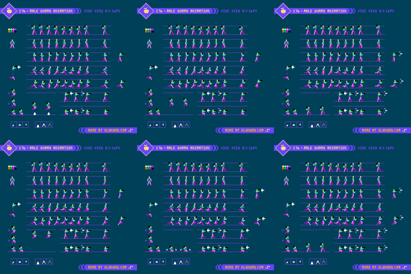
Since I’ve already established the process of defining the form and proportions from the side-view in the previous Pixelblog, I jump right into the animation frames. 8 frames achieves the optimum fluid animation, while the 4 frame version highlights the most important key frames to capturing the essence of the motion, but feels somewhat lacking on it’s own. The 6 frame version strikes a nice middle ground by removing the least compromising frames for more economy, while remaining sufficiently fluid enough to stand on its own.

Observe the frames from left to right,
1. The first frame can be described as the contact point, where the left heel meets the ground, arms and legs are at the extremities of their swing, and the overall height of the figure is at its lowest point.
2. The second frame is the down point, as the left foot comes flat down to the ground and begins to shift back towards center, as the right foot lifts off the ground and begins to swing forward.
3. The third frame is the pass point, where the legs cross one another in the center, and is the point where the figure is tallest.
4. The fourth frame is the swing point, where the right leg makes it most dramatic movement forward, but remains off the ground.

The next four frames are more or less a mirror of the first four frames, with minor adjustment to account for implied perspective. Note, how the swing of the arms relates with the gate of the legs. The movements of appendages on opposite sides of the body track along with shared momentum.

Another important detail is the overall bobbing motion of the figure. Notice the position of the head across the sequence, which create a triangle shaped wave. This produces an appealing sense of energy that feels organic. On the other hand, If the head position across the sequence creates a perfect sine wave, the uniform motion feels a bit unnatural.

All the same principles apply to the female version, but take note of subtle nuances. The bone structure and curvature of the female figure lends itself to more graceful movement arcs. Of course, this is a generality, and every person, no matter the sex, has unique characteristics to his or her manner of locomotion. The most notable difference in my models can be seen in the arm swing. The female takes a fuller swing that moves all the way back past the hips, while the male’s arms have a relatively tighter course of motion. This gives the man an intentionally more stiff, business like character, and the woman is attributed with peppy elegance. Moving the breast down one pixel on the contact frame makes all the difference.

Clothed design

Time to put some clothes on these dummies.

A well fitted suit adds a slight bulk to the base figure. The most challenging detail is the dynamics of the folding lines in the fabric. Folding lines are determined by the implied tension caused by the body pose, and gravity. Make sure these lines have consistent tension anchor points and direction throughout all frames. Save the trouble, and keep the details of folding lines minimal.

Minimal, formfitting attire presents far less difficulty when animating. However, the high heels account for an altered foot shape, and slightly modified stride. Also, the asymmetrical dress with a slit over the left leg must be considered. Simply reflecting the sprite from right to left would be inaccurate. Technically, the breast pocket on the male is also asymmetrical, but far less noticeable.

Final Thoughts

Strolling, ambling, tip-toeing, shuffling, waddling, striding; considering all the numerous ways which we can describe the manner of human locomotion, one could study the subject endlessly. I’m thrilled to add a couple more walk sequences to the portfolio, but I think I would like to move on to some different actions if I continue to expand on this series. As I stated in the last Pixelblog, my goal is to create assets that could be utilized for a beat em’ up concept. That means punching, kicking, and jumping could be on the table. I might need a detour into another subject before I expand this series, but it kind of depends on the demand. Hit that like if you want to see more. Better yet, join my Patreon and download the assets for you own project.

RESOURCES

Please consider supporting my work by becoming a Patron. Among many other rewards, Patrons can download the assets featured in my tutorials. But, most importantly, you allow me to continue making new content! 

Many of my popular assets are also available to purchase from my digital shop

Alternatively, you can support me by making a one-time donation 

Assets featured in this Pixelblog are available in Human Walk Cycle Assets Pack

Source files used in the making of this Pixelblog are available in Human Walk Cycle Source Files

Get caught up on all my downloads

You made it to the end of the article. Thank you for reading! 

-By Raymond Schlitter
Pixelblog - 49 - Realistic Human Anatomy by Raymond Schlitter

intro

The ability to accurately depict humans is a high effort, high value skill. Although we all inhabit a body, and are capable of instantly recognizing people from the most subtle features, accurately conjuring our likeness on a canvas does not come easy. Even amongst skilled artists, very few can naturally depict the human form without extensive practice, and use of references. At least that’s what I tell myself, as someone who perpetually struggles in the department. I find the main issue is consistency. No matter how strong of a foundation I build, it instantly begins to rust and crumble if I don’t keep regular practice. Well, I’m overdue for a polishing again, and the catalogue could definitely use more content on the topic. If you are new to anatomy, you can stay right here, as we are going to build our way up from basic proportions, before attempting a more expressive pose. Class starts now!

Front View

First, we start with an analysis of human proportions from a frontal view. Going for realism, I’m using the conventional 8 head model, which is based on the average size of adult human bodies. Note, that both male and female use the same 8 head model, however, the head unit is just slightly smaller for the female version, resulting in an overall slightly shorter figure.

Back in Pixelblog 17, I introduced the 6 head model, which results in relatively stocky, doll-like proportions. Although not completely realistic, this shortened model works well to capture all pertinent details within a small sprite.

In order to depict all the basic details of the human form within the 8 head model, the sprites need to be fairly large. My 8 head male is 29x96px, vs 29x78px for the 6 head model. In both examples, sizing down much at all would require more abstraction, and omission of facial features. I suppose that’s why you rarely see realistically proportioned characters in 8-bit games, as devs more often opted for expressive chibi style characters that are all eyes and head, with itty bitty legs. Moreover, the super deformed characters also economize animation. However, smaller is not always easier. With few pixels to work with, a keen sense of abstraction is needed to capture the essence of a thing with clarity. On the other hand, a large canvas permits more details, but requires more labor to flesh out. I lean towards the smaller, abstract side of things, as that’s where the magic of pixel art occurs.

Side View

I find the side view a bit easier than the front, as there is only one arm and leg to deal with. In both versions, I start with the head and work my way down the chart with the aid of references. Of course, I use many references with much of my art, especially anatomy. Sometimes I start with a simple skeletal wireframe to capture the overall form and gesture of the figure, which you can see in practice in Pixelblog 17. However, after developing more competence with the subject I feel comfortable jumping right into solid forms at this scale. If the sprites where any larger, I think I might want to wireframe first.

Before developing details, the goal is to perfect the proportions with a sort of crash test dummy that has color coded body parts. Take it one segment at a time, one body part at time, while making many checks in relation to other body parts. Visualize imaginary lines running through the various parts, and you will notice many consistent spacial relationships. For example, elbows and belly button meeting on same level, wrists meet with the groin.

Once the dummy is complete, you can have fun playing with fashion and hairstyles, while converting the dummy to consistent flesh tones. I stuck with fairly tight, form fitting outfits to not overshadow the fundamental anatomy. Also, loose fitting fabrics, and folding dynamics present a whole new lesson for another blog. For now, you can begin to glean the tendencies of the fabric by observing and attempting to recreate these characters.

Action Pose

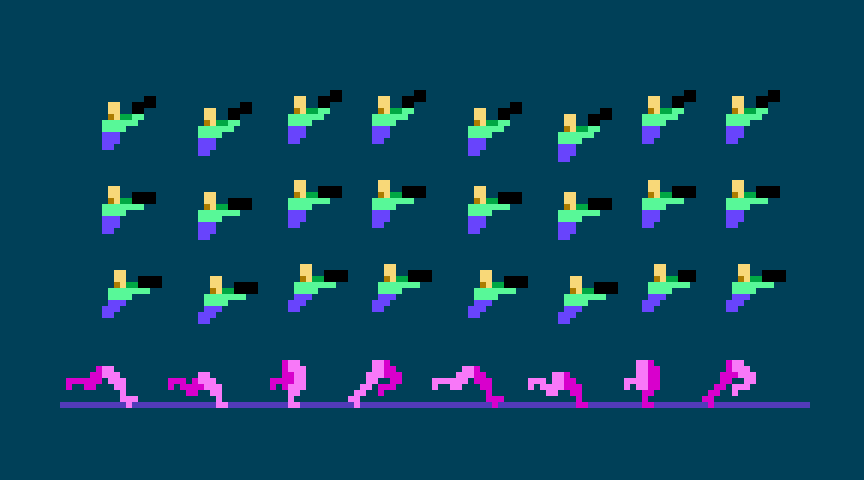
Now that we have our 8 head model established from multiple viewpoints, it’s time try out a more expressive pose. Easier said than done. One must consider how perspective, posture, and clothing items can distort proportions. Even with the long build up of establishing proportions, I feel blind without tons of references. Use references! No shame in straight up copying until you develop a more natural sense for things. It’s a staple of my blog to provide valuable pixel art specific references. I’m dazzled to see people grasp the fundamentals of my tutorials while creating a unique interpretation, however, much can be gained from 1 to 1 recreation.

Final Thoughts

This was a good exercise to reestablish anatomy skills with a realistic model, but I have much more ambitious goals. Truth is, I wanted to create tutorials that would be helpful for creating assets for a beat em’ up, but I found it overwhelming to jump right into animating large realistic sprites without laying some ground work first. So, now that we’ve established a good feel for the 8 head model, and have some basic characters designs, I think we’re prime to start tackling animations in a follow up feature. Eventually, we’ll have all the elements of a full blown beat em’ up on our hands. Better stay loose, and keep up the practice, or the rust will set in again.

RESOURCES

Please consider supporting my work by becoming a Patron

Many of my popular assets are available to purchase from my digital shop

Alternatively, you can support me by making a one-time donation 

Assets featured in this Pixelblog are available in Realistic Human Anatomy Assets Pack

Source files used in the making of this Pixelblog are available in Realistic Anatomy Source Files

Get caught up on all my downloads

You made it to the end of the article. Thank you for reading! 

-By Raymond Schlitter
Pixelblog - 48 - Military Shmup by Raymond Schlitter

Intro

Throughout all of history, man has inevitably engaged in war, over and over again. With little signs the plot will ever change, we find ways to cope with our intrinsic darkness. One silver lining I can find is the inventiveness bore from conflict. While evil in purpose, the drive of battle has resulted in many technological marvels. Like most boys, I found great appeal in machines of warfare. Guns, tanks, jets, and the glory of victory, how could I resist? As an adult, I acknowledge the grim reality behind the tools of war, but I can still admire the ingenuity and design aspects involved. Thankfully, through the magic of video games, we can celebrate weapons of war guilt free. Furthermore, war themed games are disturbingly popular, and come in many genres. When it comes to the aesthetics and logistics of pixel art, my mind goes to the shmup as a natural fit to showcase implements of war in exciting action. However, the following top down assets could just as easily find a home in a strategy, or role playing game. So, strap in for an epic campaign that will provide a plethora of top down military sprites, and a detailed desert city environment.

Fighter Jets

I have fond memories rolling around in the mud and pretending to fight Soviets with plastic guns. It was the cold war era after all. While I would eventually grow out of my days of pretend combat, my interest in the paraphernalia that surrounds it would endure. Particularly, military aircraft and their role in the evolution of aviation perpetually fascinates me. From the fabric covered bi-planes of the early 20th century, to the faster than sound jets of modern day, I find it hard to pick a favorite era.

Ultimately, I decided to focus on 4th gen fighter jets. Popularized through film and video games, this era includes some of the most famous designs. Personally, my love for these birds has mostly been fostered from playing the Ace Combat series over the years. However, we aren’t making a 3D flight sim here.

Sticking with low res, the largest sprite is only 25x36px The angular shapes and sleek lines translate nicely into pixel art with little compromise in accuracy with the irl counterparts. I also considered proportions, and the relative sizes of the sprites are informed by actual specs. All sprites only use 6 to 7 colors. The Thrust animation is only 2 frames playing at 0.05 seconds per frame. The drop shadows are made by copying the sprite, reducing scale by 50% and making it solid color. Surprisingly, even at this reduced size each ship has a distinguished silhouette.

In terms of shmup design, these jets are intended to be the player character and are oriented upwards for the vertical scrolling gameplay. You could flip them so they are pointing downward and use them as enemy units, however, the subtly skewed 3/4 top down projection will look odd when reflected. Modify as needed. Which bird you taking up?

Tanks and Helicopters

Choose your death box.

Formidable in their own right, but mere cannon fodder in the face of a fighter jet, these tanks and choppers are intended to be enemy sprites coming down the screen. Again, you could reflect them to point upward, but they will need to be modified to look right.

The largest helicopter sprite is 29x31px including blades. Each sprite only contains 5 to 6 colors. The blade animation contains 4 frames playing at 0.05 seconds per frame. After making the first blade, duplicate, and rotate in 22.5 degree increments for rough versions of the next 3 frames, then polish. Alternatively, you could make the base frame’s contour a perfect symmetrical circle, and rotate duplicates before squishing y plane down a bit on all frames to suit the 3/4 projection. This economic, yet lively motion allows choppers to fly around in all directions with convincing grace.

If I were making a game, I would take the tanks a step further and make the turret a separate layer with at least 8 directions to swivel. Also, it seems a trope to be able to blow off the turret first, before destroying the disabled tank husk.

Desert City

Top down sand dunes make a pleasing texture, and the vastness of the desert captures an appropriately epic stage for the action.

I’ve constructed a desert city environment using 16x16px tiles and only 13 colors. By layering the building tiles, countless formations of vary height and density can be made, Note, the dark bars on the bottom left are drop shadows to place around the buildings. I was able to construct the example environment with only 3 layers.
1. Buildings_2
2. Buildings_1
3. Sand

If you are new to tiles, start here Pixelblog 20

Final Thoughts

We’ve got ourselves a handful of sprites and a basic environment. It’s a good start to many game ideas, but if I were to make the shmup in my head there’s so much to expand on. I already mentioned how I would like to make the tank turrets swivel. The tanks could also have different directions so they can turn and move in all directions. Another essential component is adding roll animation to the jets so they actually tilt when you move left and right across the screen. And we haven’t even got to projectiles and explosion effects. With that said, we may have to pull for a sequel. In the meantime, please check out Pixelblog 31-32 for more on shmup design, and universal assets that could easily be adapted into the military theme.

RESOURCES

Please consider supporting my work by becoming a Patron. Among many other rewards, Patrons can access resources to compliment my tutorials. But most importantly, you allow me to continue making new content! 

Alternatively, you can support me by making a one-time donation 

Assets featured in this Pixelblog are available in Military Shmup Assets Pack

Source files used in the making of this Pixelblog are available in Military Shmup Source Files

Get caught up on all my downloads

You made it to the end of the article. Thank you for reading! 

-By Raymond Schlitter
Pixelblog - 47 - Tiny Pixels by Raymond Schlitter
Intro

In the beginning, pixel art was a practical choice necessitated by technical limitations. Color count, sprite size, animation frames, and layers were all severely limited, if possible at all. Thus, the aesthetic would be defined by economic characteristics. Nowadays, with relatively unlimited computing power, how could it be that pixel art not only lives on, but thrives? Part of the appeal stems from the economy of production, however, I would argue the limitations create design barriers that can require arduous solutions to overcome. In other words, pixel art is not the easy choice. Therefore, it mostly boils down to an aesthetic choice. Sure, nostalgia plays a role for some, but the perpetual love for pixel art has more to do with its intrinsic properties as a visual medium. At its heart, and what I’ve made core to my philosophy on the medium is- the beauty of pixel art comes from the lack of information. The missing details forces the audience to engage their imagination to fill in the gaps, making the experience more personal, and authentic. It’s the same reason why the movie never lives up to the book. Without engagement, it’s just pixels on a screen, or words on a page, but when the human imagination lights up, perfection!

As one becomes more proficient in pixel art, the tendency is to do too much for the viewer, ever pushing for greater details. Continuous improvement through increasing challenge is vital to any artist’s journey, however, to preserve the interactive magic of pixel art, one must strike a balance between necessary information and implied details. As the level of resolution and detail increases, the agency of the audience decreases. At a certain point, it becomes digital illustration when the pixels become irrelevant, and we are all unmistakably seeing the same image. While I greatly admire digital illustration, it seems a waste to achieve it through a pixel art process. The struggle to keep pixel art looking like pixel art is real.

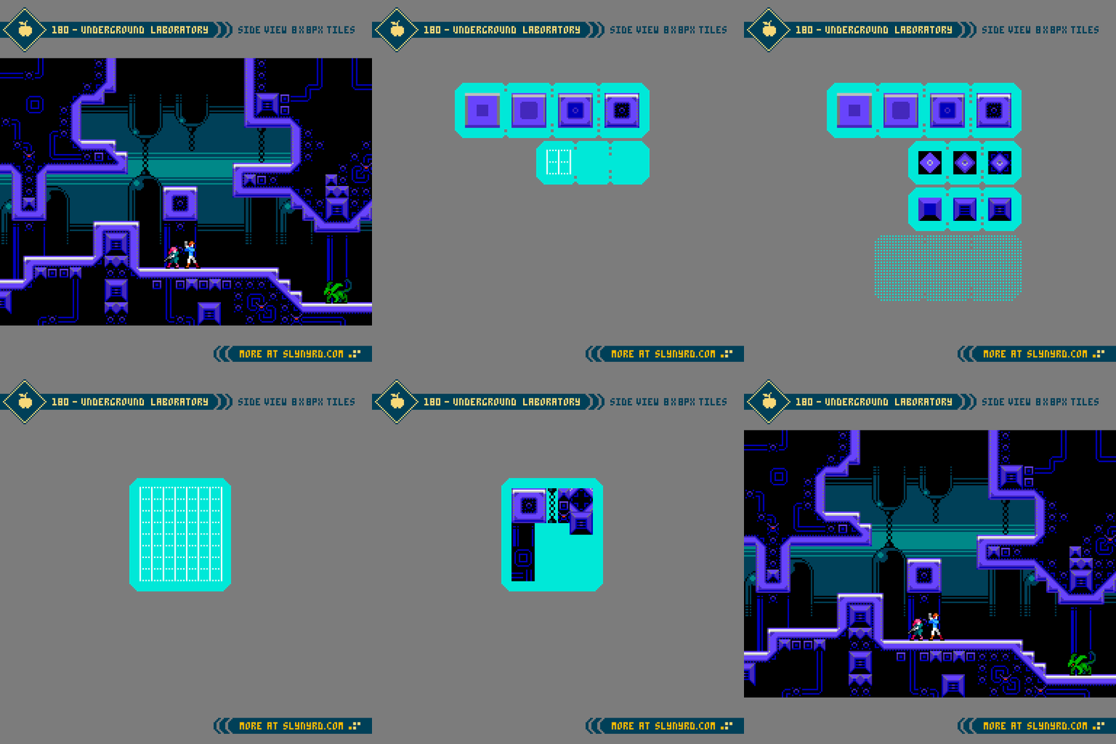
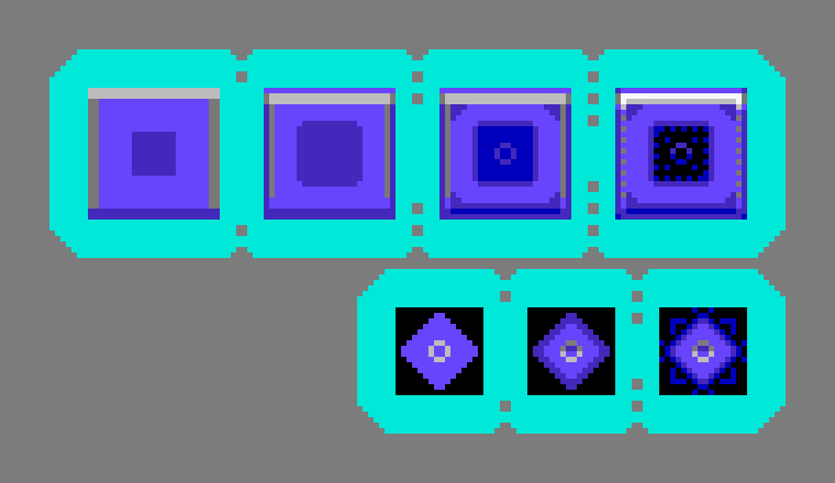
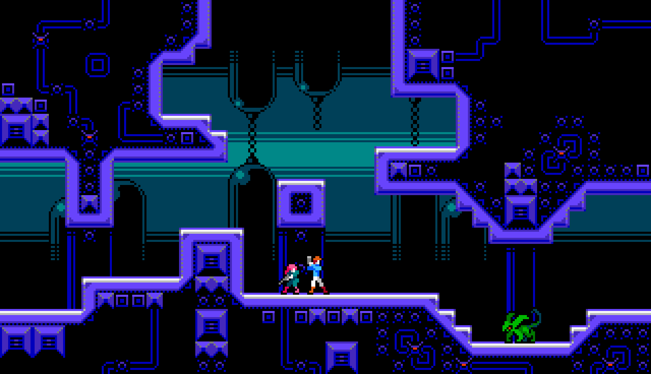
Once in a while, we all need to get back to basics to restore clarity. To stay true to the medium, I’ve cranked down the res for a fun romp in the blocks. Based on an 8x8px tile map, I present a variety of tiny assets that welcome beginners, and remind the pros the joys of simplicity.

Environment

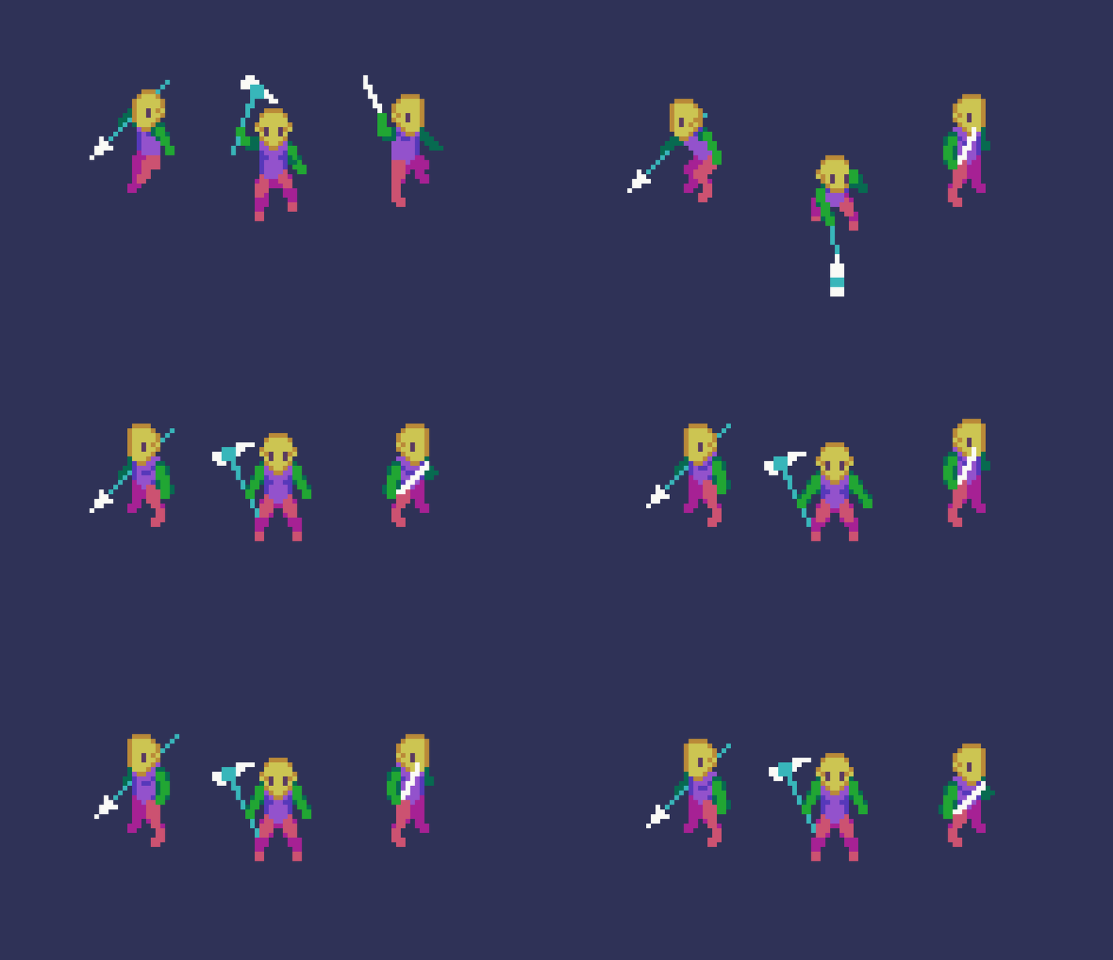
From here on out, the learning comes through visual exploration, and going through the motions presented in the tutorials. For the last several Pixelblogs I’ve designed my tutorials with minimal text baked in the design. Firstly, the pixel font does not read well in text blocks, but most importantly, I want them to be universal by showing without telling. While here in the blog I supplement the gab to provide greater clarity and insight.

All of my previous tile design content is made with 16x16px tiles. 8x8px tiles always seemed too small for the vision I had in mind, but I never gave it a fair shot. Upon this exercise, I’m surprised at how much can be conveyed in such a small space. I can pretty much translate my 16x16px designs with little compromise. Of course, everything becomes quite chonky, especially if made into a full widescreen mock-up. If I were to create a game in this style I would probably go with a classic 4:3 ratio windowed play area, and build a creative UI around the margins. Perhaps a mock-up is due for a future update.

Similar to some of my previous tile concepts, I’ve implemented a layered approach where drop shadows are applied separately, and several tiles can be combined for variation. In some instances I bake the shadow into the asset where the space within the tile permits. The following is the layer order in the above example.

7. Cliffs 2
6. Shadows 2
5. Cliffs 1
4. Trees & Rocks
3. Shadows 1
2. Grass
1. Dirt

Hero

Again, with character sprites, smaller doesn’t necessarily mean less. While many details must be compromised in contrast to my typical 16x32px sprites, everything is there for basic readability. What’s more, the sense of wonder is peaked by the lack detail. It’s clearly a human figure with shoulder pads and flaming red hair, but who this character really is comes from your imagination. In this sense, I find it more novel and compelling than a hyper realistic 3D model rendered in the most advanced game engine.

Much of the expression comes through in the animation. Furthermore, The efficiency of production permits for greater exploration with relatively little effort. Although it’s easy to make many animation frames, the main drawback is there just isn’t many pixels to show the movement. With the minimum of one pixel of movement per frame, just a few frames encompasses a full stride. Fortunately, it’s all you really need. Shift one or two pixels and boom, a turn of the head, or change of posture.

Enemies

Now for the baddies. Not much to add here in regards to the tiny sprites. For larger characters, both the design and animation can be simplified by breaking it into pieces that can be layered and moved individually. Give it a try!

Final Thoughts

Have you ever felt unsatisfied with the outcome of an artwork, compared to the sketch? Whenever I experience this, it’s usually the fault of overthinking, and overdoing the details. Somewhere, several hours ago I should have put on the brakes, but I just kept massaging the clusters until the magic of the unknown was no more. Whenever I start to veer off the less is more path, of which I believe makes pixel art so endearing, I actually look back at my earlier works to find inspiration. I think, wow, I had the formula figured out and I wasn’t even aware. In my opinion, much of the best art comes from a place of naivety, which intrinsically carries authenticity with it. So how can we maintain that authenticity as our skill grows? Well, it’s a struggle that often gets confounded with comparison. I harken back to the early days, and the simple creations made without any social pressure. To reset my current habits I reconnect to those times with self imposed limitations. For example, keep it tiny.

Resources

Please consider supporting my work by becoming a Patron. Among many other rewards, Patrons can access resources to compliment my tutorials. But most importantly, you allow me to continue making new content! 

Alternatively, you can support me by making a one-time donation

Assets featured in this Pixelblog are available in Tiny Pixel Assets Pack

Source files used in the making of this PIxelblog are available in Tiny Pixels Source Files

Get caught up on all my downloads

You made it to the end of the article. Thank you for reading! 

-By Raymond Schlitter