intro
The ability to accurately depict humans is a high effort, high value skill. Although we all inhabit a body, and are capable of instantly recognizing people from the most subtle features, accurately conjuring our likeness on a canvas does not come easy. Even amongst skilled artists, very few can naturally depict the human form without extensive practice, and use of references. At least that’s what I tell myself, as someone who perpetually struggles in the department. I find the main issue is consistency. No matter how strong of a foundation I build, it instantly begins to rust and crumble if I don’t keep regular practice. Well, I’m overdue for a polishing again, and the catalogue could definitely use more content on the topic. If you are new to anatomy, you can stay right here, as we are going to build our way up from basic proportions, before attempting a more expressive pose. Class starts now!
Front View
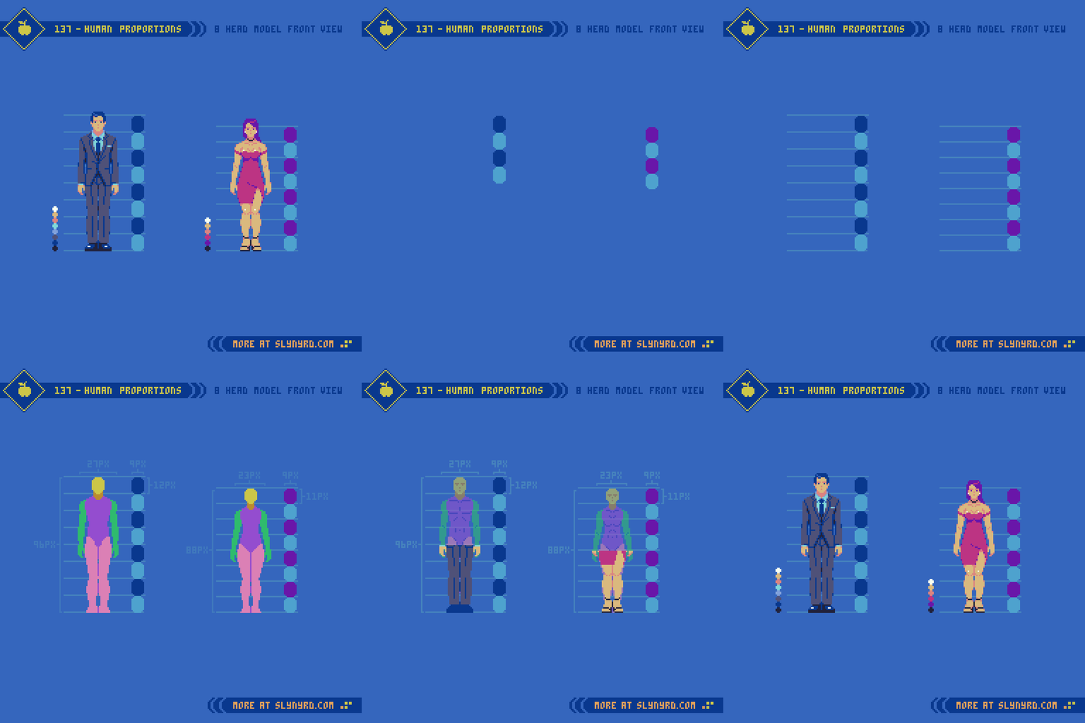
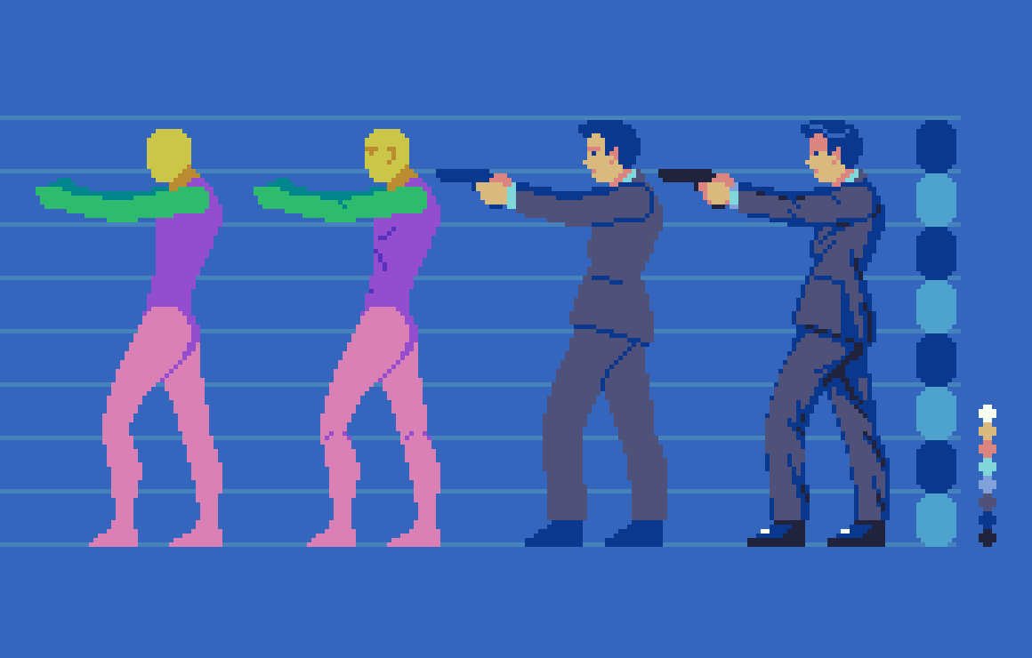
First, we start with an analysis of human proportions from a frontal view. Going for realism, I’m using the conventional 8 head model, which is based on the average size of adult human bodies. Note, that both male and female use the same 8 head model, however, the head unit is just slightly smaller for the female version, resulting in an overall slightly shorter figure.
Back in Pixelblog 17, I introduced the 6 head model, which results in relatively stocky, doll-like proportions. Although not completely realistic, this shortened model works well to capture all pertinent details within a small sprite.
In order to depict all the basic details of the human form within the 8 head model, the sprites need to be fairly large. My 8 head male is 29x96px, vs 29x78px for the 6 head model. In both examples, sizing down much at all would require more abstraction, and omission of facial features. I suppose that’s why you rarely see realistically proportioned characters in 8-bit games, as devs more often opted for expressive chibi style characters that are all eyes and head, with itty bitty legs. Moreover, the super deformed characters also economize animation. However, smaller is not always easier. With few pixels to work with, a keen sense of abstraction is needed to capture the essence of a thing with clarity. On the other hand, a large canvas permits more details, but requires more labor to flesh out. I lean towards the smaller, abstract side of things, as that’s where the magic of pixel art occurs.
Side View
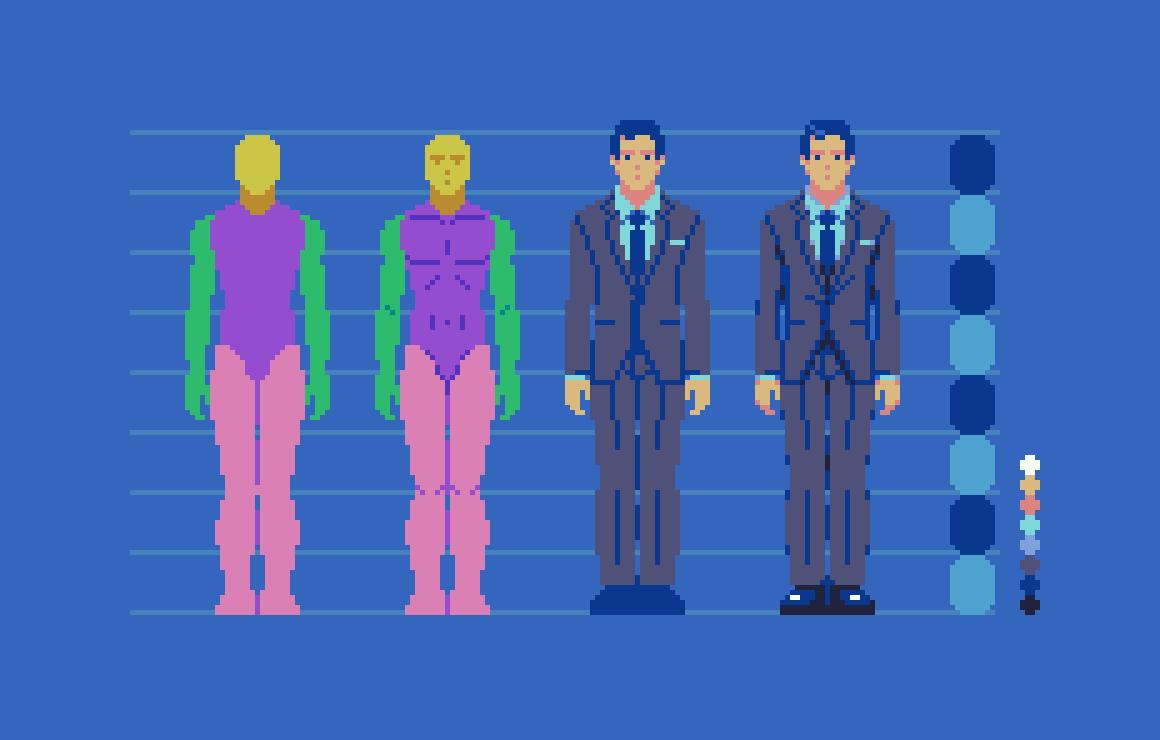
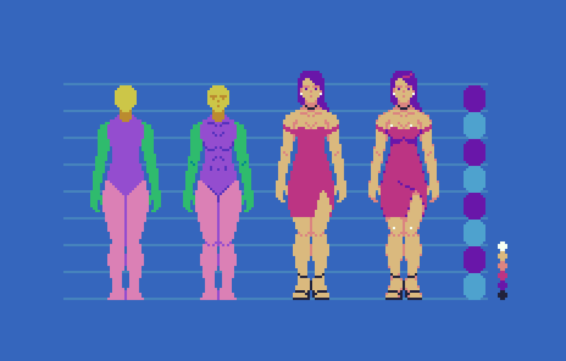
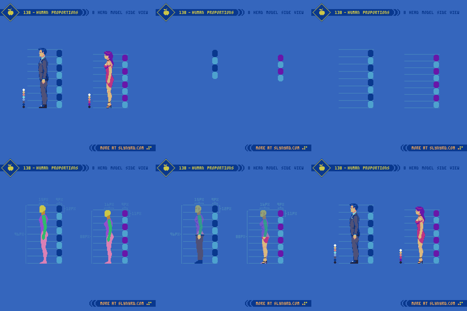
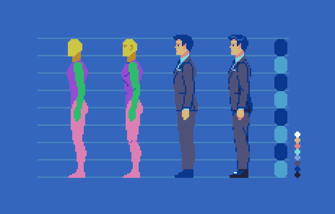
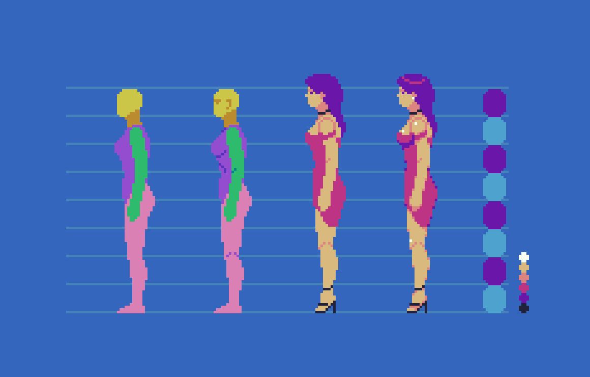
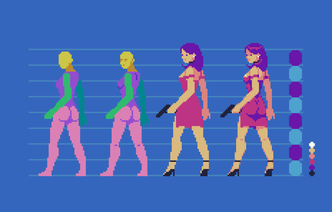
I find the side view a bit easier than the front, as there is only one arm and leg to deal with. In both versions, I start with the head and work my way down the chart with the aid of references. Of course, I use many references with much of my art, especially anatomy. Sometimes I start with a simple skeletal wireframe to capture the overall form and gesture of the figure, which you can see in practice in Pixelblog 17. However, after developing more competence with the subject I feel comfortable jumping right into solid forms at this scale. If the sprites where any larger, I think I might want to wireframe first.
Before developing details, the goal is to perfect the proportions with a sort of crash test dummy that has color coded body parts. Take it one segment at a time, one body part at time, while making many checks in relation to other body parts. Visualize imaginary lines running through the various parts, and you will notice many consistent spacial relationships. For example, elbows and belly button meeting on same level, wrists meet with the groin.
Once the dummy is complete, you can have fun playing with fashion and hairstyles, while converting the dummy to consistent flesh tones. I stuck with fairly tight, form fitting outfits to not overshadow the fundamental anatomy. Also, loose fitting fabrics, and folding dynamics present a whole new lesson for another blog. For now, you can begin to glean the tendencies of the fabric by observing and attempting to recreate these characters.
Action Pose
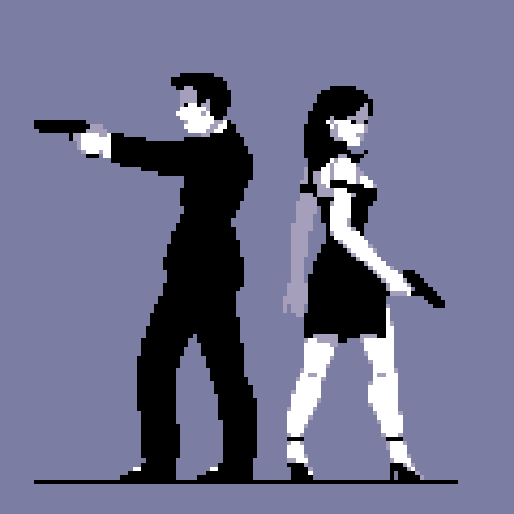
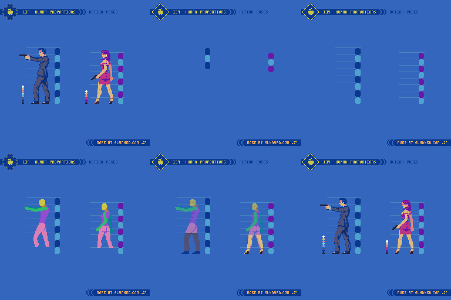
Now that we have our 8 head model established from multiple viewpoints, it’s time try out a more expressive pose. Easier said than done. One must consider how perspective, posture, and clothing items can distort proportions. Even with the long build up of establishing proportions, I feel blind without tons of references. Use references! No shame in straight up copying until you develop a more natural sense for things. It’s a staple of my blog to provide valuable pixel art specific references. I’m dazzled to see people grasp the fundamentals of my tutorials while creating a unique interpretation, however, much can be gained from 1 to 1 recreation.
Final Thoughts
This was a good exercise to reestablish anatomy skills with a realistic model, but I have much more ambitious goals. Truth is, I wanted to create tutorials that would be helpful for creating assets for a beat em’ up, but I found it overwhelming to jump right into animating large realistic sprites without laying some ground work first. So, now that we’ve established a good feel for the 8 head model, and have some basic characters designs, I think we’re prime to start tackling animations in a follow up feature. Eventually, we’ll have all the elements of a full blown beat em’ up on our hands. Better stay loose, and keep up the practice, or the rust will set in again.
RESOURCES
Please consider supporting my work by becoming a Patron
Many of my popular assets are available to purchase from my digital shop
Alternatively, you can support me by making a one-time donation
Assets featured in this Pixelblog are available in Realistic Human Anatomy Asset Pack
Source files used in the making of this Pixelblog are available in Realistic Anatomy Source Files
Get caught up on all my downloads
You made it to the end of the article. Thank you for reading!
-By Raymond Schlitter
