Intro
Throughout all of history, man has inevitably engaged in war, over and over again. With little signs the plot will ever change, we find ways to cope with our intrinsic darkness. One silver lining I can find is the inventiveness bore from conflict. While evil in purpose, the drive of battle has resulted in many technological marvels. Like most boys, I found great appeal in machines of warfare. Guns, tanks, jets, and the glory of victory, how could I resist? As an adult, I acknowledge the grim reality behind the tools of war, but I can still admire the ingenuity and design aspects involved. Thankfully, through the magic of video games, we can celebrate weapons of war guilt free. Furthermore, war themed games are disturbingly popular, and come in many genres. When it comes to the aesthetics and logistics of pixel art, my mind goes to the shmup as a natural fit to showcase implements of war in exciting action. However, the following top down assets could just as easily find a home in a strategy, or role playing game. So, strap in for an epic campaign that will provide a plethora of top down military sprites, and a detailed desert city environment.
Fighter Jets
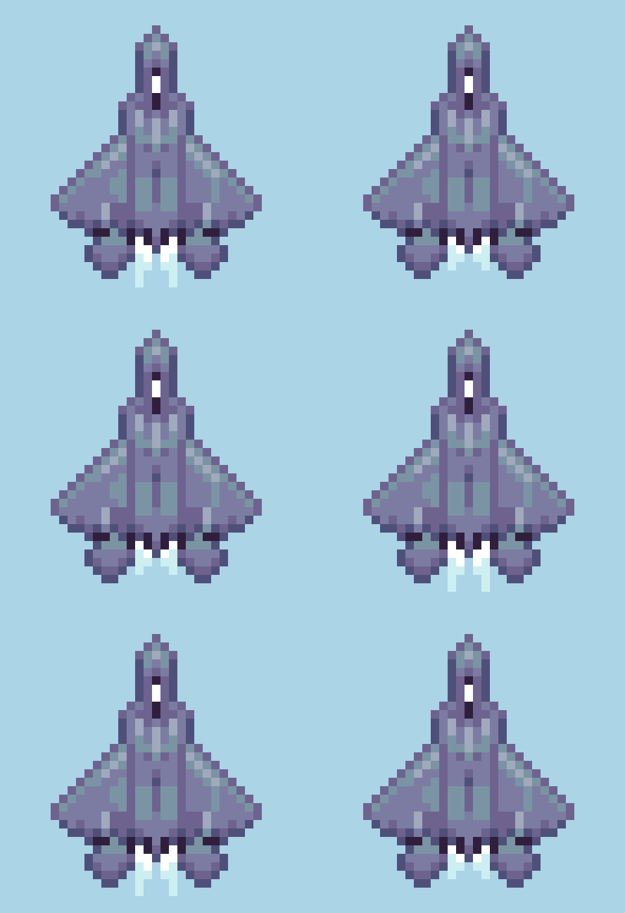
I have fond memories rolling around in the mud and pretending to fight Soviets with plastic guns. It was the cold war era after all. While I would eventually grow out of my days of pretend combat, my interest in the paraphernalia that surrounds it would endure. Particularly, military aircraft and their role in the evolution of aviation perpetually fascinates me. From the fabric covered bi-planes of the early 20th century, to the faster than sound jets of modern day, I find it hard to pick a favorite era.
Ultimately, I decided to focus on 4th gen fighter jets. Popularized through film and video games, this era includes some of the most famous designs. Personally, my love for these birds has mostly been fostered from playing the Ace Combat series over the years. However, we aren’t making a 3D flight sim here.
Sticking with low res, the largest sprite is only 25x36px The angular shapes and sleek lines translate nicely into pixel art with little compromise in accuracy with the irl counterparts. I also considered proportions, and the relative sizes of the sprites are informed by actual specs. All sprites only use 6 to 7 colors. The Thrust animation is only 2 frames playing at 0.05 seconds per frame. The drop shadows are made by copying the sprite, reducing scale by 50% and making it solid color. Surprisingly, even at this reduced size each ship has a distinguished silhouette.
In terms of shmup design, these jets are intended to be the player character and are oriented upwards for the vertical scrolling gameplay. You could flip them so they are pointing downward and use them as enemy units, however, the subtly skewed 3/4 top down projection will look odd when reflected. Modify as needed. Which bird you taking up?
Tanks and Helicopters
Choose your death box.
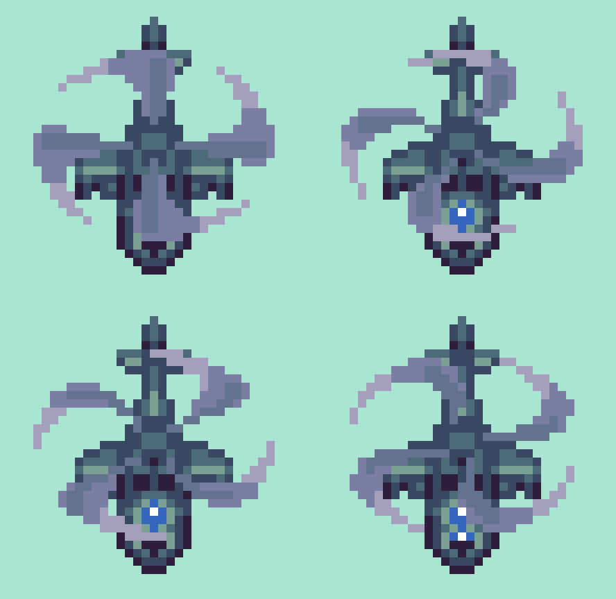
Formidable in their own right, but mere cannon fodder in the face of a fighter jet, these tanks and choppers are intended to be enemy sprites coming down the screen. Again, you could reflect them to point upward, but they will need to be modified to look right.
The largest helicopter sprite is 29x31px including blades. Each sprite only contains 5 to 6 colors. The blade animation contains 4 frames playing at 0.05 seconds per frame. After making the first blade, duplicate, and rotate in 22.5 degree increments for rough versions of the next 3 frames, then polish. Alternatively, you could make the base frame’s contour a perfect symmetrical circle, and rotate duplicates before squishing y plane down a bit on all frames to suit the 3/4 projection. This economic, yet lively motion allows choppers to fly around in all directions with convincing grace.
If I were making a game, I would take the tanks a step further and make the turret a separate layer with at least 8 directions to swivel. Also, it seems a trope to be able to blow off the turret first, before destroying the disabled tank husk.
Desert City
Top down sand dunes make a pleasing texture, and the vastness of the desert captures an appropriately epic stage for the action.
I’ve constructed a desert city environment using 16x16px tiles and only 13 colors. By layering the building tiles, countless formations of vary height and density can be made, Note, the dark bars on the bottom left are drop shadows to place around the buildings. I was able to construct the example environment with only 3 layers.
1. Buildings_2
2. Buildings_1
3. Sand
If you are new to tiles, start here Pixelblog 20
Final Thoughts
We’ve got ourselves a handful of sprites and a basic environment. It’s a good start to many game ideas, but if I were to make the shmup in my head there’s so much to expand on. I already mentioned how I would like to make the tank turrets swivel. The tanks could also have different directions so they can turn and move in all directions. Another essential component is adding roll animation to the jets so they actually tilt when you move left and right across the screen. And we haven’t even got to projectiles and explosion effects. With that said, we may have to pull for a sequel. In the meantime, please check out Pixelblog 31-32 for more on shmup design, and universal assets that could easily be adapted into the military theme.
RESOURCES
Please consider supporting my work by becoming a Patron. Among many other rewards, Patrons can access resources to compliment my tutorials. But most importantly, you allow me to continue making new content!
Alternatively, you can support me by making a one-time donation
Assets featured in this Pixelblog are available in Military Shmup Asset Pack
Source files used in the making of this Pixelblog are available in Military Shmup Source Files
Get caught up on all my downloads
You made it to the end of the article. Thank you for reading!
-By Raymond Schlitter


