intro
After a thorough study of human anatomy using an 8 head model in Pixelblog 49, it’s time to walk the walk. This is not my first rodeo when it comes to animating a walk cycle, but these sprites are significantly larger than my typical work. While the size affords more details, labor increases exponentially as pixel art is scaled up. Size, details, and frame count must be carefully considered in terms of time cost when designing animated characters. This is especially true for game design, where it’s difficult to plan exactly how many unique actions, and subsequent frames are needed to effectively display the action in balance with the gameplay. Cosmetic details that may seem like a cool idea in a single static image can quickly become a pain when animating and expanding on mechanics. Moreover, while my characters are relatively large from what I am used to, I’ve remained conservative with details and overall frame count. Delibrately on the generic side, I present male and female side-view walking models that can be expanded on, and applied to a wide array of projects.
use References
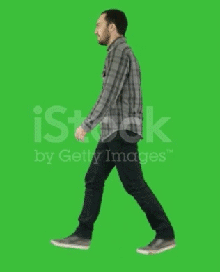
My goal with this animation is to create a fairly realistic casual walk cycle with minimal cartoon embellishments. Therefore, I use real life video references to guide the sequence. If I had a treadmill I might go as far to record my own references. Anyhow, I was able to screen record a few sample references off the web, which I then edited in Photoshop in order to reduce it down to an 8 frame loop.

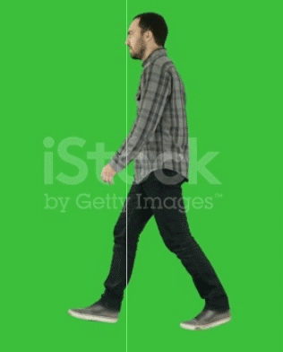
First, I open the raw video recording in Photoshop, and isolate a section in the timeline to capture a single walk cycle that loops. Then I export that section as a gif.
Next, I open that reference gif, and hand pick the best frames to meet my target of 8 frames. I feel 8 frames strikes a solid balance between economy and fluidity, but of course, you could extract more frames if your ambition is to create hyper smooth motion. In most pixel art game applications, I think anything beyond 8 frames is an aesthetic choice, and not necessary to function, or critical discernment in the eye of the audience.
The raw sliced section at 60fps results in 72 frames. Several frames are identical at such a high frame rate. Nope, not going to need all that.
After reducing to 8 key frames and adjusting the playback duration to maintain a natural speed, the final reference looks like this. The slumped posture and limited gate to the arm swing is not ideal to the character I had in mind, but still provides a good base. By comparing this with other references, and making my own embellishments, I can modify aspects to my own preferences.
Dummy template
To animate most efficiently, I always start my character drawing process with a simple color coded dummy to clearly define all the core parts of the whole. In this case of a full proportioned human, the breakdown includes head, neck, torso, arms, and legs. Of course, you can further granulize, but I feel that greater distinction at this scale begins to impede on the efficiency of animating.
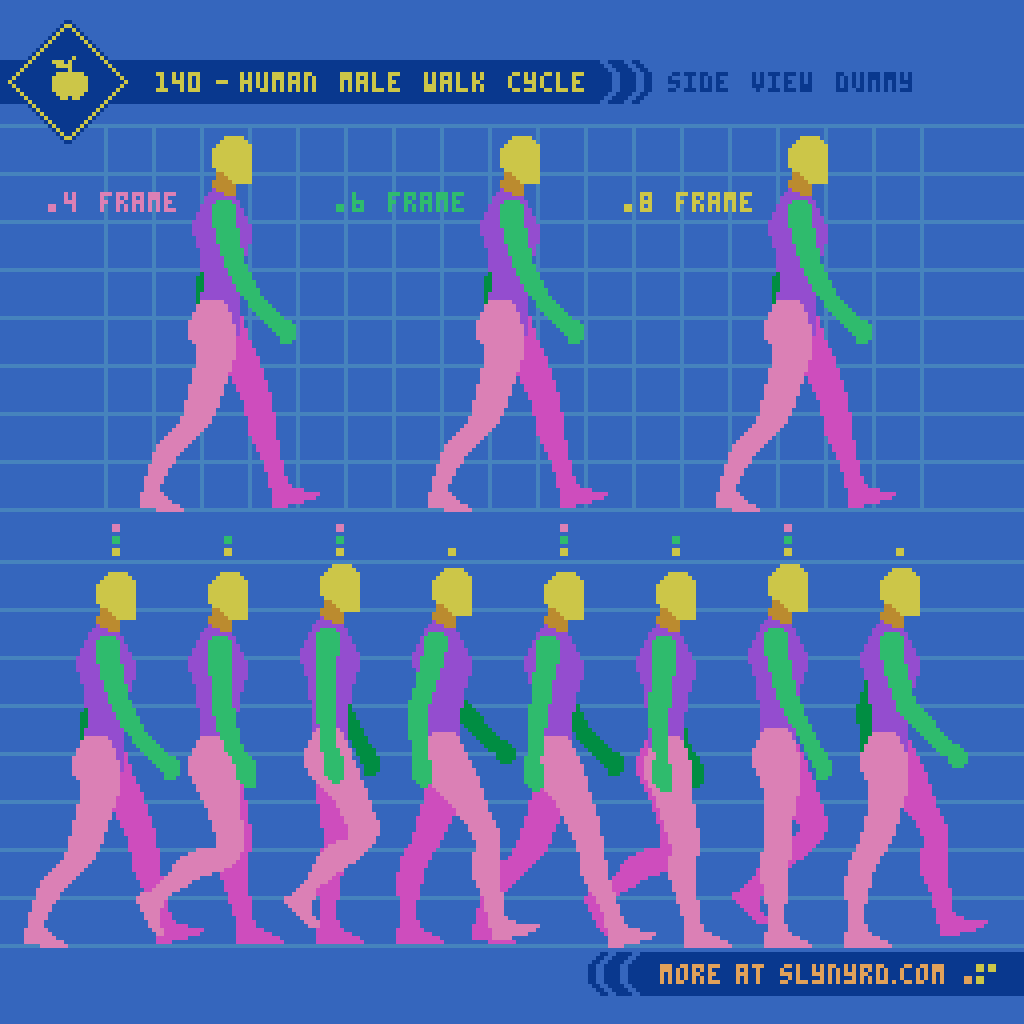
Since I’ve already established the process of defining the form and proportions from the side-view in the previous Pixelblog, I jump right into the animation frames. 8 frames achieves the optimum fluid animation, while the 4 frame version highlights the most important key frames to capturing the essence of the motion, but feels somewhat lacking on it’s own. The 6 frame version strikes a nice middle ground by removing the least compromising frames for more economy, while remaining sufficiently fluid enough to stand on its own.
Observe the frames from left to right,
1. The first frame can be described as the contact point, where the left heel meets the ground, arms and legs are at the extremities of their swing, and the overall height of the figure is at its lowest point.
2. The second frame is the down point, as the left foot comes flat down to the ground and begins to shift back towards center, as the right foot lifts off the ground and begins to swing forward.
3. The third frame is the pass point, where the legs cross one another in the center, and is the point where the figure is tallest.
4. The fourth frame is the swing point, where the right leg makes it most dramatic movement forward, but remains off the ground.
The next four frames are more or less a mirror of the first four frames, with minor adjustment to account for implied perspective. Note, how the swing of the arms relates with the gate of the legs. The movements of appendages on opposite sides of the body track along with shared momentum.
Another important detail is the overall bobbing motion of the figure. Notice the position of the head across the sequence, which create a triangle shaped wave. This produces an appealing sense of energy that feels organic. On the other hand, If the head position across the sequence creates a perfect sine wave, the uniform motion feels a bit unnatural.
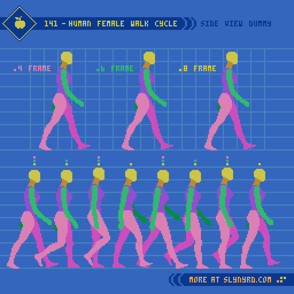
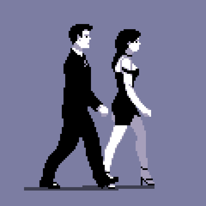
All the same principles apply to the female version, but take note of subtle nuances. The bone structure and curvature of the female figure lends itself to more graceful movement arcs. Of course, this is a generality, and every person, no matter the sex, has unique characteristics to his or her manner of locomotion. The most notable difference in my models can be seen in the arm swing. The female takes a fuller swing that moves all the way back past the hips, while the male’s arms have a relatively tighter course of motion. This gives the man an intentionally more stiff, business like character, and the woman is attributed with peppy elegance. Moving the breast down one pixel on the contact frame makes all the difference.
Clothed design
Time to put some clothes on these dummies.
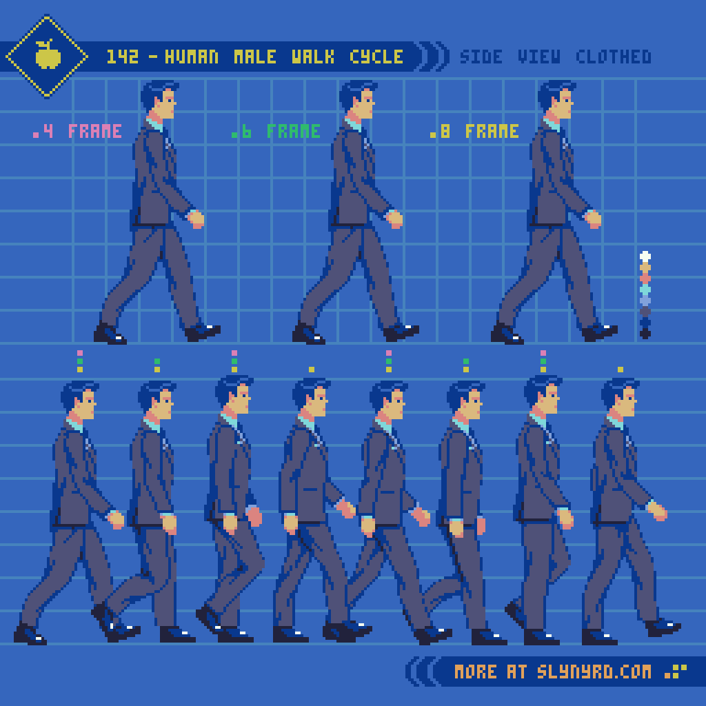
A well fitted suit adds a slight bulk to the base figure. The most challenging detail is the dynamics of the folding lines in the fabric. Folding lines are determined by the implied tension caused by the body pose, and gravity. Make sure these lines have consistent tension anchor points and direction throughout all frames. Save the trouble, and keep the details of folding lines minimal.
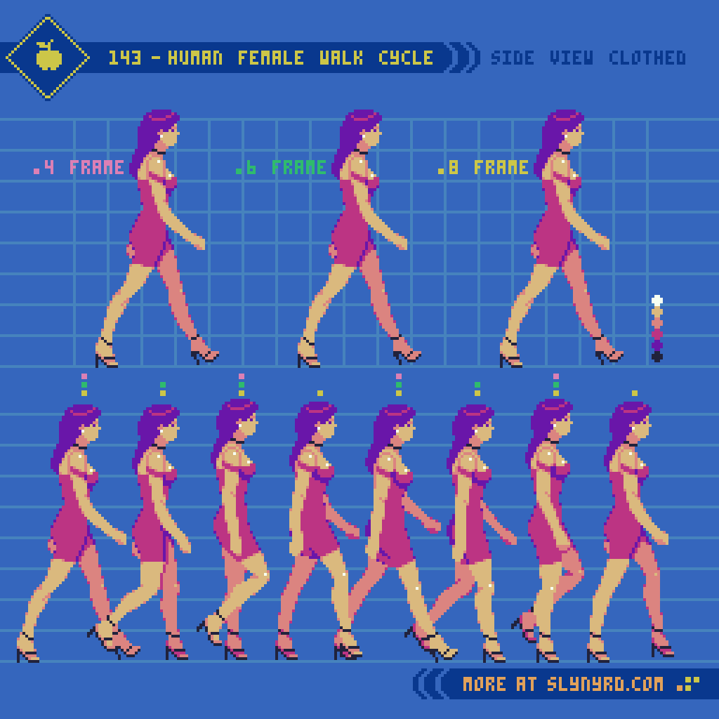
Minimal, formfitting attire presents far less difficulty when animating. However, the high heels account for an altered foot shape, and slightly modified stride. Also, the asymmetrical dress with a slit over the left leg must be considered. Simply reflecting the sprite from right to left would be inaccurate. Technically, the breast pocket on the male is also asymmetrical, but far less noticeable.
Final Thoughts
Strolling, ambling, tip-toeing, shuffling, waddling, striding; considering all the numerous ways which we can describe the manner of human locomotion, one could study the subject endlessly. I’m thrilled to add a couple more walk sequences to the portfolio, but I think I would like to move on to some different actions if I continue to expand on this series. As I stated in the last Pixelblog, my goal is to create assets that could be utilized for a beat em’ up concept. That means punching, kicking, and jumping could be on the table. I might need a detour into another subject before I expand this series, but it kind of depends on the demand. Hit that like if you want to see more. Better yet, join my Patreon and download the assets for you own project.
RESOURCES
Please consider supporting my work by becoming a Patron. Among many other rewards, Patrons can download the assets featured in my tutorials. But, most importantly, you allow me to continue making new content!
Many of my popular assets are also available to purchase from my digital shop
Alternatively, you can support me by making a one-time donation
Assets featured in this Pixelblog are available in Human Walk Cycle Asset Pack
Source files used in the making of this Pixelblog are available in Human Walk Cycle Source Files
Get caught up on all my downloads
You made it to the end of the article. Thank you for reading!
-By Raymond Schlitter