Intro
Welcome back to the charming world of top down pixel art. In the previous 2 Pixelblogs we covered basic ground tiles, and various environment objects. Now, in the 3rd part of the top down series we’ll bring the world to life with fully animated character sprites.
Character sprite Process
In order to animate a top down character you will need to represent the sprite in at least 4 directions. Unless you’re using dramatic directional lighting, or your character has an asymmetrical design you wish to accurately display based on orientation, the side facing version can simply be reflected for right and left movement. Therefore, our first goal is to create a character facing in 3 directions of the screen; up, down, and to the side.
Before you jump into character design it’s important to establish the sprite size, as the size of your characters can strongly affect the look and feel of your game. Generally, tile size is the best gauge for determining sprite size. As shown in the lower section of the above tutorial, relative sprite size usually conforms to a tile unit, or multiples of the tile unit. The height and width can multiply independently. For example, 1 tile wide by 2 tiles tall is one of the most common sprite sizes, and is the size I’ve chosen for my example.
Basing the character size on tile units allows the sprite to naturally fit in the grid-like structure of the tile based world, with simple collision bounds also defined by tile units. While modern tools allow one to break the grid and create sprites and environments of arbitrary size, the snug logic of the grid-based approach is still common convention.
Note, the frame of the sprite size is relative and the character doesn’t have to completely fill it edge to edge. However, you don’t want there to be too much empty space around your character, as to avoid pronounced gaps with adjacent sprites and parts of the environment with collision. Conversely, pixels spilling out of the frame may lead to unwanted overlap. With the top down viewpoint there is implied depth along the Y axis, as we assume objects lower on the screen are closer. Therefore, it looks perfectly natural and improves the sense of depth to allow the top half of a 2 tile high sprite to overlap sprites that are just a bit higher on the screen. However, overlap along the X axis is arbitrary and confusing to the eye.
Walk and Run Animations
Once you have created the idle position of the sprite facing 3 directions you can begin creating a walk/run animation. It’s best to keep the sprite very basic at this point and add details after you are satisfied with the motion.

I often establish the animation with a dummy sprite composed of clearly defined solid color body parts like the above image. In this case, since the sprite is quite small and some of the lighting details effect the appearance of the motion, I skipped the dummy step and straight up animated the details on the first pass. However, I recommend always starting with a dummy, especially if you are working with larger more detailed sprites.
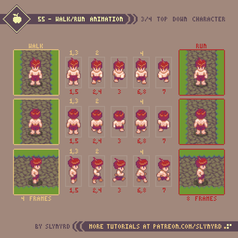
While my walk cycle is 4 frames and the run cycle is 8, you don’t really need to create that many unique poses. The walk cycle borrows all its frames from the run cycle, but simply omits the frames where the character is in full stride, and the playback speed is slower. The frames with the arms swinging can simply be reflected for the up and down facing versions.
Once you are satisfied with the animation you can use these frames as the base for all characters in your game with similar proportions. I suggest starting with a basic nude, which you can easily build off and accessorize.
Although we only have the sprite in 4 directions, you can still implement 8 direction movement and it will look acceptable when any of the 4 directions veer off at an angle. Applying 4 directions to 8 directional movement was common practice with many 16-bit games and still looks good to me. Secret of Mana, and A Link to the Past, are a couple examples that come to mind. But if you want to get fancy, you can try adding the 4 angles. I think the absence of the angles only becomes jarring if the sprite is large and detailed.
Character Sprite Reference
After you have created a base model for a character sprite, the real fun of designing unique characters can begin.
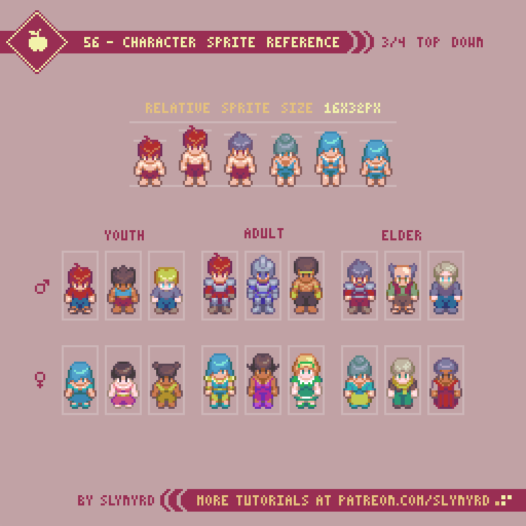
As a basic proportion guide, I created various heights to distinguish between male, female, young, and elderly. Of course, there can be exceptions, and I permit some wiggle room for slight variation in height between the same types. However, when working with such limited information, I find it best to stick to a system and not challenge the player’s expectations too much. Remember, the part of the sprite in the upper half of the frame can overlap sprites, so no need to worry about the empty space at the top of the frame.
The smaller the sprite the more condensed and abstracted the proportions tend to become. When working with limited size the head usually takes up a third to half of the total sprite. This is to emphasize the expressive features of the character, which helps the player form an emotional connection to the characters. Going for realistic proportions at such a small size will result in a stick figure, which can be an interesting style, but lacks personality. While a small canvas seems to allow little room for stylistic choice, there is always potential for creativity. I challenge you to create your own unique style of characters.
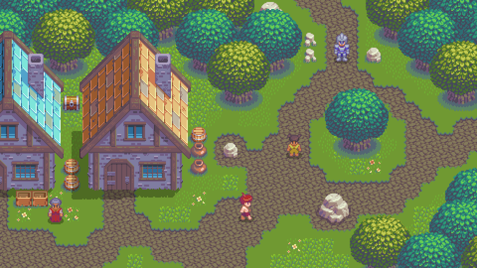
House
Wherever you have people, you are sure to find dwellings. I just couldn’t help myself, and had to make a bonus tutorial for creating a house!
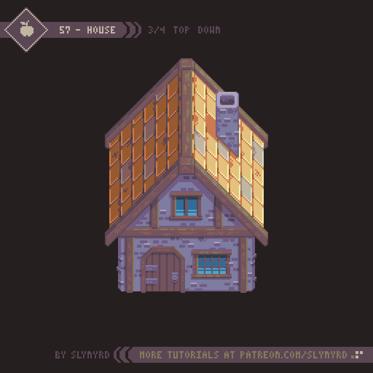
The size of the house is also based on tile units, so it logically fits into the game world with no odd gaps or unwanted overlap. Furthermore, it could be broken into tiles and expanded into different structures by adding various filler and connection tiles. For now, it’s just one large sprite.
The scale of buildings in top down games is often shrunk in relation to the characters, appearing tiny on the outside, then magically become spacious when you step inside. This partly originates from technical limitations, but also makes navigating a village much more practical, especially if the game doesn’t have a run feature. While it’s still an acceptable convention and has a certain charm, I like my buildings to at least have a believable scale in relation to the character sprites. Once you go inside, it’s still perfectly acceptable to expand the layout of the building.
Screen Size
The screen size/native resolution of your game should be established in the early stages of development, as it can strongly affect aesthetics and gameplay. When working with pixel art it’s especially important to pick a screen size that can perfectly scale to fit common displays and remain pixel perfect. 1920x1080p is one the most common display resolutions, and many displays have a 16:9 ratio. Therefore, the basic guideline I use is to make sure your native resolution perfectly multiplies into 1920x1080. However, you should also consider other common displays, such as 1366x768.
480x270px native resolution feels just right for this mockup.
In order to preserve the pixel art aesthetic there’s a limited range of acceptable resolutions. Too high resolution and it no longer appears as pixel art. Too low resolution and it becomes abstract blocks. This leaves us with a handful of acceptable options that perfectly scale into 1920x1080, and closely fit other common displays.
320x180(6x) Quite chunky when viewed on a large display but still an acceptable retro look
480x270(4x) A good fit for my top down mockup made with 16x16px tiles
640x360(3x) This is the resolution of the shmup I’m making, Thyrian Defenders
Of course, your resolution is not limited to these options. There are complex scaling solutions that allow other sizes to display with a pixel perfect look, but my technical knowledge is very limited on the matter. If you choose an arbitrary resolution your game may not be able to display pixel perfect at full screen, leaving borders around the play area. However, I find this more acceptable than distorting the pixel units in order to fill the entire screen.
When choosing a size It’s important to consider the relative size you want your sprites to appear on screen and how this may affect gameplay. The higher the resolution the smaller the pixel units become, or more zoomed out everything will appear. Therefore, the higher resolutions might be a good fit for something with fast scrolling, and fast moving sprites. If you’re going for something less twitchy, or simply want a retro look, perhaps you want to try one of the lower resolutions. Ultimately, screen size is something you should mock up and test for yourself before deciding on.
Final Thoughts
Well, this is the 3rd and final part of my multi-part series on top down subjects. From the start, I had a general plan with the intention of creating a cohesive game world with lessons that build upon each other. Honestly, I wasn’t quite sure what I would end up with when all I had were grass and dirt tiles, but with each lesson the world grew more lively. Now, it’s starting to feel like a real game, and I almost wish it was. I hope you have learned much on this journey with me. I know I have. Although it’s a bit sad, I’ll move on to a new subject in the next Pixelblog, but I don’t think you’ve seen the last of this world. There’s still plenty of opportunity to expand this world with new lessons on top down subjects.
RESOURCES
Was this article helpful? If you find value in my content please consider becoming a Patreon member. Among many other rewards, Pixel Insider members get extra resources to compliment my tutorials. But most importantly, you allow me to continue making new content.
Assets featured in this Pixelblog are available in Top Down RPG Starter Asset Pack
Source file used in the making of this Pixelblog is available in Tutorial 55 Source File
Get caught up on all my downloads
If you're not ready to commit to the subscription model of Patreon, make a one-time donation and receive exclusive art and resources. Help continue the content by providing me a living. Thank you!
-By Raymond Schlitter