Intro
Strap in for another round of space shooting goodness, as I expand on several aspects of shmup design. Building from the designs I created in Pixelblog 31, I will now introduce examples of player shot types, pickups, and environment assets. By the time we reach the end of this lesson we’ll have enough elements to create a full fledged shmup level!
Player Shot
If you’re going to shoot em’ up you’re going to need a weapon. The primary shot of the player in shmups is foundational to the overall gameplay and should be developed with care.
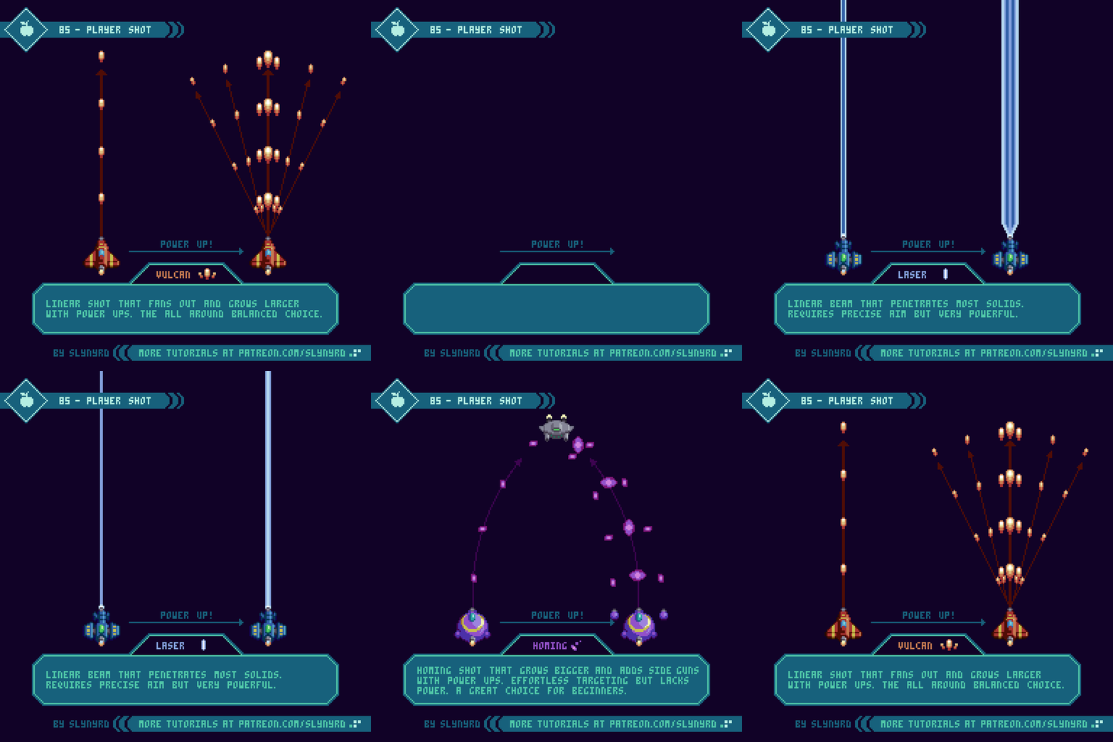
Here I cover 3 conventional types of weapons that are commonly found in the genre.
Vulcan - The most common type of player shot found in shmups is a linear string of bullets, which evolves into a spread shot through some kind of upgrade system. This provides a great balance for all types of players. Usually it starts as an unimpressive but practical pea shooter, and becomes significantly more satisfying as it spreads out.
Laser - A linear beam that widens and becomes more powerful through an upgrade process. The small area of coverage requires precise aim but it makes up for it with sheer power and the ability to shoot through multiple solids. Furthermore, it may be a hard sell for a beginner, but can become the most effective choice once familiarized with the level design. My laser stays on for a duration with brief stoppages between shots. This makes usage a little more strategic, but I would make the off period so brief, as to make auto fire still very effective. A constant beam might provide slightly more power but I predict it would feel a bit noisy to always be on and become exhausting. The interval approach seems more interesting to me.
Homing - The homing shot eliminates the need for precise aim by automatically seeking out the nearest enemies. This advantage makes it a great choice for the beginner who is not yet familiar with the level design. With upgrades these spinning bullets become larger, more powerful, and side pods provide additional bullet streams. In order to keep this from being an overpowered handicap, homing shot deals the least damage of the bunch. While effective against swarms of small enemies its advantage is minimized against large strong enemies and bosses. Furthermore, it makes the beginner instantly feel powerful, but the advantage of homing becomes less significant as the player memorizes the level design.
Key points
Geometry - This describes the flight path and area of effect. The geometry strongly impacts the player’s behavior. For example, your flight path when using homing will differ from when using laser.
Fire rate - Generally, the faster the fire rate the more powerful and satisfying the weapon feels. However, if each bullet deals a great deal of damage, a high fire rate can become overpowered. Also, consider how an extremely fast fire rate creates noise by jamming the screen full of bullets.
Power - The amount of damage dealt should be balanced in relation to geometry and fire rate. For example, homing should be relatively weak, or it will become overpowered and unbalanced due to it’s seeking attribute. On the other hand, the laser needs to be quite powerful for its narrow area of effect to still be useful. Power should also be carefully balanced in relation to fire rate. Generally, a slow fire rate should be compensated with power, and fast fire rate should have the power toned down.
Appearance - This refers to the visual appearance of the projectiles. While mostly cosmetic, the visual style should fit the behavior. For example, an arrow shaped projectile would look awkward as a homing bullet unless it rotated to always point in the direction it moves. Moreover, I chose to make my homing bullets spinning ellipses, which look interesting and lend them selves to omni-directional movement.
Obviously, all these characteristics are interconnected and should be carefully balanced together.
Pickups
Pickups are a staple of most game genres, and have an especially prominent place in shmups.
Pickups should generate excitement and make the experience more dynamic. To do so they should all have distinct meaning, and a varying range of rarity. This set exhibits many examples of the conventional pickups found in shmups, with a touch of unique character to fit my design aesthetic.
The following describes the above pickups from top to bottom. The specific attributes and quantities are a personal choice. As the developer, you are free to implement ideas in any manner you like.
Power up - P stands for Power up! These are how you turn your pea shooter into a glorious spread shot. Each one you get levels up your shot to a max of 5 levels.
Speed - Boost the speed of your ship. Each one you get adds a speed tier to a max of 3. The tiers can be cycled through, so you can adjust your speed depending on the situation, as speedy movements can be a disadvantage when navigating through tight spaces.
Bomb - Bombs are a special weapon that destroy all surrounding enemies and projectiles. Bomb pickups give you an extra use. You start with one by default and can bank up to 3. One bomb equals use.
Life Token - The classic one up item. A life token gives you an extra ship.
Heart - Completely restores your ship’s armor if you’ve taken damage. It’s common for shmups to strictly have only one hit kills, but I think a life meter system promotes a more dynamic and interesting experience. However, I still think taking damage should be of high consequence. For this project, I’m going with a 3 hit system where most hazards dish out a single hit, but some less common threats could inflict 2 at once, or instant death. I would likely also include a small heart pickup that only replenishes one hit of armor.
Pazul - A fictional resource that fills a shield meter. The more you fill the meter the longer the shield lasts when you use it. As with the heart, I would likely include one or two more sizes of the pickup to make the mechanic more dynamic, and the pickups more exciting to collect.
Key Points
Appearance - In concerns to the visual design, pickups should read well and have a distinct appearance that sets them apart from other sprites, as to not be confused for a hazard. A lively idle animation goes a long way here. There are many simple idle animations you can apply, which can be observed in my examples.
Distribution method - The distribution method must also be considered. For example, it could drop from specific enemies, be given by a special neutral unit, or simply just enter the screen randomly. Try to think of a fun and engaging method that best suits the gameplay.
Movement - With all the action happening in a shmup, just getting a pickup can be an interesting challenge in itself. For example, it could drift side to side as it comes down the screen, bounce off the borders of the playing field in angular patterns, or simply sit in the place it spawns from.
Space Environment
We’ve covered all manner of sprite designs commonly included in shmups, but we’re still missing a huge piece of the puzzle where much of the artistry lives - the environment design.
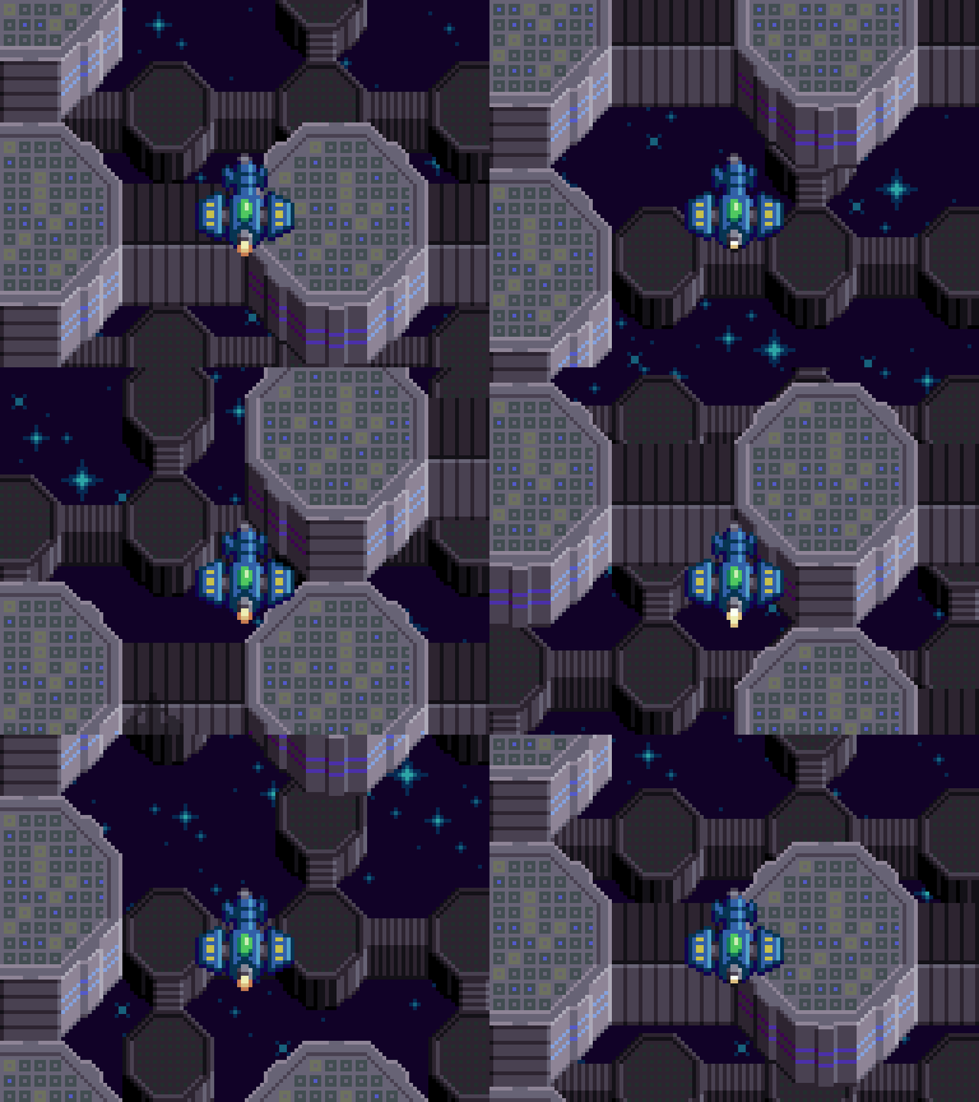
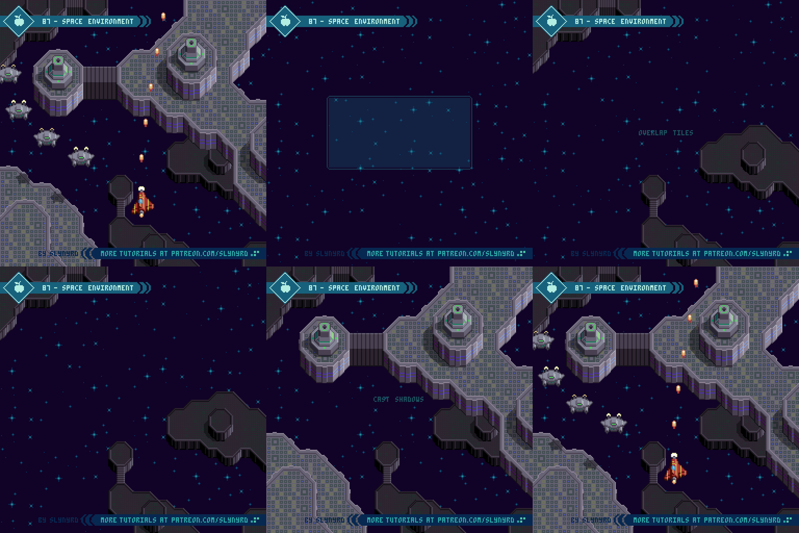
Here I present a practical approach to environment design with a space scene. The first thing to consider is if, and how you can interact with elements in the background. For example, I want to be able to have enemy ground units and buildings on the nearest background layer that you can destroy. To do so, this ground layer must appear fairly close to your ship but still maintain the illusion that you’re flying over it at a consistent altitude. Some games incorporate a secondary weapon for shooting things on the ground, like a mini bomb that you see dropping to the ground in front of you. This helps preserve the sense of depth, but personally, I find this mechanic tedious. Furthermore, I prefer to have your main stream of bullets collide with both ground units and air units. As long as the background layer with the enemies on it doesn’t appear so far away the collision remains believable. I just imagine there’s an imperceivable degree of auto-targeting going on.
Key Points
Layers/Parallax - It’s key to incorporate multiple layers into the background, so you can apply the magic of parallax scrolling. At minimum, you need at least 2 layers for parallax scrolling, but I think it really comes alive with 3, as in my example. When creating multiple background layers you should consider scale, and how color is used to capture atmospheric perspective.
Foreground - In some scenarios you can also have a foreground layer, such as clouds that pass overhead. However, if you do incorporate a foreground layer, make sure it doesn’t dramatically impede your vision of the play area, or appear like it will collide with you. Generally, I avoid having fully opaque foreground objects, but don’t rule it out. If they are off to the sides and pass by quickly, it could work. The trick is designing the foreground objects so they obviously appear above you and not on the same layer as you. Sorry, I didn’t attempt a foreground in my example.
Tiles - I used tiles to create the ground layers. This is not a technical requirement for pixel art games, it’s simply an efficient way to design environments with few assets. What’s more, tiled designs tend to capture that cozy retro aesthetic that makes pixel art so charming. On the other hand, if the tile design is uninspired it can appear monotonous. If I were to create an entire level with the above concept, I would surely add more variation. I like to combine many small generic tiles with large custom assets, which brings me to the next key.
Landmarks/Visual pacing - An interesting and varied background obviously enhances the aesthetic experience, but it also contributes to the gameplay. The key to winning in shmups is memorization. Furthermore, It’s important to create a memorizable background that doesn’t give you a feeling of deja vu. Just a glance at the background should always help orient the player as to where exactly they are in the level. While it’s possible to memorize a level based purely on enemy patterns, it’s so much more intuitive to also have cues from the background to tell you what’s coming next.
The occasional unique landmark is the best way to create a memorable background. Also, the generic sections can be memorable by mixing up the visual pace. For example, a large chunk of land that fills the entire screen, followed by small scattered islands, a brief section of open space, a large chunk of land running along the right side of the screen, then the left side of the screen… You see what I mean? Don’t just make a homogeneous flow of the distribution of the assets, vary the visual pace.
Final Thoughts
Part 2 of the shmup design series down! I actually wasn’t sure if I would have enough material to make a substantial follow up to Part 1. However, as I created this feature I started to think I might need to go for a part 3 to fully flesh out the project! While I covered many aspects of shmup design, we still have no UI, or bosses… Tell me if I’m forgetting something else meaty. In particular, I feel a UI is needed to bring the whole vision together. Let me know your thoughts in the comments below.
If you’re enjoying this series you’ll certainly get a kick out of my game Thyrian Defenders, due out this spring. Many of the concepts presented here I learned through my experience creating TD. So, if you really want to see what’s possible with my design approach, check it out!
RESOURCES
Was this article helpful? If you find value in my content please consider becoming a Patron. Among many other rewards, Patrons can access resources to compliment my tutorials. But most importantly, you allow me to continue making new content.
Assets featured in this Pixelblog are available in Space Shooter Asset Pack
Source file used in the making of this Pixelblog is available in Tutorial 86 Source File
Get caught up on all my downloads
If you're not ready to commit to the subscription model of Patreon, make a one-time donation and receive exclusive art and resources. Help continue the content by providing me a living. Thank you!
-By Raymond Schlitter


