Pixelblog - 15 - Plant Life by Raymond Schlitter

Intro

Next to art, field-biology has always been one of my favorite areas of study. Wildly diverse and genuine in all its forms, I particularly have a deep respect for plant life. Essential to the architecture of our eco-system, these beautiful life forms stand nobly affixed in place. The infinite variation of colors, forms, and adaptions captures a brilliance beyond the capabilities of human invention. However, they will never stop inspiring us to strive for this beauty. Ironically, the essence of this natural beauty can be captured in the limited medium of pixel art.

Title_image.png

While organic subjects like plant-life can be difficult to render in pixels, it just takes practice. The key is to embrace abstraction. Don’t try to force realistic details simply for the sake of accuracy. Compared to the real-life counterparts, you’ll find plant life in pixels takes on a whole new charming aesthetic. Ahh, green is so calming.

General Classification

First, let’s review the general categories of all plants and some examples. Even if you don’t use a reference, a little foundational knowledge will help you access better solutions when a creative problem calls for plant design. Furthermore, I believe intimate knowledge of the subjects you work with will bring out a more authentic quality in your work.

33-Plants.png

Plant life can be further broken into more specific categories, but for classification on the broadest terms, all plant life fits somewhere in this spectrum. This knowledge may not seem necessary to be a good pixel artist, but in fact, knowledge of any kind will help you improve as an artist. Understanding how things work allows you to see everything more clearly, and nothing is more important to a visual artist than seeing.

Leave Shapes

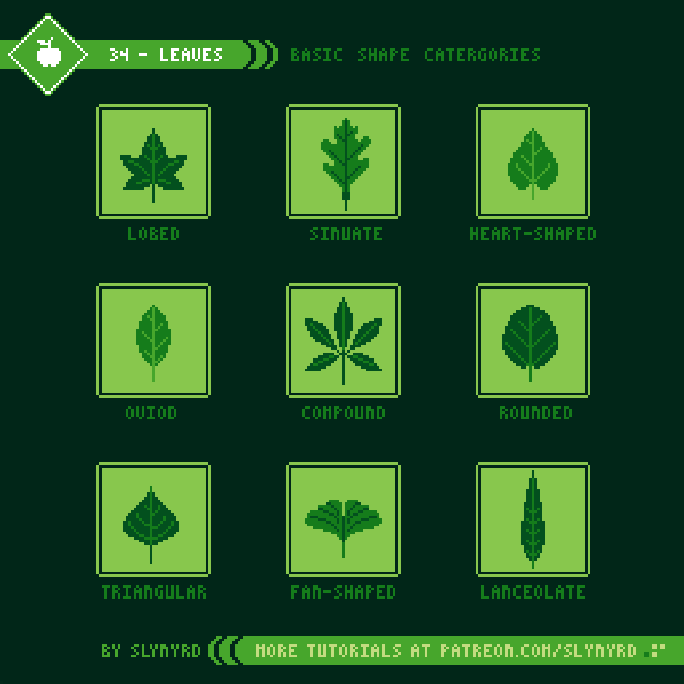
Most plants grow leaves to drive photosynthesis, thus providing nourishment. Leaves come in many shapes and sizes. If they are doing their job right, they are almost always a green hue. Here is a reference for the general shape categories.

34-Leaves.png

Many of these categories can be further broken down into more specific physical characteristics. When it comes to pixels, you’ll rarely have the scale/resolution to explicitly depict the leaves of a specific species, especially in dealing with dense foliage, but it’s always good to have a reference point and abstract as needed.

Tree study

One of nature’s greatest gifts has to be trees. They provide us with so many resources, like firewood, lumber, fruits, medicine, and even oxygen. The way their limbs reach up towards the sky like outstretched arms, we can even relate to their anatomy. Being in the presence of great trees can even have a spiritual quality. It’s no wonder we love trees. While the dormant tangle of barren branches has it’s own appeal, I find a tree’s beauty shines the most when donning robust foliage.

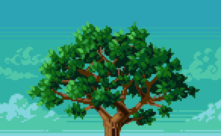
35-Tree.gif

Trees come in all shapes and sizes, but for this particular study I depict a generic deciduous species with a nice canopy of foliage that still allows you to view some of the inner branches. I first draft the entire tree, including some rough shading and highlights. Developing the image beyond this rough impression of the forms and cleaning up the clusters is where most learners hit a snag. At this point you should pay mind to all the pixels and bring meaning to your clusters. Not every leaf needs to be represented. Just enough to give the impression of a leafy texture and the mind will automatically fill in the gaps where there are less defined large clusters. In fact, I almost went too far with the details in this example, but since I repeat similar cluster arrangements across the sprite it maintains a clean consistent look. Too much variation will create displeasing noise.

Final thoughts

It was so refreshing to use a lot of green. Nature is my number one inspiration but it’s always challenging to pixel organic subjects. You can definitely expect more plant life tutorials in the future. I’d be happy to do a whole feature just on trees!

RESOURCES

Was this article helpful? If you find value in my content please consider becoming a Patreon member. Among many other rewards, Pixel Insider members get extra resources to compliment my tutorials. But most importantly, you allow me to continue making new content. 

Assets featured in this Pixelblog are available in Plant Life Assets Pack,

All assets in this feature use my custom palette Planemo 8

Get caught up on all my downloads

If you're not ready to commit to the subscription model of Patreon, make a one-time donation and receive exclusive art and resources. Fan support is necessary to keep producing content. Thank you! 

-By Raymond Schlitter
Pixelblog - 14 - Cityscapes by Raymond Schlitter

Title_Image_Day.png

Intro

Crowded, dirty, and sparse in nature, big cities certainly present some ugly realities. Yet, within the chaos that arises from massive populations, great beauty can be found. The convergence of people leads to marvelous human achievements, most notably displayed in the lofty structures that rise from the population. Viewed from a distance, where one can take in the totality of our modern marvels, the aesthetic shines the most. When I used to live in Japan, I loved going to observatory decks to gaze out across seemingly endless city. Nearing dusk, golden sunlight would reflect off the rooftops, creating a sea of metal and glass. As the sun set somewhere beyond Mt. Fuji, rivers of neon came to life and flowed across the landscape. Turns out the city really can be beautiful, even for this country boy.

SkyScrapers

30-Sky_Scrapers.gif

The 3/4 side view is one of my favorite ways to draw architecture. In this projection the object appears skewed about 45 degrees away from a direct front facing view, foreshortening the sides to about 3/4 their actual width. This is simple to execute and always creates a convincing sense of depth when done with good color choice. I usually imagine the light source from the top left or right side of the scene, which results in a strong contrast in color between the two sides of the building, maximizing the feeling of depth.

Futuristic Skyscraper

Nowadays, many sky scrapers around the world have much more futuristic designs than what I’ve presented so far. My geometric designs are often more conservative than what is possible in real life. However, the geometry is well-suited for pixel art and result in a fine aesthetic.

31-Futuristic_Building.gif

You can see my approach to architecture is more like construction than drawing. Using simple geometry and few but precise angles, unlimited forms can be made. This constructive technique works well with all types of angular forms not limited to urban architecture. For example, you can spot some of the same forms in my airships, and various mechanical designs. This approach can even provide the base forms for some natural subjects, like rocks and cliffs. However, in those cases I break up the straight lines with more variation and add texture to give a more organic quality.

SPC_EP_30_Metro_Emperica.gif

More futuristic city building on display in Pixelcast 30. Here I use a uniform color scheme across all the buildings. This makes the city feel like one cohesive mega structure, and enhances the concept of a strict ordered empire. Looks mighty, but maybe not such a fun place to live.

City Skyline

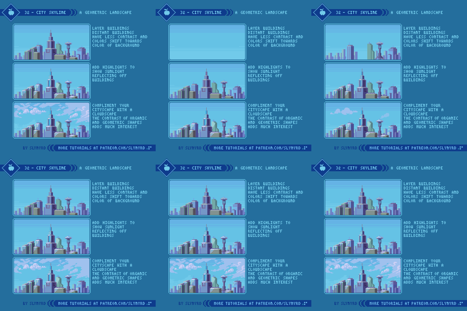
Now let’s put together some of the buildings we’ve learned to create into a larger city landscape.

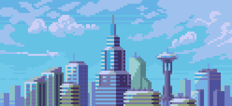
32-City_Skyline.gif

Some cities are very dense and present a mountainous skyline of buildings overlapping into the distance, while others are more spaced out with just a few iconic structures standing above the blocky mass of the city. Organize your city however you see fit. I like to create each building as a separate layer so I have the freedom to move things around at any time to find the perfect composition. It’s also smart to duplicate some buildings and make small variations, rather than pixel each building from the ground up.

Once you are happy with the arrangement of the buildings, contextualize the scene with a background design. While I often save background details for last, I determine the light direction and general setting from the outset. Is it daytime, evening, or night? Is your city floating in space or submerged under the sea? For me, you can never go wrong with a nice cloudscape. The contrasting organic forms compliments the angles of the city and seems to balance out the scene.

Title_Image_Night.png

FINAL THOUGHTS

Growing up in a modestly small city where the tallest building is about 6 or 7 stories, I often romanticized the city when I was younger. The giant buildings seemed so futuristic to me. After moving and living in the city for several years my romance faded, but something that never faded is my love for architecture and the way skyscrapers inspire me. The contrast between nature and monolithic structures made by humans deeply fascinates me. However, it is my hope that some day we can evolve our architecture to fit in with nature more harmoniously.

RESOURCES

Was this article helpful? If you find value in my content please consider becoming a Patreon member. Among many other rewards, Pixel Insider members get extra resources to compliment my tutorials. But most importantly, you allow me to continue making new content. 

Assets featured in this Pixelblog are available in Cityscapes Assets Pack

Get caught up on all my downloads

If you're not ready to commit to the subscription model of Patreon, make a one-time donation and receive exclusive art and resources. Fan support is necessary to keep producing content. Thank you! 

-By Raymond Schlitter

Pixelblog - 13 - Rocks by Raymond Schlitter

Title_Image.png

Intro

They make up the mountains, they are in the ground under your feet, the wonderful world of rock is all around us. As an artist, it’s important to be able to depict this abundant material in its many forms. Thankfully, the pixel is a finely suited for the task. There’s something incredibly satisfying about well rendered pixel art rocks that just can’t be captured in other mediums.

The 3 types of rocks

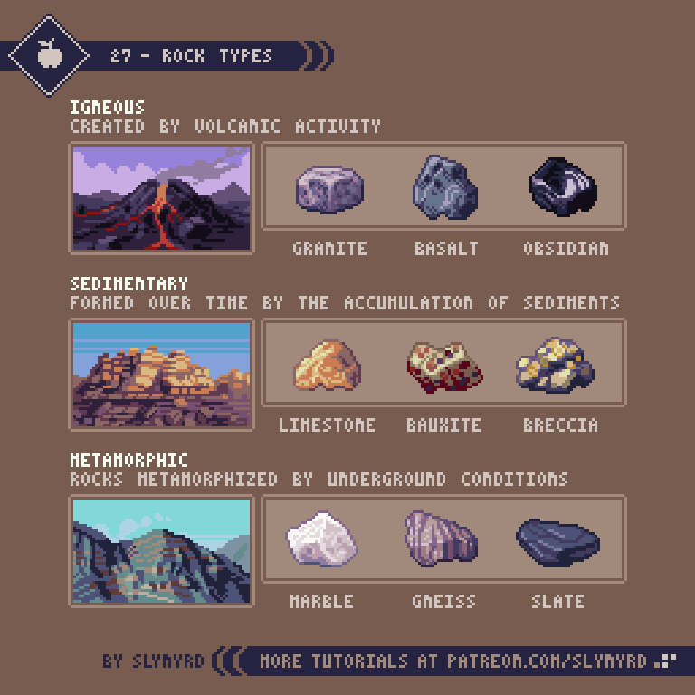
First, let’s review some elementary rock knowledge. Rock is a hard natural material forming the surface of the Earth and other similar planets. This hard material is made out of many different minerals and mineral like materials. A wide variety of colors and texture can be discovered in the world of rocks, however, they can all be narrowed down to 3 main types based on how they are formed.

27-Rock_Types.png

Understanding how rocks are formed and familiarizing with specific examples can help you design environments with more accuracy. Such thoughtful design enhances world building and immersion. Besides, what’s more inspiring than the real science happening around us?

Simple ROCK

While realism is appreciated, the limits of pixel art can make it difficult to capture the fine textural details of what makes up rock. Usually, generic gray rock gets the job done. If I had to get technical, I suppose this would be some kind of granite, phyllite, slate? What’s most important is the color and shape fits the geology of the environment. For example, in a canyon made of reddish oxidized rock, a gray stone would look out of place. In that case, a simple palette swap might do the trick, but it’s also important the shape makes sense. Every rock tells a story.

28-Rocks_2.gif

I tend to use this outline approach when creating larger stone sprites, as the angular lines lead to a sharp, hard look. However, I sometimes use a blocking approach and start with solid blobs of color, then chisel down the form as I go. Especially if the sprite is very small, I won’t bother with the outline steps.

Mountains

Basically, really big pointy rocks. Mountains are some of the most majestic features of the planet. Growing up in a flat region, I’m always awestruck by any formation taller than my house.

29-Mountains.gif

Before you start slapping down color, it’s always good to study references, especially in concerns to natural scenery. I suggest studying many references to become familiar with common shapes and shadows seen in mountains. With practice, you will eventually be able to conjure up mountains with little to no reference.

Final Thoughts

On paper, the sound of a rock tutorial seemed a bit mundane to me, but I really got into it. I had forgotten the basics of the rock cycle, and just how fascinating these materials right under our feet truly are. Of course, we all can appreciate the beauty of a mountain range, but when is the last time you picked a stone off the ground, marveled at the texture, and contemplated its origins? With kid like curiosity, I find myself captivated by the geologic world and hope to make more rock themed tutorials in the future. Rare minerals and precious gems would surely be fun to pixel.

RESOURCES

Was this article helpful? If you find value in my content please consider becoming a Patreon member. Among many other rewards, Pixel Insider members get extra resources to compliment my tutorials. But most importantly, you allow me to continue making new content. 

Assets featured in this Pixelblog are available in Rocks Assets Pack

All graphics in this tutorial use my custom palette Bright Future

Get caught up on all my downloads

If you're not ready to commit to the subscription model of Patreon, make a one-time donation and receive exclusive art and resources. Fan support is necessary to keep producing content. Thank you! 

-By Raymond Schlitter


Pixelblog - 12 - To the Stars by Raymond Schlitter

Intro

A vast universe of unlimited possibilities lies beyond our lonely little planet. When I gaze at the distant lights in the night sky I feel my ego slip away and wild imaginations guide me into the cosmos. Majestic starscapes full of alien worlds and life forms fill my mind. Anything you can possibly think of exists out there somewhere. The universe is truly awe-inspiring and a source of much great art. Ironically, little dots on a computer screen do well to capture this magnificence.

Title_Image.png

Starscapes

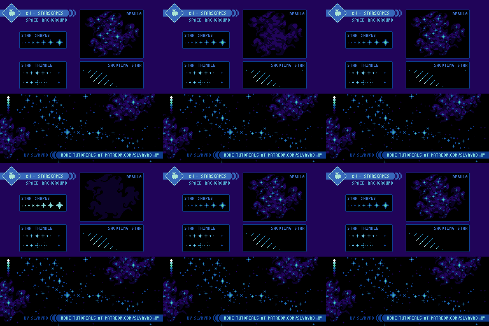
Even at optimal clarity our naked view of the stars from Earth is only a small glimpse at the beauty of space. Without the hindrance of the atmosphere and surrounding lights, the view becomes a mosaic of countless stars and luminous nebulae of all shapes and sizes. Don’t hold back in your creative translation of this cosmic backdrop.

24-Starscapes.gif

These are the typical elements I use when creating starscapes. I stuck to a fairly monochromatic look for this example but you can mix it up with more color like in the title image. You can also get creative and come up with your own star shapes and all kinds of nebulae. Just google nebula images for some inspiration; truly wild stuff.

Planets and Large Celestial Bodies

25-Celestial-Bodies.gif

This is where things really get fun. Now we zoom in on those stars and imagine the environments of distant worlds. While it’s good to keep some footing in science, this is an opportunity to really have fun and come up with creative worlds. I stuck to the common space objects here, but you can come up with all kinds of bizarre and impossible worlds. The Star Wars prequels are a great source of inspiration for fantasy worlds. I mean, a world completely covered in a dense city doesn’t seem very plausible, but it’s cool, and I’m cool with that.

Notice how I used two different approaches to the shading of the base spheres. The moon goes from lightest to darkest and the planets are shaded from darkest to lightest. In the case of the moon, it appears like the light is coming from behind, and on the planets it appears to be coming from the front. Both work fine, it’s just a matter of preference. Choose whatever feels right for the particular sprite.

Space Ships

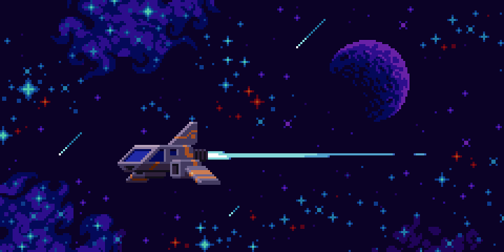
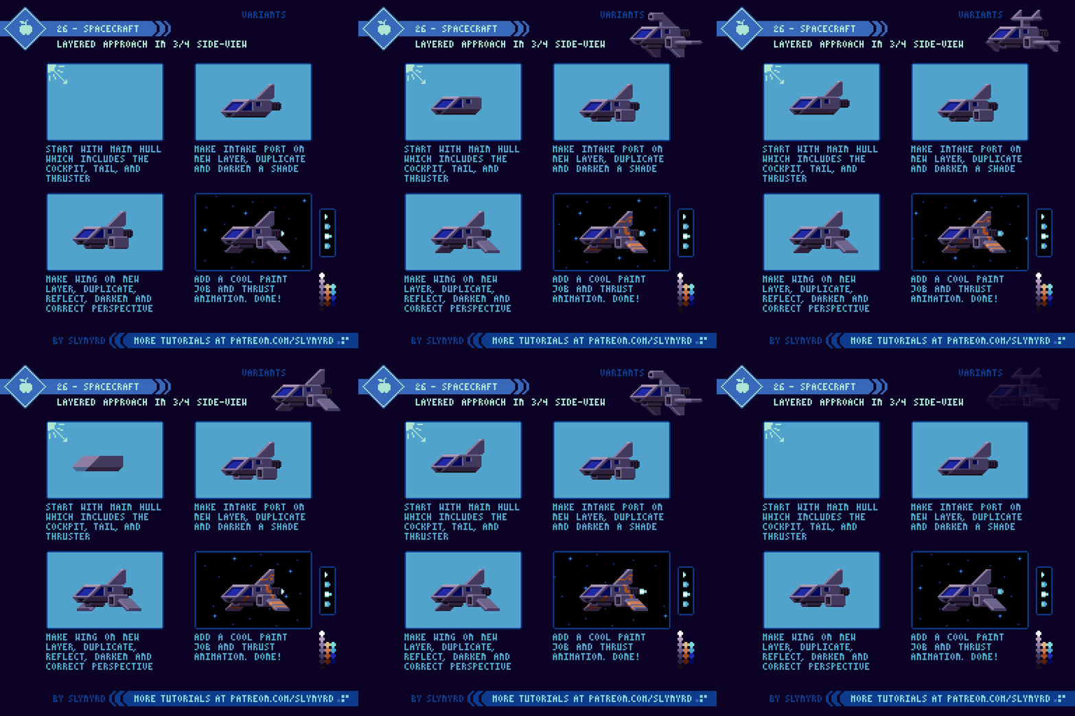
In space the principles of flight are much different than in Earth’s atmosphere. Without atmosphere and a dominant force of gravity, the traditional aerodynamic winged design need not apply. This opens up the possibility to create all kinds of uniquely shaped vessels. While it’s not hard to stretch the imagination of what’s possible in our own terrestrial realm, the mystery and vastness of space provides much more creative leeway. Nevertheless, I tend to stick to more traditional winged designs that feel like they might actually be able to fly.

26-Spacecraft.gif

The idea is not to copy my design exactly, but adapt this modular approach into your own spacecraft. Try to come up with multiple versions for the wings, tail, cockpit shape, and so on. Then you can easily mix and match the pieces to create spacecraft variants. The paint job is really where it comes to life. I like to create bright striping patterns over a neutral color base. Chris Foss is a big inspiration for cool vessel designs, but mostly for the rad paint jobs.

FINAL THOUGHTS

I’m passionate about space and sci-fi aesthetics, but this is only my first tutorial on the subject. Look forward to more space themed tutorials in the future; alien landscapes, lifeforms, civilizations, more detailed spacecraft designs and so on. What space themed tutorial would you like to see?

RESOURCES

Was this article helpful? If you find value in my content please consider becoming a Patreon member. Among many other rewards, Pixel Insider members get extra resources to compliment my tutorials. But most importantly, you allow me to continue making new content. 

Assets featured in this Pixelblog are available in To the Stars Asset Pack

All graphics in this tutorial use my custom palette Bright Future

Get caught up on all my downloads

If you're not ready to commit to the subscription model of Patreon, make a one-time donation and receive exclusive art and resources. Fan support is necessary to keep producing content. Thank you! 

-By Raymond Schlitter

Pixelblog - 11 - Landscape Pixeling by Raymond Schlitter

Intro

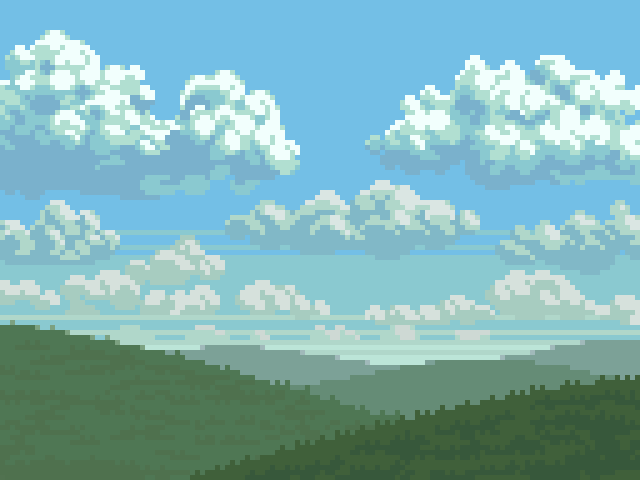
For a medium defined by limitations, I’m always surprised by the flexibility of pixel art. As a nature lover, I’ve been pleasantly surprised by how well pixels handle landscape art. In my beginner days, I thought the hard edges and overall blockiness was a poor fit for natural subjects. However, with practice I discovered the abstraction of low resolution lends an expressionist quality well suited for landscape art. What was once thought as a limitation becomes an advantage, and so goes the story of pixel art.

Landscape.png

Clouds

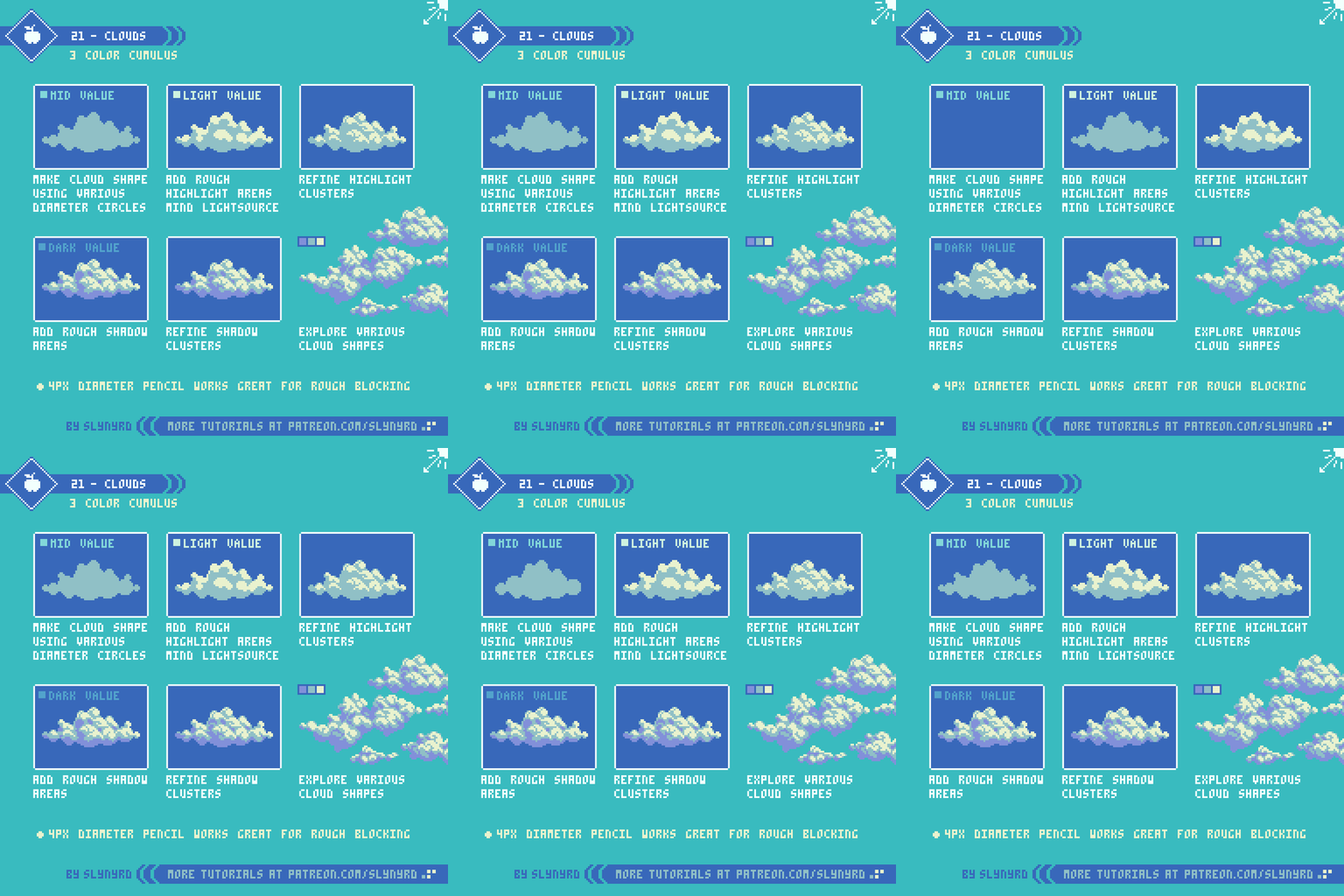
For me, the heart of a landscape is what’s written in the sky, and clouds are the language of this beautiful poetry. While clouds offer a good opportunity to play with creative forms, it’s important to become familiar with the scientific classification of cloud shapes and the circumstances behind them. But I’m not here to give a science lesson. Depending on geography we all have an intimacy with certain skies and more or less know how clouds work. I’m a big fan of fair weather days full of lots of puffy cumulus clouds.

This is just one style of cloud, but this basic technique can be used to make all kinds of clouds. Try various shapes and light conditions.

Atmospheric Perspective

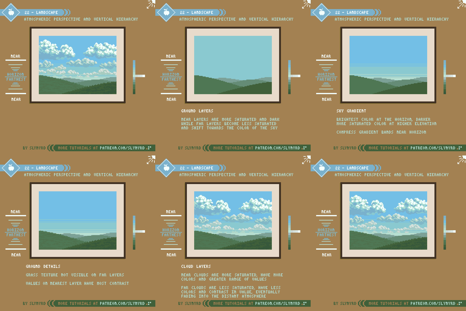
One of the most effective ways to capture depth in a landscape is atmospheric perspective, or also called aerial perspective. Atmospheric perspective is the effect the atmosphere has on the appearance of objects depending on viewing distance. The further the object, the more it takes on the color of atmospheric haze. In a day time setting, close objects are more saturated with clear contrast between light and shadow, while far objects become less saturated and contain less colors.

The vertical position of an object on the canvas also informs the depth. The closer an object is to the vertical position of the horizon, the more distant it appears.

22-Atmospheric_Perspective.gif

This is a simple landscape but the same approach can be used to create all kinds of landscapes with a convincing sense of depth. My terrains often feature subtle rolling prairie land, a nod to my home in Kansas. However, I also enjoy creating exotic alien landscapes. I suggest starting with real world references of scenes that have meaning to you. Once you get the hang of the basic principles you can create more imaginative scenes. For more tips on how to create texture for grass and clouds check out Pixelblog 2

Lighting

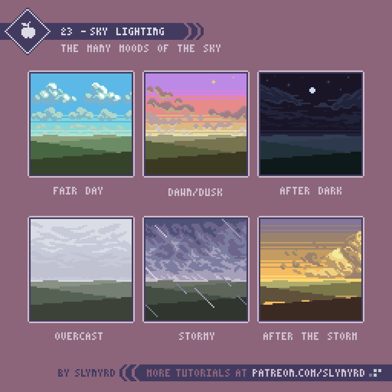
Lighting totally changes the mood of a scene. Bright blue skies gives both an energetic and relaxing feeling. The warm hues of dawn create a contemplative mood, while a fiery sunset can speak of romance. Let’s get creative and explore the expressive qualities of the sky.

23-Sky_Lighting.png

FINAL THOUGHTS

Nothing inspires quite like a real nature experience. Wherever you live, I hope you can easily access clean nature. I recommend you explore your local surroundings, take photographs, and study the landscape. I love going on long country drives and exploring every interesting nook I can find. While I don’t often follow one particular image, my collection of photographs, and visual memory of my experiences, help guide my vision. When your art expresses something from your true surroundings the heart can be felt.

RESOURCES

Was this article helpful? If you find value in my content please consider becoming a Patreon member. Among many other rewards, Pixel Insider members get extra resources to compliment my tutorials. But most importantly, you allow me to continue making new content. 

Get caught up on all my downloads

If you're not ready to commit to the subscription model of Patreon, make a one-time donation and receive exclusive art and resources. Fan support is necessary to keep producing content. Thank you! 

-By Raymond Schlitter
Pixelblog - 10 - Water in Motion by Raymond Schlitter

Intro

Wherever there is water, populations will gather. Of course, this is mainly due to our dependance on water for survival, but the attraction to water extends beyond our basic needs. The reflective quality of the surface, the soothing sounds of waves and currents, the overwhelming wonder of the alien world below the surface; without a doubt water has an aesthetic allure. Let’s look at various ways to bring this attractive feature to life in our pixel art with movement.

Intro_Image.gif

Wave motion

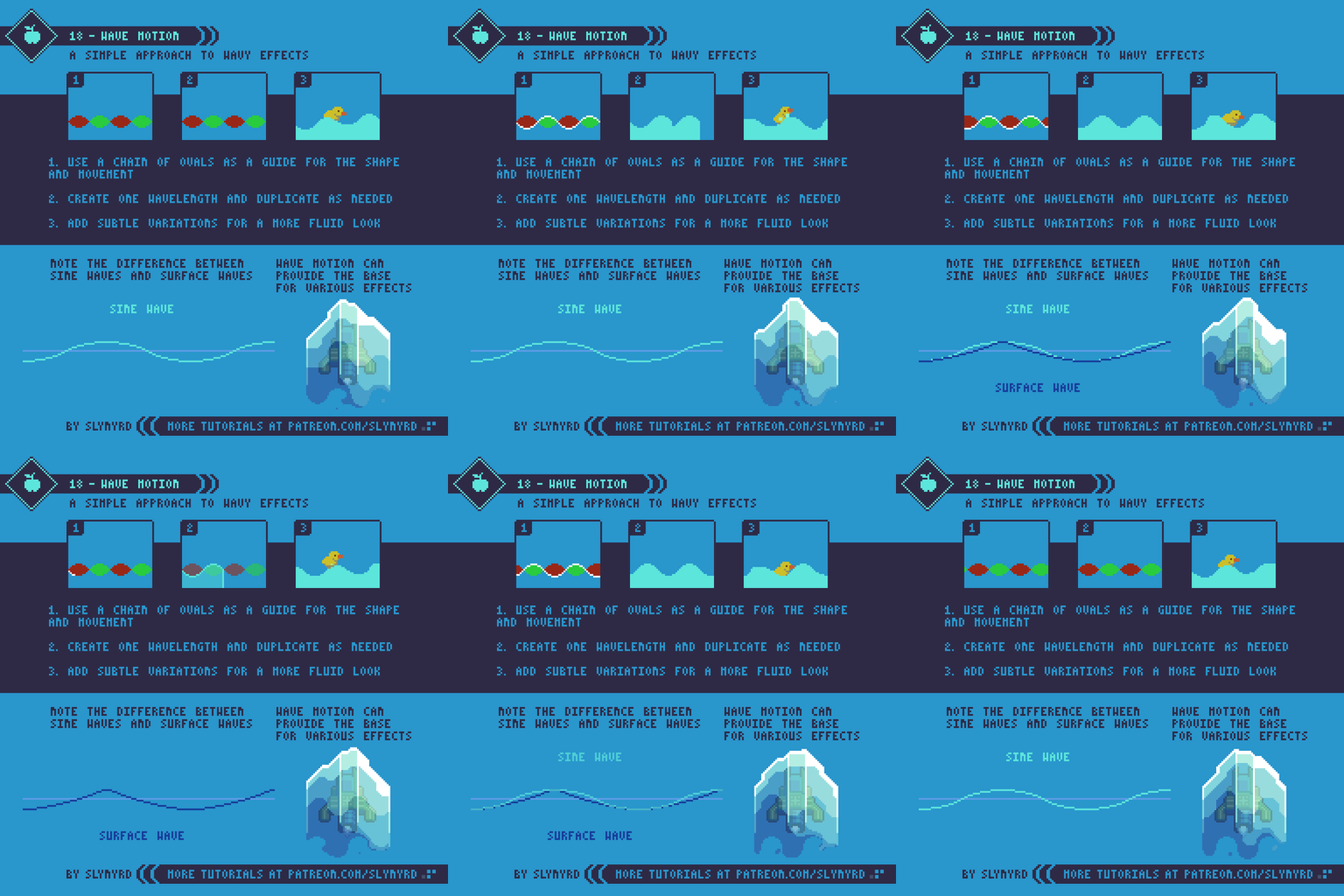
The constant rolling motion of a sine wave can provide the base for many pleasing animations, including water effects. Surface waves on the ocean seen from a direct side-view are similar to a sine wave shape. The crests of surface waves are actually slightly steeper than the inverse dips. Please take note of the difference illustrated in the tutorial. Nevertheless, a sine wave is very easy to generate and can be modified into many interesting effects.

18-Wave_Motion_2.gif

It’s all starts with creating a chain of ovals. This makes it easy to trace a symmetrical wave shape that can be tiled. Also, the guide can be used to test if the motion loops properly before animating the wave.

Make sure you are satisfied with the shape of your wave before animating movement. Obviously, the shape of your oval chain will change the curvature of the wave. Use circles for short deep waves, and wide ovals for shallow wide waves. Try an asymmetrical oval pairing to capture more realistic shaped surface waves.

My example uses uniform ovals, therefore resulting in a sine wave. I could probably modify my waves to look more like surface waves on the water but it’s not so noticeable when the waves are small and narrow. The wider the wave the more apparent the difference between sine waves and surface waves. In any case, I find it easiest to start with a generic sine wave and modify as needed.

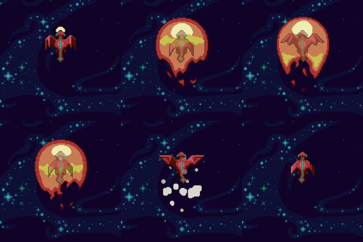
I’ve utilized this technique on several animations in Thyrian Defenders, not necessarily related to water. While these have been heavily evolved, they all started with the same technique of creating a basic wave.

Redwing_Fireshield_On_Off.gif
Sniper_Blast.gif

Can you see where the wave motion is incorporated in the animations? Anyway, getting back to water…

Waterfalls

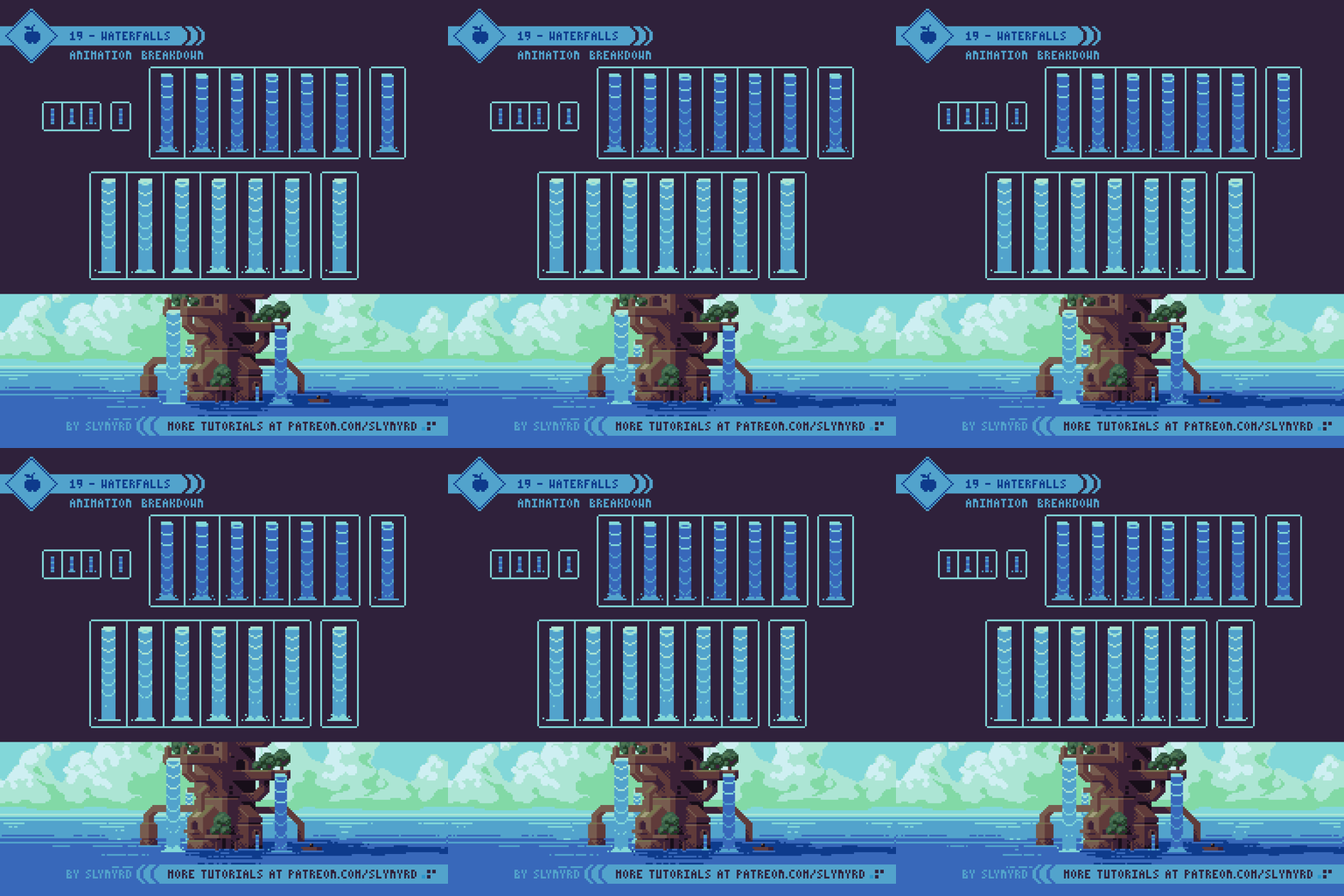
Waterfalls are as hard as you make them. It may seem like a great challenge but there are many simple solutions. Here is a breakdown of one of my animated scenes, which features animated waterfalls and a sparkly surface effect.

19-Water_Falls.gif

It’s easiest to break the waterfall into 3 main components; the mouth, the flow, and the splash. The mouth is where the water flows over at the top. This area is brighter with lots of reflections. The flow is the main vertical section where movement needs to be conveyed. In this case I use bands that sag and darken as they move downward. Eventually the bands break apart as they reach the bottom. The splash is the fun part. Just makes sure it loops in sync with the flow.

You might also be curious about the sparkly water surface animation. This is also a 6 frame loop. All the motion is simple linear movements, which are plain to see. The overall lighting and texture of the surface is made to capture the profile of the clouds. It’s quite subtle but you’ll notice the lighter reflective areas relate to the position of the highlights in the clouds. Check out the entire image.

River flow

River_Flow.gif

Simple pulsing lines can be used to express directional river flow. I came up with this technique on a game project several years ago. It works especially well if your river has lots of twists and turns and doesn’t adhere to a tiled grid. Just make a few little animations like these and place them wherever it feels like movement is needed.

Water Reflection

A reflective water surface adds lovely atmosphere to a scene and is surprisingly easy to execute. Creating a static reflection is as simple as flipping your image and applying some highlights. However, adding meaningful movement to the reflection can be tricky. I’ve discovered an easy solution using one of the most basic stock effects in Adobe After Affects.

20_Water_Reflection.gif

Regardless if you have After Effect or not, it all starts with good art. If your scene looks bad without animation, it won’t look any better with it. So take your time and make a nice believable reflection before applying motion. In many cases the reflected image is slightly shortened, but it’s not always the case. As with any form of illustration, it’s always a good idea to use a reference.

Even if you’ve never used After Effects before, this effect is very easy to understand. If you want slow subtle movement like in my case, wave speed, width, and height should be set quite low. One of the most important settings is where you place the ripple source. I placed my source off the bottom side of the image area so you only see waves moving in one general direction, creating the illusion of a linear flow. In order to do this you must add plenty of extra transparent space around the asset you apply the effect to, as the effect can only be generated within the dimensions of the asset. Play with lots of positions and settings until it feels right for you.

One trick with this method is getting the animation to loop smoothly. Honestly, I got lucky and the settings I liked just happened to loop perfectly on a 2 second timeline. Fortunately, it’s not so miraculous to find this sweet spot. First, get the effect to look how you want it, then search for the magic point in the timeline where it loops.

While I have a lot of experience using After Effects in my graphic design days, this is the first time I’ve used it for pixel art animation. It’s surprisingly easy to create cool effects that are applicable to pixel art and I’m excited about the potential for new animation ideas. Don’t worry if you don’t have access to this software. I’m only talking about the occasional trick here and there, which can still be insightful and inspire your own animation techniques.

Final Thoughts

Whether it has to do with water or not, I hope this collection of flowing animations can provide solutions to your own creative problems. There’s still much to be discussed on the topic of water, and I intend to return to the subject soon. Let me know what trips you up about illustrating or animating water and I’ll try my best to offer solutions.

RESOURCES

Was this article helpful? If you find value in my content please consider becoming a Patreon member. Among many other rewards, Pixel Insider members get extra resources to compliment my tutorials. But most importantly, you allow me to continue making new content. 

Get caught up on all my downloads

If you're not ready to commit to the subscription model of Patreon, make a one-time donation and receive exclusive art and resources. Fan support is necessary to keep producing content. Thank you! 

-By Raymond Schlitter

Pixelblog - 9 - Melee Attacks by Raymond Schlitter

Title_Image.png

Intro

Time to face it straight and swing some limbs! Melee attacks are heavily used in games across many genres and come in many forms. In this lesson we'll examine some basic melee attacks using side-view characters. Even if you're more of a lover than a fighter, it's an important animation challenge. Especially if a game focuses on melee mechanics, the animation quality can make or break the game. A melee attack with just the right timing, motion, and sound effect can be a thing of beauty. Let's see if we can make some pleasing action starting with simple punches. 

Punches

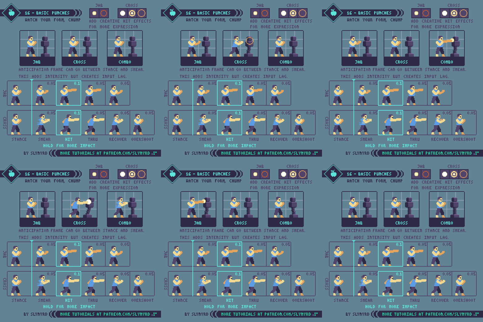
16-Melee_Attacks.gif

Before you just start carelessly swinging limbs around you need to think about exactly what kind of punch your character is throwing and study the proper form. Of course, you can exaggerate and create abstract motion but the real physics should be studied first. It all starts from the punch stance. Depending and the fighting style the stance may change. My fighter has a standard boxing stance; fists raised up by the face, hips between the feet, knees slightly bent. 

Jab - If right-handed, the jab should come straight out with the left hand. While the hips slightly open and the legs tense, most of the motion is in the punching arm.

Cross - If right-handed, the cross comes from the right hand in a straight line from the face. The cross has more power and range than the jab but is still quick and easy to throw. you can put a bit of a step lunge into the cross but make sure the back doesn't hunch over and the head stays up straight. After the recover frame I move the stance one pixel to the left for one frame to create a bounce effect. This illustrates an important animation principle known as overshoot, which says that an object stopping will slightly ‘overshoot’ the stop point before eventually stopping.

The overshoot is applied to the recovery frame.

The overshoot is applied to the recovery frame.

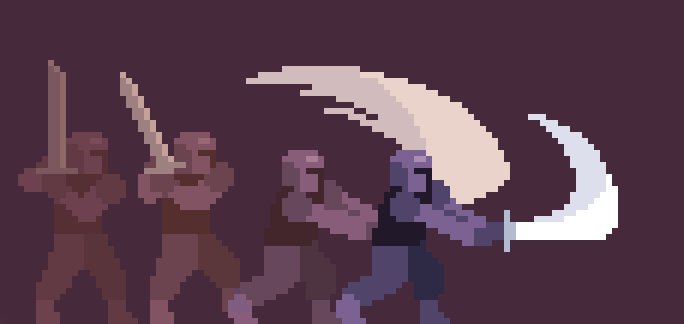
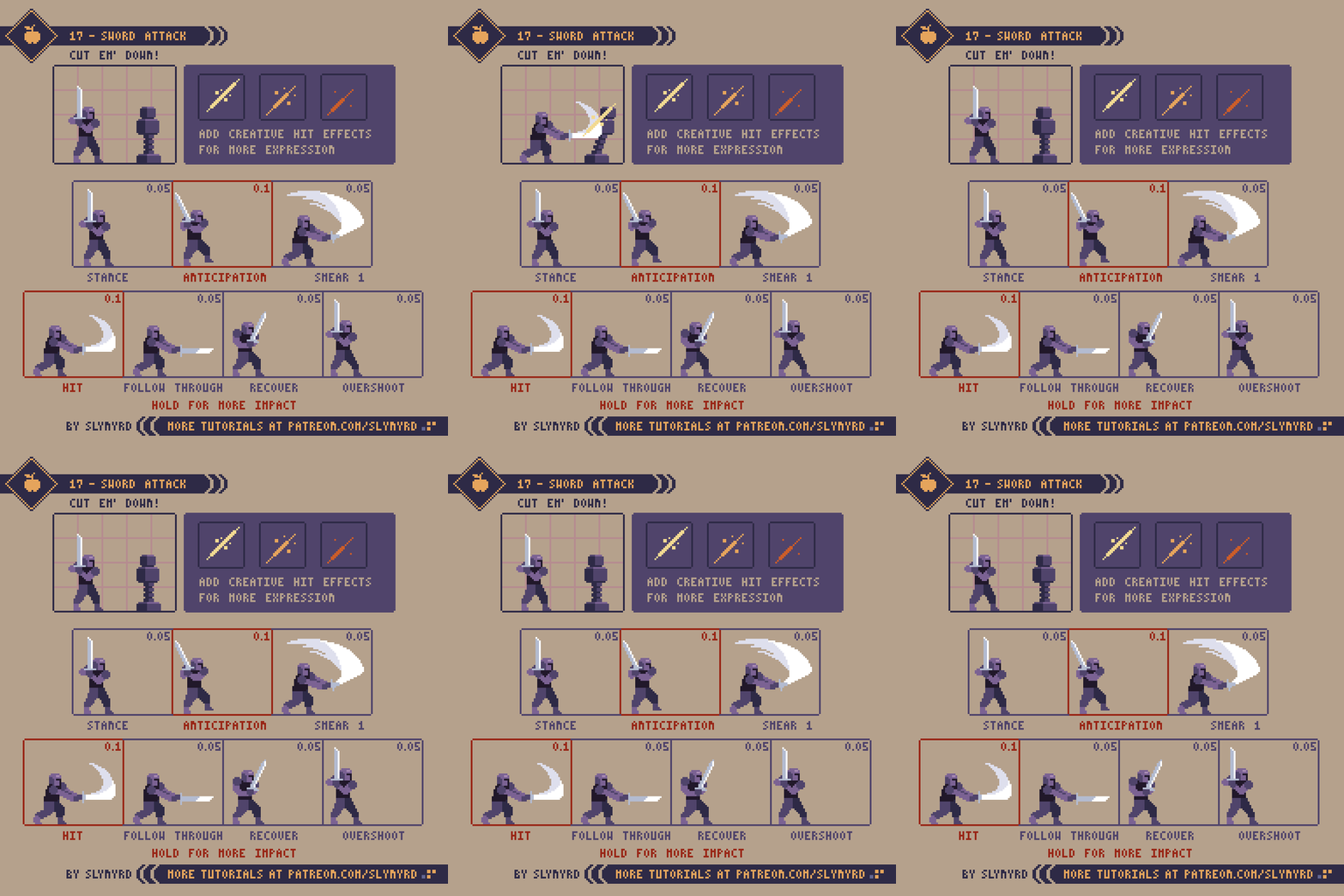
Introducing weapons brings in all kinds of possibilities. While there is always room for creativity, the stance is largely influenced by the weight and balance of the weapon. For example, a broad sword is commonly held with two hands like in my example. But a lighter curved blade might be held with one-hand off the side of the body or possibly over the head. Choose a stance that makes sense in concerns to the weight balance of the weapon and the strength of your character.

It's also important to think about how you want your character to attack and make sure the motion naturally transitions from the stance. For example, if you want your character to make backhand upward slashes with a blade, it makes sense to have the blade start in a sheathed position off the hip. On the other hand, for downward vertical slashes a raised two-handed grip like my example works well. 

To emphasize weight you can add more frames or hold certain frames a bit longer. I hold the follow through a slight moment longer than the other frames to give the sword a touch of weight. For heavy weapons like a mace or two-handed axe, one would expect a slower anticipation and recovery. However the smear frames should always be few and fast. 

Gameplay

Realism is good and all but when it comes to games, gameplay is king. Moreover, you should always think about how the melee attack will translate into gameplay. Anticipation and recovery frames add realism but can make sluggish gameplay. Too much anticipation will give a nasty feeling of input lag, and too much recovery will make your character feel sticky and vulnerable. If you intend to have slow methodical gameplay it's okay to have realistic weighty movements. However, when a player pushes a button they expect immediate feedback. Most pixelart games keep it snappy and can get away with even fewer frames than my examples. 

Another thing to consider in terms of gameplay is the area of attack. My sword attack example is actually quite strong, as it covers a large 90 degree area from above the head to straight in front of the character. This allows the character to attack enemies from above without jumping. Only the lower body is left vulnerable to low attacking enemies. However, if it were a straight pierce motion or pure horizontal slash, more precision would be required to align your attacks. There is no right or wrong, it just depends on how you want your character to feel and the gameplay you are going for. Generally, weapons with a wide area of attack are slow but powerful, while weapons with a small attack area are fast with weak to moderate power. 

KEY POINTS

Stance - It all starts from the stance. Choose a stance that fits the character, weapon, and attack motions. You don't have to always play it by the book though. The stance is a great opportunity to give your character a unique feel.

Smear frames - Typically a smear frame is a non-keyframe that is blurred to emphasize the motion and add expression. Smears are essential to creating a smooth feel, especially when using few frames. Usually a single smear frame can get the job done. Make sure your smear motion follows a natural path from stance to follow through. Experiment with a variety of smear shapes and colors to find the right motion and expression. Adding color gradation to a smear can enhance the smoothness without adding extra frames.

Freeze Time - Hold a pose for a few extra frames to add impact. I like to do this for anticipation poses and the sometimes the impact frame on strong collisions. This should be subtle, and not held for too long. Use this technique only for exaggerated actions.

Overshoot - Any moving object that is stopping will miss the stop point a bit before eventually stopping. The faster the object is moving the greater the overshoot. This principle can be illustrated by a pendulum swinging to a stop.

Exaggeration - It never hurts to exaggerate movements to bring more energy to your animation, as totally realistic poses sometimes feel stiff in pixel form. I often make the arms or weapon slightly elongated at the max extent to give a loose feel and increase the range of the attack. 

Gameplay - If you are animating for a game, the desired gameplay should dictate how you handle melee attacks. Quick low frame animations may not be super fancy but they always work well for quick responsive gameplay. On the other hand, long high frame animations look sexy but often translate into sluggish controls.
 

Final thoughts

The world of hand to hand combat is rich in style and weaponry. To make nice melee attacks requires some understanding of the real world physics along with a sense of how the action translates to gameplay. Here I've provided some standard attacks to build from. In the future I intend to elaborate and explore more attacks, weapons, and how to string together combos. Also, I want to explore similar animations for different styles and perspectives. For example, 3/4 top-down characters. There's so much to yet learn and teach!

RESOURCES

Was this article helpful? If you find value in my content please consider becoming a Patreon member. Among many other rewards, Pixel Insider members get extra resources to compliment my tutorials. But most importantly, you allow me to continue making new content. 

Assets featured in this Pixelblog are available in Anatomy & Animation Assets Pack.

Get caught up on all my downloads

If you're not ready to commit to the subscription model of Patreon, make a one-time donation and receive exclusive art and downloads. Fan support is necessary to keep producing content. Thank you! 

-By Raymond Schlitter

Pixelblog - 8 - Intro to Animation by Raymond Schlitter
Title_Graphic.png

Intro

While the economy of pixel art makes it a splendid medium to animate in, the limitations present peculiar nuances. The majority of pixel art is animated in a traditional frame by frame manner. Most often you will find pixel art animation in the form of short looping cycles, especially when used in video games. As simple as they may seem, looping animations demand great attention to detail. When repeatedly played over an over again you notice every detail, and a single misplaced pixel can create an eyesore. In other words, you can't hide poor cluster work with fluid animation. Furthermore, I recommend developing confidence in your basic pixeling skills before getting too carried away with animation. But ultimately, the most effective way to learn is by going through the motions. Best to start with simple small sprites and limited colors. Let's ease in with some idle cycles. 

Idle Cycles 

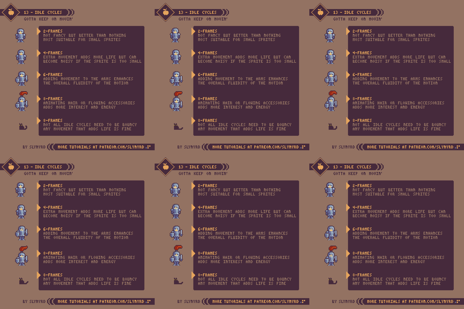
13-Idle_Cycles.gif

Idle animations are a simple and effective way to bring life to your art or game. The basic requirement for an idle cycle is movement. It doesn't even have to make sense, just move. In 8-bit JRPGs you commonly see them reuse the same 2-frame walk cycle for the idle animation, so the character appears to always be marching in place. I thought this was quite funny as a kid but I realized it's actually a clever way to bring life to incredibly small and simple sprites on a tight memory budget. However, the most common idle cycles come in the bouncy breathing variety.

As for the above examples, they are all reasonable solutions. The complexity of your idle cycles should be determined by the scope of your project. For example, if you are a small team making a game with lots of unique character sprites it might be unreasonable to give every character an 8-frame idle cycle. However you choose to approach idle animations they should be consistent. 

Run Cycles

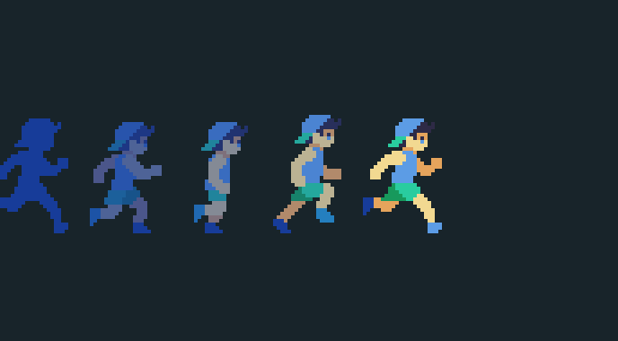
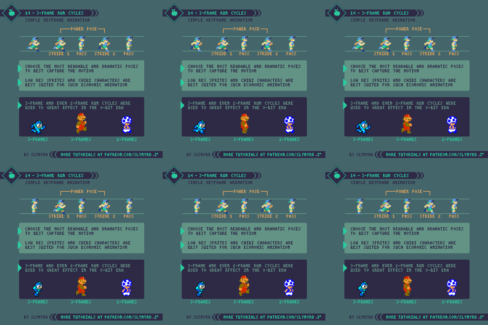
14-3-Frame_Run_Cycles.gif

Now it's time to pick up the pace and go for a run. This is a good point to become familiar with keyframes. Keyframes are basically guide frames that determine the start and end of a specific motion. For example, say I'm going to animate a character throwing a punch. First I would make one keyframe of the character wound up before the punch, and one keyframe of the punch at full extension. If needed I would then make the frames that fill the motion between, which are called in-between frames.

Keyframes should be the most dramatic poses that capture the essence of the motion. Even with the in-between frames removed the gist of the animation should be readable from the keyframes alone. Many good examples of pure keyframe animation can be found in older games. In the 8-bit era limited memory left little to no space for in-between frames, so developers were forced to create economical animations using only keyframes. While they appear simple, finding just the right poses to create the illusion of motion is an art in itself.   

I particularly admire the Mega Man run cycle. With just 3-frames it captures more kinetic energy than most modern run cycles made with many more frames. Technically there are 4 frames in the loop but the same pass frame is used twice. This is the model I used for my own exampIe. 

In my practice I found a few keys to making a good 3-frame run cycle. First, you want to make powerful stride poses with limbs extended and the character tilted forward. Often the fist is swung up in a manner that almost looks like the character is punching to maximize the action. The pass frame should have all the limbs close to the body in neutral positions so it connects with both stride poses. Lastly, don't forget to include some vertical movement to get the bounce effect. 

15-Run_Cycles.gif

Now let's pick up the pace and look at run cycles with higher frame counts. I first created the 8 frame cycle and simply removed frames to make the economized cycles. So how do I decide which frames to remove? Well, we know from our study of 3-frame cycles that contact and pass frames are crucial keyframes, so we don't want to get rid of them. If you observe all of the frames you can see the recoil frame is quite similar to the contact and adds little movement. Therefore, I first remove the recoil to make the 6-frame cycle, and you can see it's of little consequence and may actually have better energy without them. Finally, the only non-keyframe I can remove to make the 4-frame cycle is the high point. This more significantly impacts the animation but the core movement and energy are still preserved. 
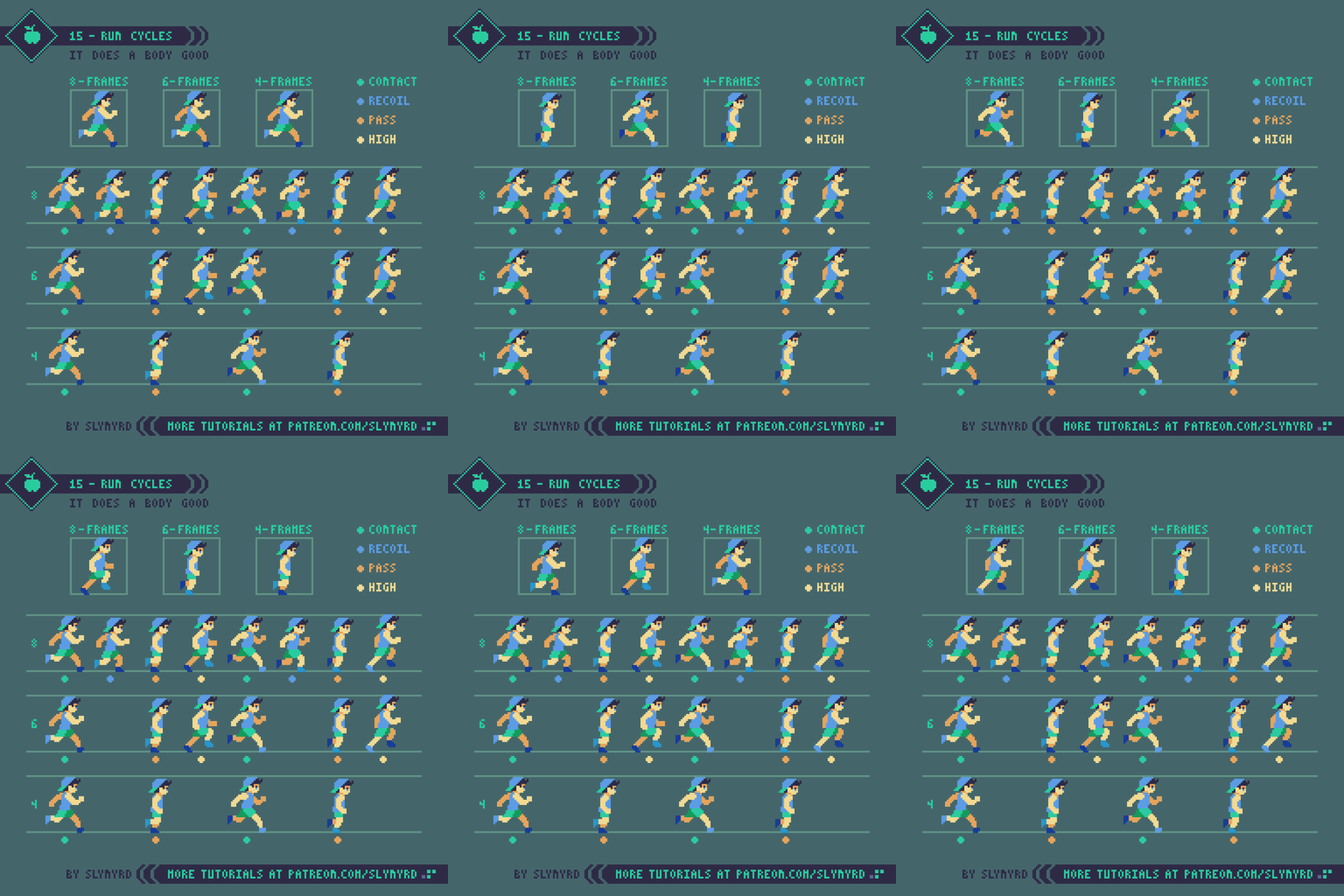
In order to preserve that same energy the playback speed must also be adjusted when frames are removed. For example, each pose in the 8-frame cycle is shown for 80 milliseconds, while each pose in the 4-frame cycle is shown 160 milliseconds.

The most important thing when creating a run cycle for a game is the energy of the motion. As you can see in these examples, more frames creates smoother animation but not necessarily more energy. In fact, too many in-between frames can make your motion look sluggish. It's best to have trust in your keyframes and not weaken them with excessive in-betweens. The above example shows how your imagination fills in the blanks. Making an energetic run cycle all starts with strong keyframes. Nevertheless, I find 6-frame cycles work well in most cases. They are easy to manage and just have a nice gallop to them.   

KEY POINTS

Start simple - Create simple sprites with clear color separation for the sake of animating. You can add details after you are satisfied with the motion.
Size - Tiny sprites limit the motion you can depict, while larger sprites are time-consuming and difficult to animate. Pick a size that is comfortable for you. 
Keyframes - Good animation all starts with strong keyframes
Excessive frames - Too many frames can leach the energy from your motion. Focus more on solid keyframe design
Attention to detail - Respect the clusters of every single frame. A single orphan or misplaced pixel in a looping animation is obvious.
Energy - Smooth movement doesn't necessarily equal good animation. Focus on the overall energy of the motion.
Playback speed - The duration each frame is shown dramatically impacts the energy of the motion. Experiment with many speeds and feel it out.

Final Thoughts

Animation is a wonderful skill to develop and a very effective way to exploit the charms of pixel art. Especially if you want to make pixel art for video games, animation is a must. Don't worry if your first attempts are miserable, animation is a skill learned with practice. The first time I tried animating pixel art in Photoshop it nearly brought me to tears and I seriously thought maybe I should just stay away from animation. But I continued to practice and over the years my dread turned to joy. Now animation is one of my favorite things to make and continues to grow on me as I improve. I hope you too can experience the satisfaction of bringing your pixels to life with motion.

I'm just scratching the surface here and will continue covering animation topics in future posts. I hesitate to do software specific content, as we are all using different tools and I don't want to alienate anyone, but I'm curious to know what subjects or aspects of animation you would like me to cover. Explosive effects, parallax motion, sub-pixel animation, and quadrupedal run cycles are just a few examples on the table. Better make sure I know how to do all that;)  

RESOURCES

Was this article helpful? If you find value in my content please consider becoming a Patreon member. Among many other rewards, Pixel Insider members get extra resources to compliment my tutorials. But most importantly, you allow me to continue making new content. 

Assets featured in this Pixelblog are available in Anatomy & Animations Assets Pack.

Get caught up on all my downloads

If you're not ready to commit to the subscription model of Patreon, make a one-time donation and receive exclusive art and downloads. Fan support is necessary to keep producing content. Thank you! 

-By Raymond Schlitter